Drought survivors

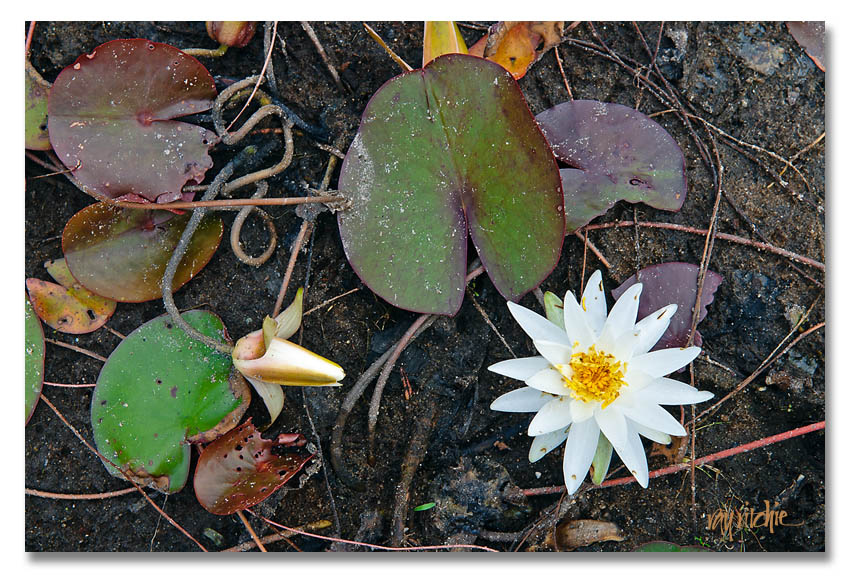
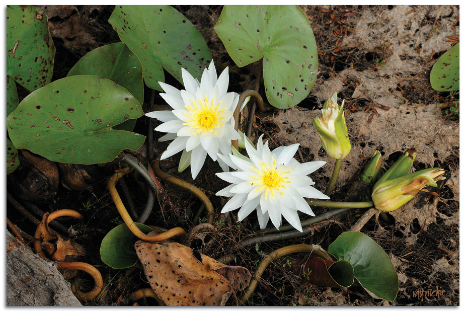
Our local lake, the Manasquan Reservoir, has been suffering the effects of our continued drought. The last time I was there, about a month ago, the water level was several feet below capacity, which is bad for our county water supply, but interesting for photographers. It means that areas of the reservoir normally under water were now exposed, and you could walk out to beds of water lilies that are normally too far offshore to make good photos. In fact, many of the lilies were no longer on water at all, but rather lying in the damp exposed sand, barely clinging to life. I’ve seen this before, a couple of years ago – here’s my first “drought survivor” image from 2008:

And here’s one of my favorite shots from this year:

Drought survivors 2

These lilies remind me of Japanese “cycle of life” flower paintings, as you see the flower at peak bloom, bud, and shriveling and dying and infested by insects, all at once. As the leaves and stems are exposed to the sun and begin to dry out, they take on deep oranges, yellows, and reds that you never see when the plants are completely immersed. They tell me a story of beauty, sadness, danger (global warming?), and at the same time, hope.

More of my water lily series can be seen on my flickr stream here. Until I get an etsy store or some other sales outlet set up on line, if you’re interested in prints, please use the contact page to let me know what you’d like. I print these myself in a variety of sizes, from 5×7 (matted to 8×10) up to 16×24. Larger prints can be made available, including canvas gallery wraps, but I have to outsource the printing of these, and it takes a little longer.

Postcards from Asbury Park (part 2)

I’ll wrap up my discussion of the Sickel lettering design for Asbury Park with a couple of additional examples that show how the broad strokes of this lettering style give us an advantage for photographic effects.

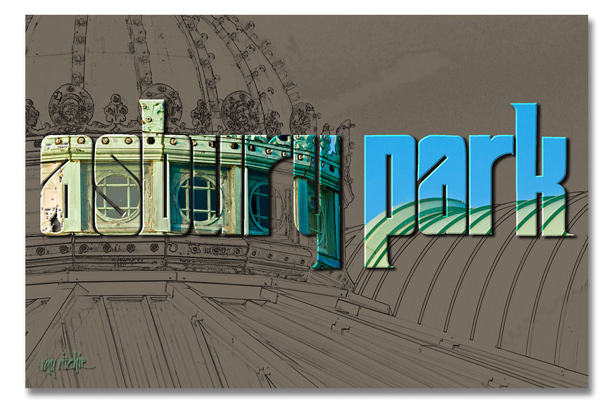
The Old Casino

Here I’ve taken one of my photos of the roofline of the old Casino complex and turned it into a line drawing using the Photoshop “Find Edges” filter. I then used the same lettering as in the first postcard (see Postcards from Asbury Park – part 1) as a mask to let some of the color from the original color photo come through.

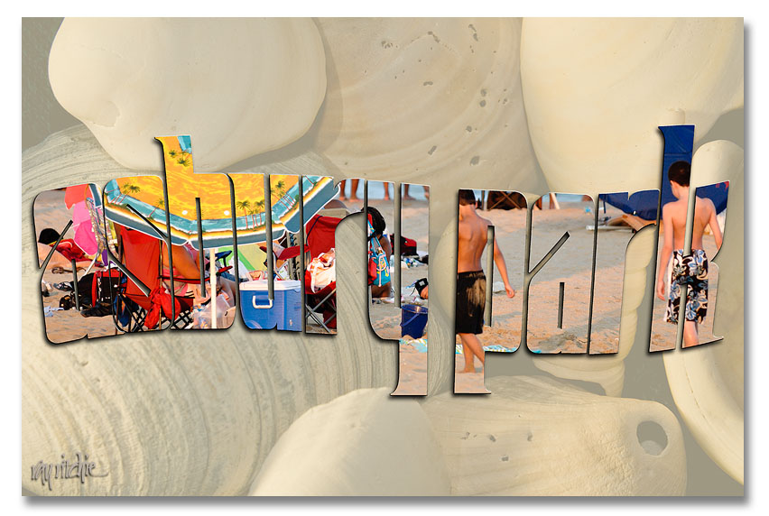
This one, obviously, is two separate photos. The background shell image is from my personal stock library, and the second was a beach scene made during the July 24 Photo Walk. I used a wavy version of the Asbury Park lettering to mask that second photo and layered it over a faded version of the shells.

I could as easily have used a font, rather than designing my own letters for these cards, of course. A font like Arial Black would also give me nice heavy strokes, but it wouldn’t be as distinctive – someone else could easily produce the same look. The combination of my own lettering with my photos gives the cards a unique look that hopefully would distinguish them from others on the rack.

I’ll have to decide now whether to actually do a commercial print run of any of these – it’s probably too late in the summer vacation season to do it for this year – if you have a favorite, please use the comment button or the contact form to let me know.

Faux framing

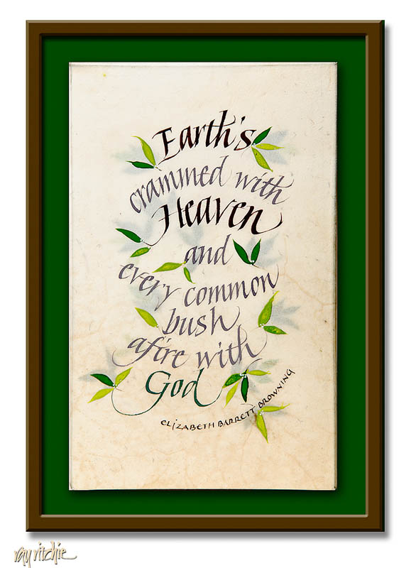
A few months ago, I had the opportunity to take a three-day intensive workshop on working with vellum (calfskin), taught by noted Irish calligrapher Denis Brown. I haven’t gotten around yet to doing much with what I learned, but I did come home from the workshop with a little 5×8 miniature that I did during the class. It’s been sitting on the corner of my drawing board for three months, waiting for me to get around to doing something about framing it. Today I decided that, if I couldn’t get a physical frame done, I could at least use Photoshop to do a little faux-framing to help me decide what final treatment I want to use. Here’s the piece, as it would look float-framed in a shadowbox treatment:

To give a few more details about the piece itself, the material is “slunk” calfskin vellum, which is a skin taken from a stillborn calf. The quality of this particular skin and its preparation is extremely high, and the skin is quite translucent. To take advantage of the translucence, I mounted a piece of watercolor paper to the piece of plywood that the skin would be stretched on, and on that I painted a background of extra leaves for the “bush.” The skin was then stretched and glued on top of the background, so that the final piece has a little of a three-dimensional feel. The calligraphy and decoration were done in gouache.

Postcards from Asbury Park (part one)

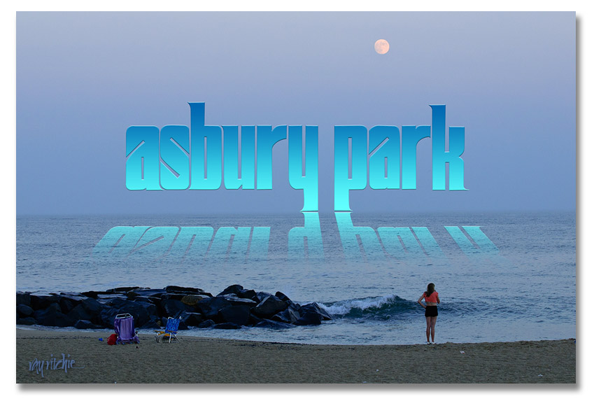
Continuing with the previous post on lettering (More on Lettering and Calligraphy), I promised to give some examples of how the draft versions of the Sickel lettering might be used with some of my photos from the Asbury Park photo walk. I decided I would develop a series of postcards, and see which I liked best. Here’s the first example:

The reflection effect was mostly based on an article by Corey Barker in the March 2010 issue of Photoshop User magazine. It involves adding a gradient to the lettering, then duplicating and flippling the duplicate layer to get the reflection, and masking and blending the “reflection” to allow it to blend into the water and disappear as the reflection gets further from the main title. I added the trick of distorting the reflection so that the reflection widens as it gets closer to the viewer.

Doing a self-critique here, I think the Sickel design doesn’t work as well as I’d like for this effect, as the descenders in the “y” and “p” cause the main part of the reflection to be too far from the main title. I might want to change the lettering to an all-caps style, or modify my Sickel design to eliminate these descenders if I were really going to use this design.

Small miracles

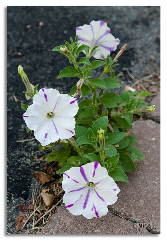
Anita and I have been taken in the last few days by a small miracle happening beside our garage door. In a period of severe drought for our area of central New Jersey, this little petunia has somehow taken root in the crack between our asphalt driveway and the paving stone patio:

We don’t have any other petunias this year, so we aren’t sure where the seed came from, or how it managed to find enough soil and water in this particular spot, but there it is, bringing a little smile to us every time we come and go from the garage. I finally had to get out the camera and tripod and record it so that I won’t forget.

More on lettering and calligraphy

To take the exploration of lettering and calligraphy a little further, here are a few examples I’ve been playing with today.

A few weeks ago, I participated in Scott Kelby’s Third Annual Worldwide Photo Walk, an event in which groups of 50 or fewer photographers get together at sites all around the world and take photos for a couple of hours. My local walk was held in Asbury Park, New Jersey (the town where Bruce Springsteen and Jon Bonjovi first made names for themselves as rock musicians). A few of my photos can be seen in my photostream here. Since that time, I’ve been thinking of making some kind of poster, T-shirt, or other graphic with one or more of the photos – but I need some lettering that says “Asbury Park.”

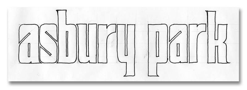
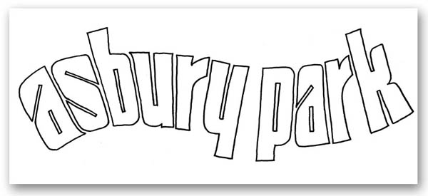
Here’s a sketch for a possible base design, just as it came off my drawing board:

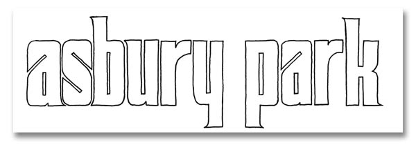
This is a variation of a style of lettering known as “Sickel,” which has been recently discussed on cyberscribes. Note the pencil lines – the design is drawn based on geometric proportions, and then quickly inked in with a pen. After a little cleanup in photoshop, it comes out looking like this:

And if I want to clean it up further and make it easier to enlarge and distort the letters, I can import that drawing into Adobe Illustrator, and trace it with “bezier curves,” which will get rid of all the little bumps and rough spots in my hand drawing. I like this style of letters for this particular application, because 1) it has a “retro” feel that harkens back to the glory days of Asbury Park in the early 20th century, 2) the wide strokes give me lots of room for graphic effects, including using the letters as a mask that my photos will show through, and 3) it lends itself to manipulation and distortion. Here’s an example of that third point:

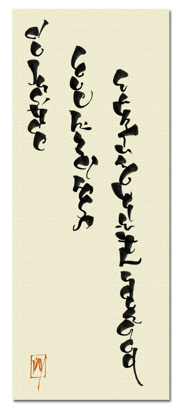
This Asbury Park letter design is an example of what I consider “lettering,” rather than “calligraphy.” It is drawn, rather than written, and will be extensively retouched and manipulated before I reach the final version. As a contrasting example of “calligraphy,” here’s a design based on something I discovered in my inspiration files last night:

This lettering was written with a brush, and I was deliberately playing with the brush characteristics, trying to see if by exaggerating the thicks and thins, and stacking the letters, I could get something that resembled an oriental script. In this case, I haven’t manipulated the original letters at all – I just layered them over a textile background in Photoshop, and added a “chop” in a typical orange-red. The text, in case you can’t read it, is from Micah 6:8: “And what does the Lord require of you, but to do justice, to love kindness, and to walk humbly with your God?”

Next, I’ll try to show an example of using the Asbury Park lettering with a photo.

Understanding Engineers

I just finished reading a post on DPreview criticizing the engineering team who developed Lightroom 3, one of my primary photo post-processing tools. As a retired engineer, I thought I should try to help people understand engineers better, so here are a couple of takes passed along to me by another retired old-timer from Bell Labs:

Take 1: An optimist sees the glass as half full. A pessimist sees the glass as half empty. An engineer sees a glass that’s twice as big as it needs to be.

Take 2: Lots of us believe, “If it ain’t broke, don’t fix it.” Engineers believe “If it ain’t broke, it doesn’t have enough features yet.”

Back to the main topics tomorrow.

Styles in development

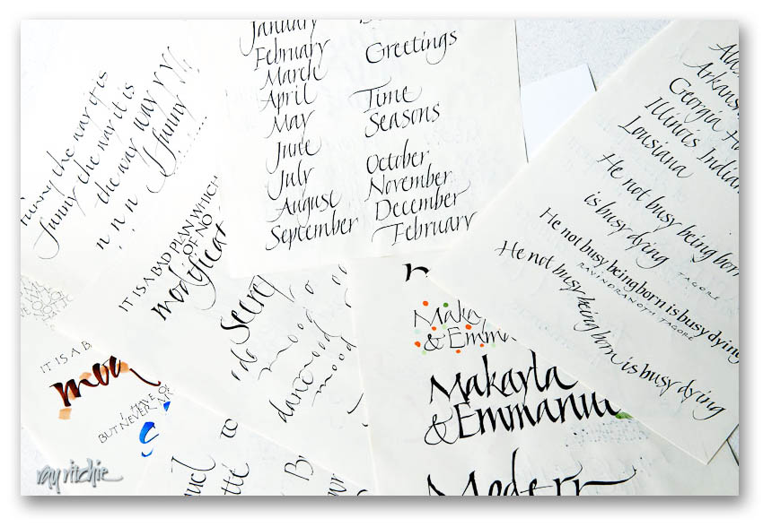
People sometimes ask me “What style of calligraphy do you do?” but I never have an easy answer. I do whatever I’m currently hooked on, whatever I think the job may require, and whatever I really wish I could learn to do. Much of what I do is based on Italic and uncial, two of my earliest calligraphic loves, but a lot of my recent stuff has been heavily influenced by the brush. I work a lot on my Romans, but they’re never good enough to make me happy.

The easiest way for me to give examples is just to dig into my files of practice sheets and drafts. I do a lot of calligraphic doodling as I sit in my chair in the den, theoretically watching TV, and I accumulate huge piles of practice sheets and doodles. Most of them have no value at all, but when I get a stack an inch or so high, I usually go through them and find the 10 or 12 pages that might have a hint of something interesting on them. Those go into a box that’s used for an “inspiration file” when I’m looking for a new direction for a “real” piece. If you’re looking for finished work, this is not the place, but here’s a look at one of the piles:

Looking at that picture reminds me of “there must be a pony in here somewhere!” If you don’t recognize that punchline, try Googling “the pony joke.”

Lettering and calligraphy

I’m planning to talk about lettering, calligraphy, graphic design, and photography in this blog, so that begs the question “What’s the difference between lettering and calligraphy?” The distinction between the two isn’t always a bright line, but for most of my purposes, I usually say that calligraphy is written (by hand, of course), while “lettering” is a broader category including letters that are drawn and, in some cases, heavily retouched, either by hand or with the assistance of computer software such as Photoshop or Adobe Illustrator. “Calligraphy” means “beautiful writing,” according to its Greek origins. The notion of “beautiful” is of course open to debate, but to me, “writing” means that I make calligraphic letters with a sequence of strokes of a pen or a brush that allows me to construct each letter fairly quickly. But if I then scan that calligraphy, touch it up in Photoshop, and convert it to a vector graphic form so that I can enlarge it, distort it, and otherwise manipulate the letters, I’d say I’m getting into “lettering.”

Lettering may also just be letters drawn with a pencil, or letters drawn and then inked, or any number of other variations. Lettering may also get into font design, although that’s not currently one of my involvements.

Does any of this really matter? Only to the extent that it matters whether we understand each other. I’m not a purist about any of this. I have done a lot of studying of calligraphy and lettering and taken many workshops with some of the finest calligraphic and lettering artists in the world, but I don’t feel a strong need to put myself in a particular category. I just like creating designs that feature letters, and I usually try to make those letters unique and personal. Unless there’s a specific design reason for the letters to conform to a model, I don’t usually try to make my letters exactly like anyone else’s.

I’ll try to show more examples of personal lettering and calligraphy in some of the following posts.

Comfort and hope

My wife and I are leaders of an adult church school class called Seekers, and this year we asked the class to think about the question “What resources do you turn to in times of trouble?” The class responded by writing about hymns, scriptures, favorite quotations, and personal recollections, and we decided to make these writings into a book that our class members could have as a keepsake.

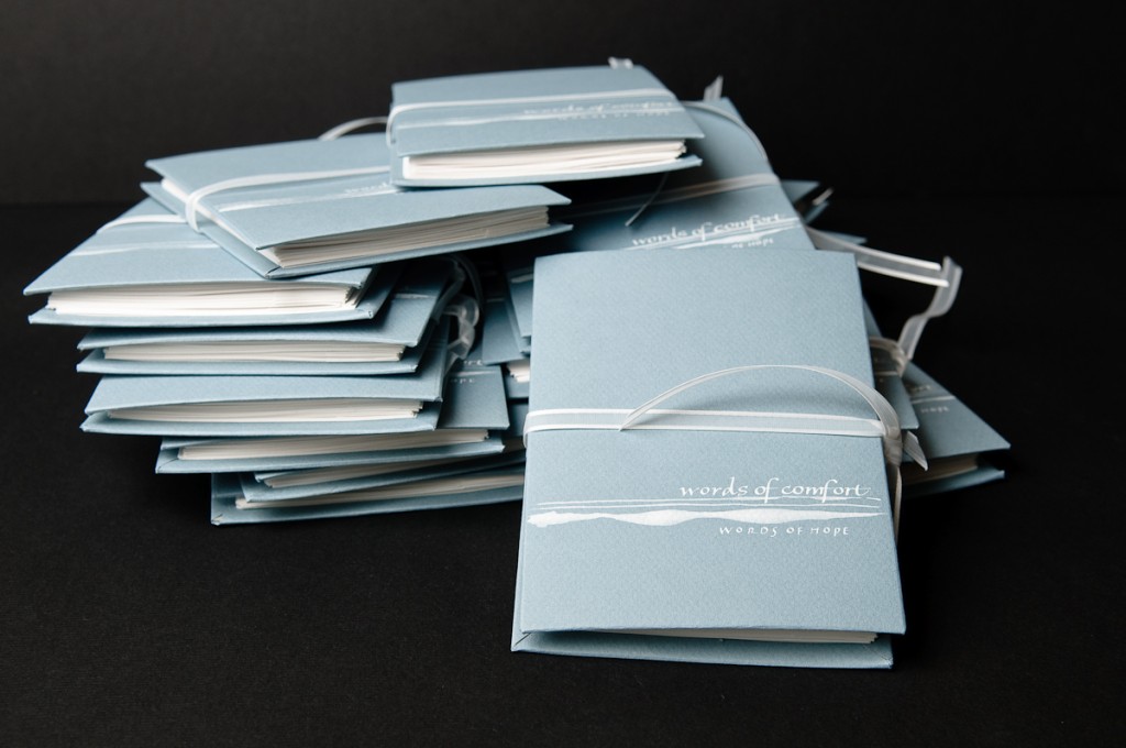
Never having done a book-making project, we thought we’d probably want to avoid a binding method that required stitching, so we settled on an accordian-fold binding. No calligraphy here except for the cover, as the entire book ran to more than 30 pages, and we needed to make about 15 copies. But I was still pleased with the way it came out – here’s the result:

Comfort and hope books

I learned a couple of things here – first, I did enjoy the bookmaking process. And second, making 15 copies of a book is really time-consuming! For those who like details, the covers were made from chipboard, covered with Canson paper and the cover was then painted and lettered with white gouache. The closure ribbon was inserted between the chipboard and cover paper for the back cover, and threaded through slots cut into the edge of that cover. I’m sure there are other solutions to making a closure – this is just the one we arrived at without knowing what we were doing.

I think Comfort and Hope would be a good theme for a calligraphic piece. What gives you comfort and hope? If you don’t want to comment publicly, please feel free to send me a private e-mail using the Contact page. Let me know, too, if you’d give me permission to use some of your words.