Pencil Doodles

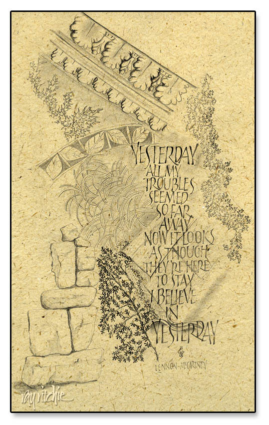
I’ve been reading a couple of books on art and drawing technique, and spending some time each day sketching on my lap board. Most of these sketches are really just doodles, and I’ve been concentrating on particular patterns and technique, rather than making any real effort at design. But I’ve been finding that interesting designs are emerging nevertheless, with no particular effort or conscious thought on my part. The background of the sketch below started with my copying the design of a piece of molding from a photo I had taken in the chapel at Les Invalides in Paris (site of Napoleon’s tomb). Then I began adding random other elements, with no intention of creating a unified piece. But when I looked at the page, I felt it suggested a sense of the past, and I thought of  the lyrics to “Yesterday” as a set of text. The lettering style is just something I had been playing with recently, and wasn’t chosen for any special reason.

This actually violates one of my usual practices, in that I try to avoid using copyrighted text – but since I have no plans to sell this piece, perhaps the Beatles lawyers won’t come after me. The original sketch was just done on white inkjet paper. I scanned a piece of banana fiber paper and then overlaid the sketch in Photoshop to give it a little more texture, and more of a finished appearance.

The books I’ve been reading, by the way, are Bert Dodson’s Keys to Drawing with Imagination, and Trudy Friend’s Artist’s Complete Problem Solver.  Both are full of examples and suggested exercises – good resources for a person like myself with relatively little formal art training.

Zen stones revisted

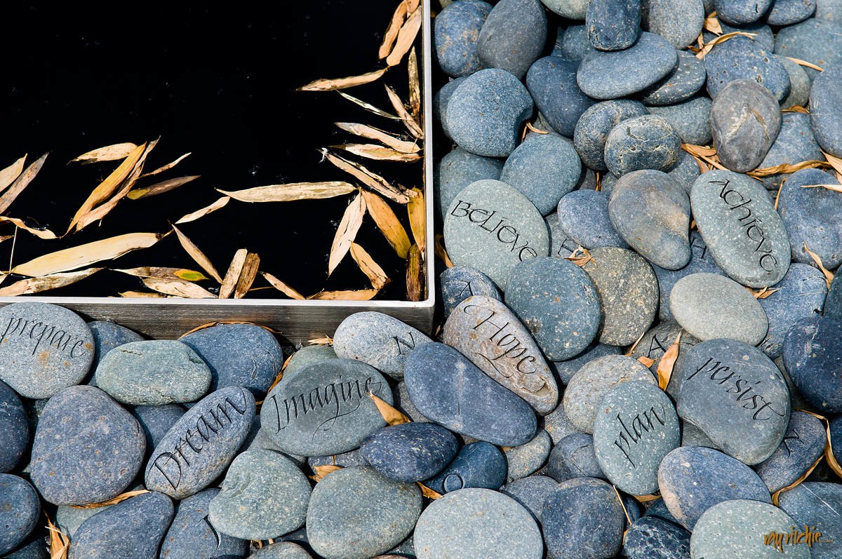
Some time ago, I made a post about “Image Seeking Word,” and asked for some thoughts about what words might be appropriate. During the Christmas season, someone who had seen the blog came to me and asked if I might make a customized version of that image for her son. She suggested that words like “Dream” and “Imagine” might be used, but asked that I pick some more of my own. Here’s what came out of that project:

The letters of the name of the recipient, “Jonathan,” are also sprinkled among the stones. Each word was written separately in black gouache, then scanned into Photoshop, and re-sized and warped to fit the contours of the stone, before finally being “etched” (using the Bevel and Emboss tools), so there’s a fair amount of work involved in using this many words, but I enjoyed it, and learned a lot in the process. I’ve since done a similar version, with a different name, for another customer.

I’d be interested in getting your feedback and further ideas about words for the image.

Oregon Coast part 2 and back to Seattle

Wow – it’s been over a month since my last post! I’ll spare you my weak excuses, and just say that I’ll try not to do that again.

I wanted to wrap up the northwest coast trip photos with just a few more of my favorites. After leaving Newport, we continued north on Highway 101, and began to see impressive examples of the power of ocean, as we approached Boiler Bay. Here’s an example:
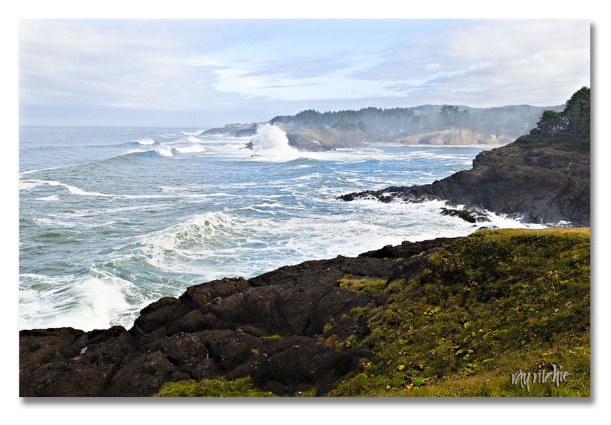
As we moved further north, Rte. 101 bent inland, and it began to look as though our incredible luck with the weather was running out. A side trip to Cape Lookout gave us only a view of mist and fog, so we returned to 101 and entered Tillamook County, which our guidebook said has the highest rainfall in Oregon (80-90 inches annually, with some spots as high as 200 inches). Just as we saw the “Welcome to Tillamook County” sign, it began to rain, and we drove through the dairy farming valleys under a steady downpour. We had been advised that we should stop at the Tillamook Cheese factory (“ice cream to die for,” was how my Internet contact put it), and somehow, as we entered the town of Tillamook, the sun came out again. We turned our backs on the Heart Association for a delicious lunch of macaroni and cheese followed by ice cream, and then continued on to Cannon Beach and Ecola State Park. The latter was my favorite spot of the trip, and even though we found ourselves running out of time and energy, after a long drive down a single-lane road, we made our way to Ecola Point, where I also got my favorite shot of the trip (if you click on the image, you’ll be taken to a larger version than I usually post):
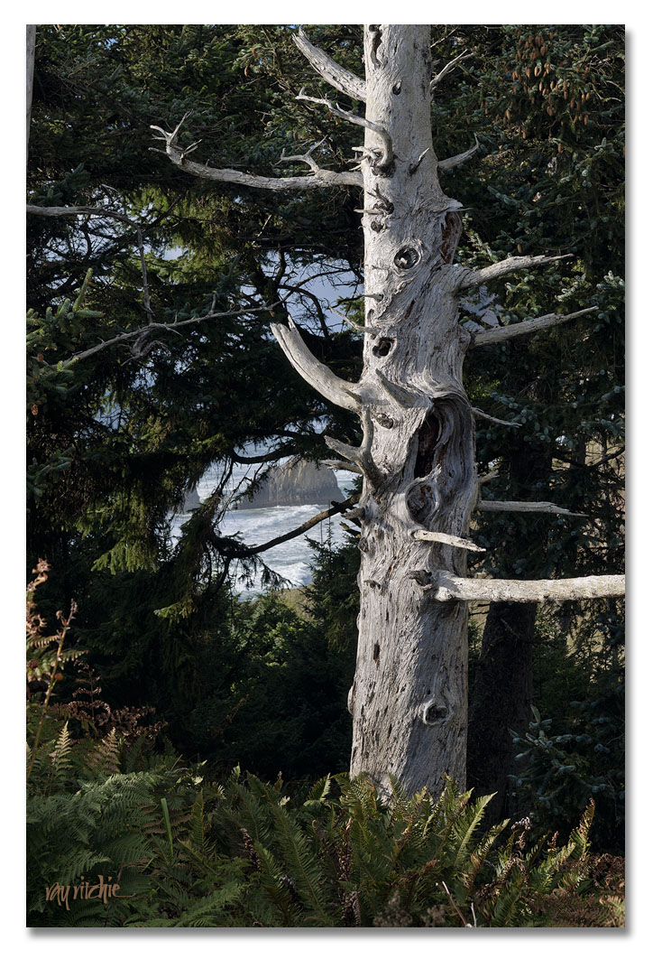
I loved that shot for the old tree, the ferns, the redwoods in the background (note the small cones in the upper right), the great light, and especially for the little window through the trees, showing the rocks in the ocean. For me, it was almost a perfect summary of our coastal tour experience. By the way, I have made 12×18 prints of this shot, and it holds up very well to enlargement – if you’re interested in a print, drop me an e-mail (see the contact page link at the top of this page).

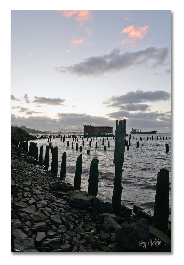
We had thought we’d spend the night in Seaside, just on the other side of Ecola State Park, but there was a convention in town that was tying up most of the hotel space, so we decided to go on to Astoria for the night. We found a room right on the banks of the Columbia River, so close to the fishing docks that we were serenaded all night long by barking seals, who apparently like to sleep on the floating gangways where the boats tie up. I watched the sunset over the river, looking out towards one of the few remaining buildings from the hundreds of canneries that operated in Astoria before the salmon were overfished almost to extinction:
And the next morning I was able to see the seals clearly amid the boats:
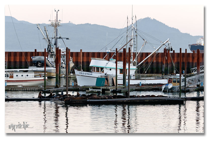
I couldn’t figure out the rules of the seal union. Both late at night and early in the morning, it was clear that most of them were sleeping away like sacks of potatoes, but at least a few were always barking. So maybe they work in shifts? How does a sleeping seal know when it’s time to get up and start barking? Does the seal on barking duty just go over to a sleeping seal and nudge it awake? Do males and females share this obligation equally?

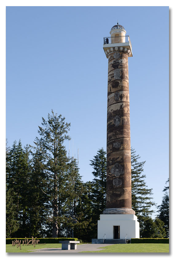
Our AAA guidebook listed Astoria Tower as a “gem,” and compared it to the famous Trajan Column in Rome. Since Trajan’s column is a treasured icon to calligraphers (the inscribed letters on the column are considered the most perfect examples of classic Roman caps), I felt we had to check it out. Calligraphically, it was disappointing, as the letters were nothing to brag about, but the artwork spiraling up the column, which tells the story of the settlement of the Pacific Northwest, was interesting, and from the viewing platform you can see a 360-degree panorama of the Columbia River area:
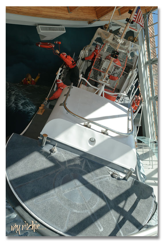
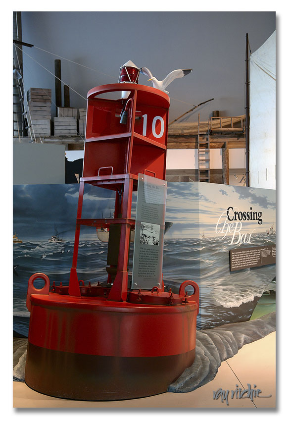
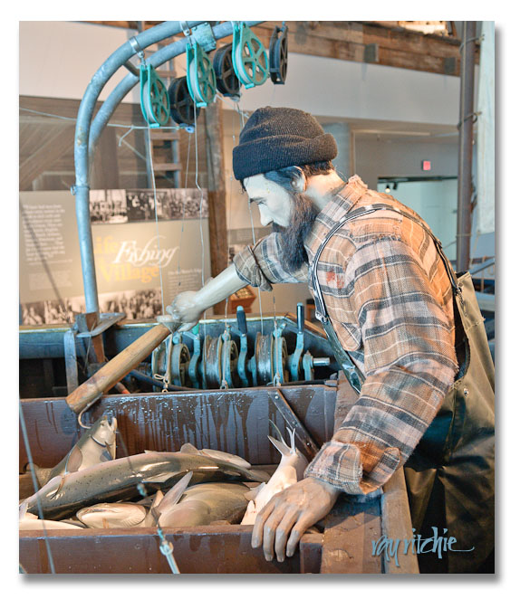
Our favorite spot in Astoria turned out to be the Columbia River Maritime Museum, which I suspect we might never have discovered, had it not been just down the street from our hotel. It’s right on the river, and has real Coast Guard lightship and rescue boats which can be visited, and fascinating videos about the Columbia River Bar pilots (who know the river so well that they can draw a map including every sandbar entirely from memory), showing them boarding the incoming and outgoing freighters by jumping from the pilot boats onto a rope ladder tossed over the side of the ship. The “bar,” we learned, is the area at the mouth of the river where the tides of the Pacific meet the outflow of the river, leading to swells which can be in excess of forty feet. The river is so hazardous in this area that more than 2000 vessels have been lost since record-keeping began. Here are a few shots from the museum:
If you’re in the Astoria area (and why not, since that’s where “Goonies” was filmed ;-) ), this little museum is well worth your time.

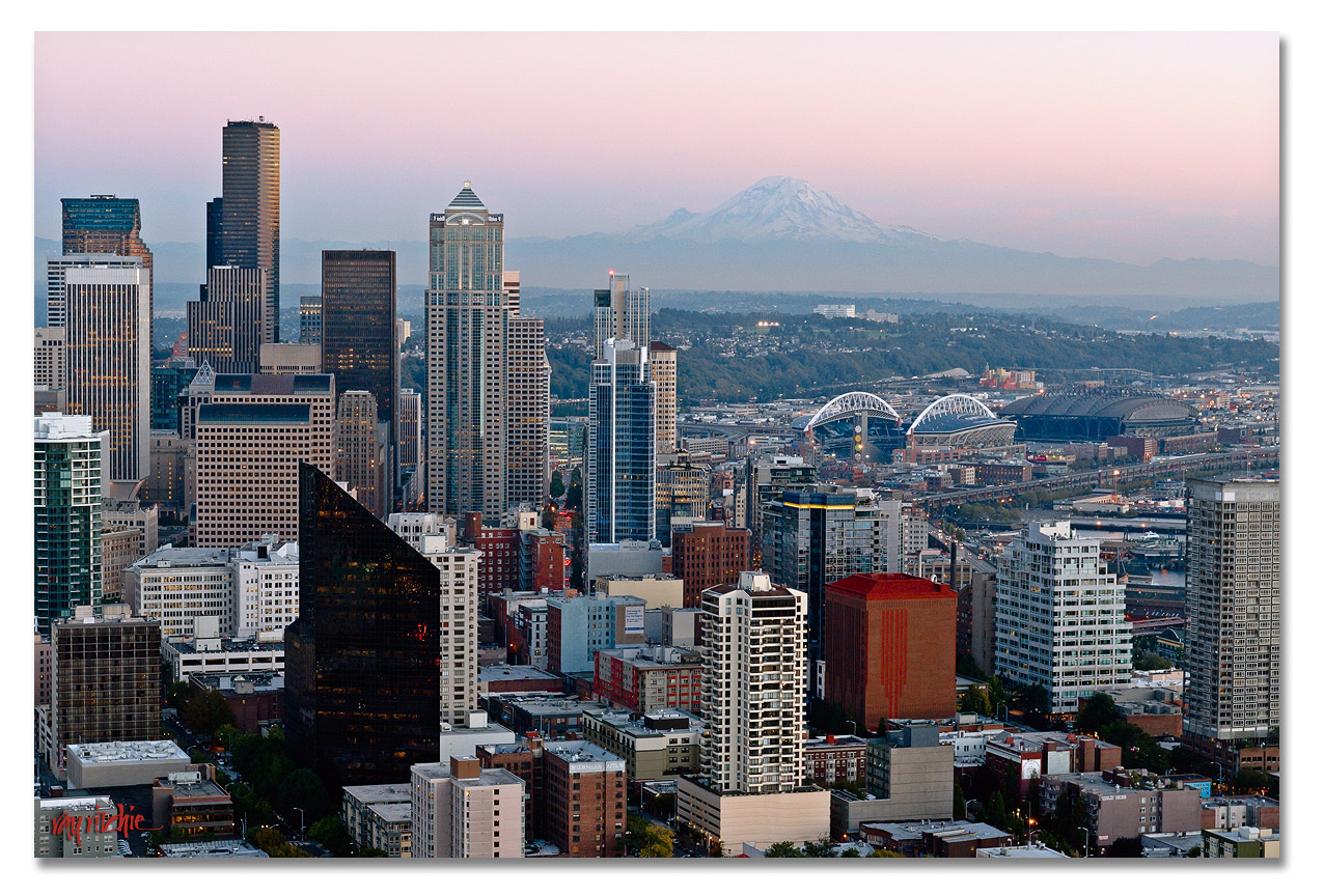
After our visit to Astoria, we returned to Seattle for our last two nights, and got in a visit to Pioneer Square and a trip to the top of the Space Needle for a sunset view. I’ll end this travelogue with this view of the city (click on the image for an larger version):
It was a great trip – can’t wait to go back.

Volcanoes and Waterfalls

Most people would go from Mt. Rainier to Mt. St. Helens by going back to the Interstate (I-5) and then getting off that at the Silver Lake Interpretive Center, and taking the 47-mile mountain road up to the blast area on the western slopes, where there is a Visitor Center. But that would have been too easy. Actually, it looked much quicker on the map to take the back roads to a sequence of viewing areas on the east side that starts with Bear Meadow and ends at a point overlooking Spirit Lake.

Bear Meadow is the spot where photographer Gary Rosenquist was standing on May 18, 1980 when he captured a famous set of photos of the explosion of Mt. St. Helens. As the marker at the site says, “Located 11 miles from the mountain, Gary began taking pictures shortly after the 8:32 AM earthquake which triggered the great landslide. He continued to take shots as the hot ash-filled cloud raced towards Bear Meadow at over 300 mph. The group quickly realized their danger. Within minutes they were driving northward, groping their way through the darkness caused by falling ash.” Hmm…maybe Gary and his friends weren’t all that quick.

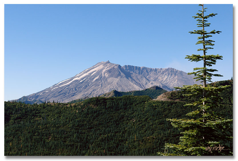
Anyway, that’s the way we decided to go in, and we were rewarded by an ever-changing set of views as the road hugged the mountainsides. If you look at Mt. St. Helens today from a viewpoint on a line with Bear Meadow, you’ll see something like this:

(This shot was from much closer than Bear Meadow, but the line of view is about the same) Notice that the mountain slopes facing away from the blast are completely forested, while Mt. St. Helens itself is completely bare. But as you enter the blast zone, the story changes dramatically. This panorama shows how the view changes from outside to inside the blast zone (click on the photo for a larger image):

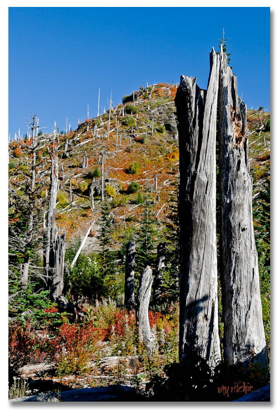
As you can see, even thirty years after the blast, the slopes facing Mt. St. Helens are only beginning to have a few small trees. Here’s a closer shot of one of those slopes:

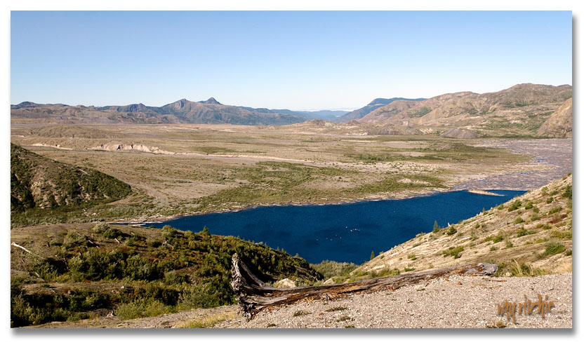
This looks pretty barren, but when you get to the end of the road, only a mile or two from Mt. St. Helens, the landscape looks like this:

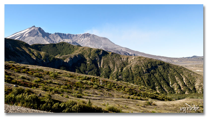
You’re looking here at a corner of Spirit Lake, which was raised 200 feet by the mile-wide landslide that followed the eruption. Spirit Lake was formerly a major recreation area. Mt. St. Helens is to the left of this shot, and from this same viewpoint looks like this:

I believe that’s steam from the volcano that you’re seeing above the mountain, but Anita says it’s just a cloud. Mt. St. Helens is still considered to be in a period of activity. If the dome of lava inside the crater continues to grow at its present rate, Mt. St. Helens will be restored to its former height in about 200 years.

We thought we were finished with our trip to Mt. St. Helens at that point, but we quickly found that the drive back down to Bear Meadow is much more harrowing than the drive up. On the way up, you’re hugging the mountainside. On the way down, you’re driving at the outer edge of the road, often with no guardrails and no shoulder. In fact, in a number of places, the ground underneath the outer roadway has eroded away slightly, and the pavement has begun to collapse. Sitting in the passenger seat, as I was, you look out your window to drop-offs that seem to go down forever. We were pretty much on edge for the next several hours, as even after we left the Mt. St. Helens National Volcanic Monument, the road continued to be a narrow, winding two-lane mountain road with no shoulder, all the way down to Cougar. I guess the designation “Closed in Winter” on the map should have been a tip-off.

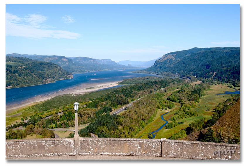
From Cougar, we followed the highway along the Lewis River back to I-5, and took that across the Columbia River to the Portland area, where we found a room in the suburb of Troutdale.  We dropped the bags in the room, and then went back out to nearby Hwy 30, which is labeled as a “Scenic Byway.” It more or less parallels the Columbia River, winding through the Columbia River Gorge and past a series of waterfalls. Our first stop was at Vista House, where we had this view of the River Gorge:

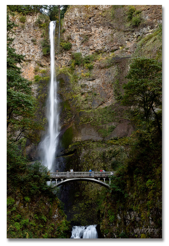
We might have stayed a little longer at Vista House, but we were being pushed around by winds that seemed to be gusting to 40 or 50 mph. The park ranger at the information desk told us this was just a typical day – nothing exceptional in terms of wind. We continued along the 12-mile waterfall run of Hwy 30, and visited six different waterfalls, finishing up with Multnomah, the most famous, and also the highest, with a 620 foot drop in two cascades. I wasn’t able to find a spot to shoot all of both cascades, but here’s a classic view that I was able to get:

As mentioned before, more images will be available on Flickr. Next: Crater Lake.

Mt. Rainier

We were very lucky, or I might even say “blessed,” by wonderful weather during the trip. In 10 days in the rainiest part of the country, we only really got rain one morning. But as we set off from Seattle for Mt. Rainier, we didn’t know that would be the case, and we were a little worried, as Seattle was foggy and overcast, and that continued to be the case throughout the morning. But as we neared the mountain around noon, suddenly the clouds lifted, and we had a gorgeous view; the rest of the day was crystal clear.

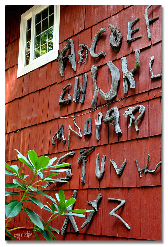
We stopped in Ashford to book a room, and the clerk there recommended we have lunch at Copper Creek Inn, where we found another semi-calligraphic expression:

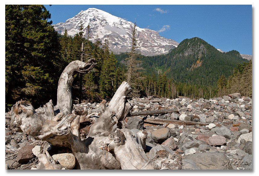
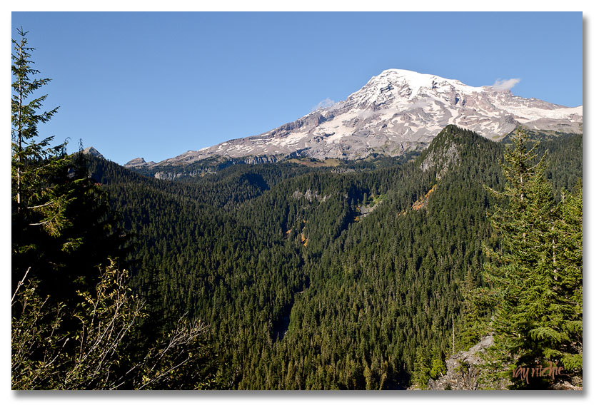
Shortly after entering Mt. Rainier National Park, we pulled over at a viewpoint and took a trail down onto the riverbed of the Nisqually River. Here’s one of the views from there (as with most of the images on this blog, you can click the image for a larger view):

Over and over during the trip, we were awed by the forces of nature -it’s almost incomprehensible to think of all the glacial action and flooding which has taken place over the millenia to leave a debris field like that.

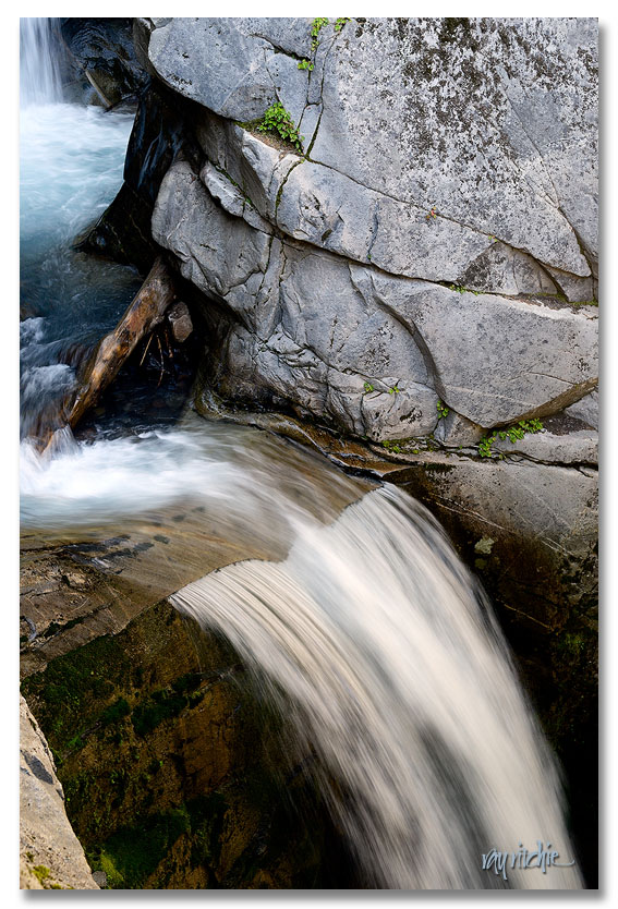
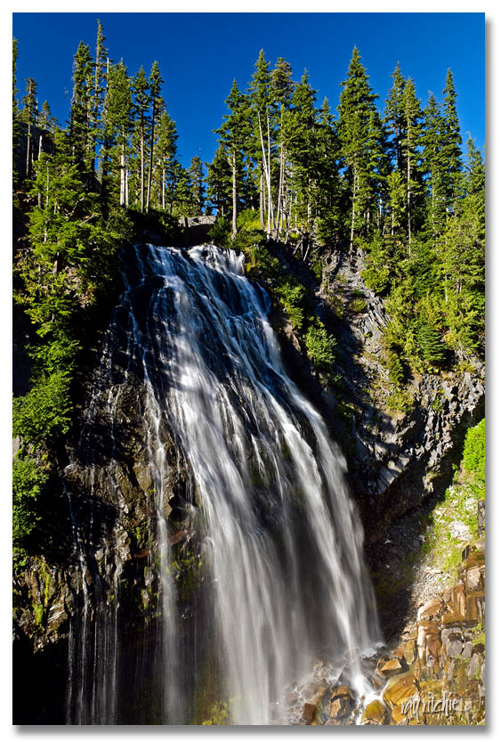
With stops for views and photography, it took us two or three hours to make it up to Paradise, which is the site of the main visitor center for the park, and the highest point you can reach by vehicle in this part of the park (Before entering the park, we passed Faith Baptist Church, whose motto was “If you want to make it to Paradise, you have to go by Faith”). Among the sites on the way were : Waterfalls

and one spectacular view after another of Mt. Rainier itself,

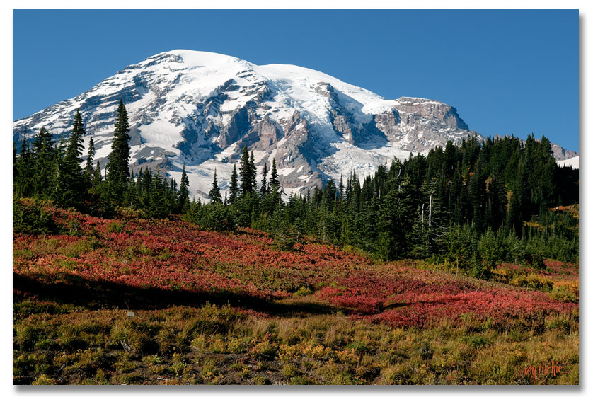
which was finally culminated by this view as we arrived in Paradise around 4:30:

In the light of the evening sun, the hillsides looked literally ablaze with reds and oranges. It would have been great to stay in one of the park inns and take time to hike some of the trails, but the park lodging was all booked up (which was why we had stopped in Ashford), and so we returned to Copper Creek for dinner, and then went to bed (no cell phone service, no landlines, no TV) so we could get an early start on towards Mt. St. Helens the next day. We were worn out, but overjoyed that the trip had gotten off to such a good start.

Seattle

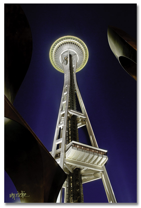
Our itinerary for the trip included flying into Seattle, spending the night and the next morning there, then moving on to Mt. Rainier, Mt. St. Helens, the Portland area, Crater Lake, and then returning up the Pacific Coast of Oregon. Since we were staying about three blocks from the Space Needle in Seattle, I had to get up early for some night shots of that. Here’s my favorite:

Those other-worldly pieces of metal framing the Needle are a nearby sculpture. This photo is what digital photographers would call a “High Dynamic Range” image – it’s made by blending one photo exposed for the sculpture with one exposed for the Space Needle. I made a number of photos from the top of the Space Needle on the return trip, but I’ll post those later.

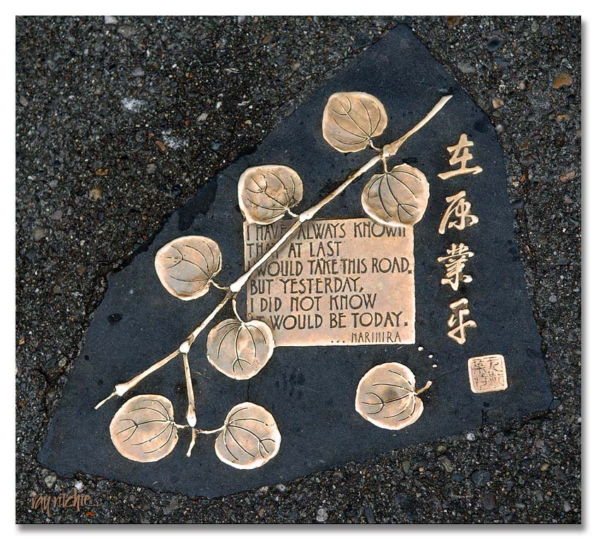
The next morning before leaving for Mt. Rainier, we made a trip to Pike Place Market, where we stumbled across this delightful piece of calligraphy embedded in the asphalt near the main entrance:

I assume that the chop in the lower right corner is the name of the artist, but I can’t read it. If anyone knows what it says, please let me know so that I can credit the artist properly. I’d love to know who it is and see some other examples of his/her work.

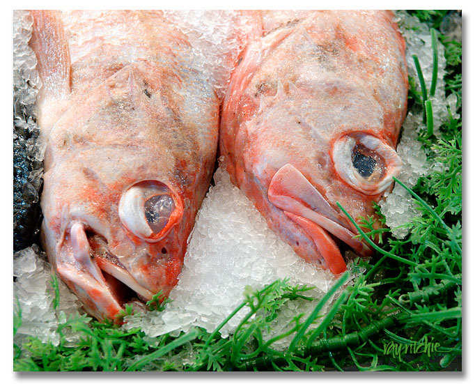
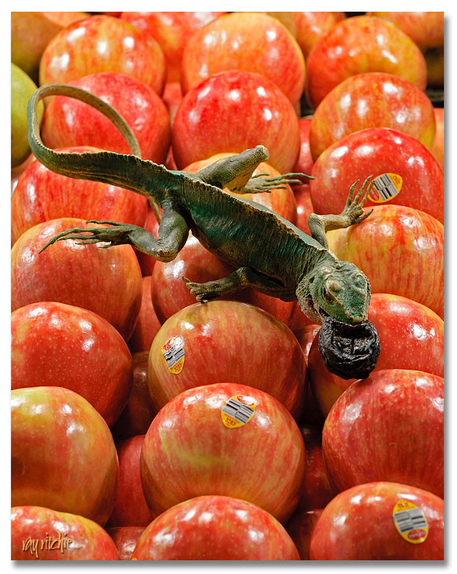
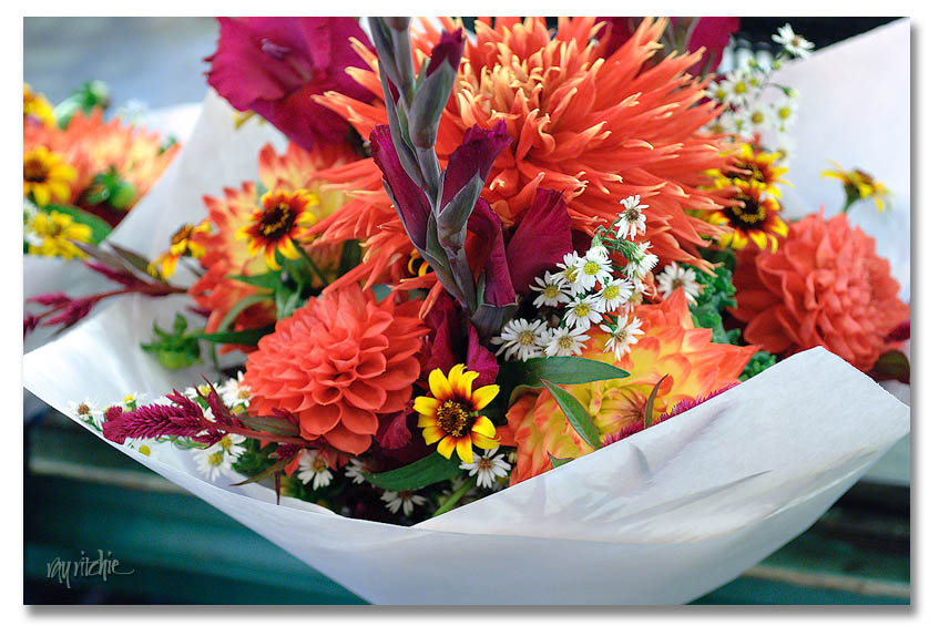
Pike Place Market has something like 600 shops, and I’m not sure that counts all the fishmongers, flower merchants, produce stands and craftspeople who come and go. We were actually there before most of the retail shops opened, though, so we saw mostly the food and flowers. Here’s a brief taste:

We could easily have spent the day (or several days) there, but that was true of almost everywhere we visited during this trip. Next post: on to Mt. Rainier.

A larger collection of the photos from the trip will be available on my Flickr page.

On to something different

I’ve been writing mostly on calligraphic topics for awhile now, but yesterday we returned from a 10-day trip to the Pacific Northwest (Washington and Oregon, that is), and I have tons of photos I’m dying to share with someone, so the next few posts will be a mini-travelogue. A larger collection of photos will be available for viewing on my Flickr page. As usual, if you see something you’d like to own, just drop me a line using the email link on my contacts page.

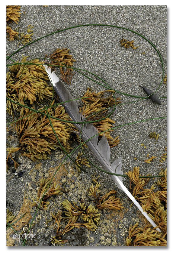
Since we’re shifting gears from lettering and calligraphy, here’s a transitional photo. This pile of seaweed with the seagull feather looked very calligraphic to me when I found it on Harris beach in southwestern Oregon:

I was amazed by the Oregon beaches – very different from anything I’ve experienced on the east coast of the US, and especially different from the Outer Banks of North Carolina, which is where 90% of my beach-going experience has taken place. Oregon is somewhat like the area around Bar Harbor, Maine and Arcadia National Park – lots of rocky beach, tidal pools, and mountains that drop right into the ocean. We were on a madcap tour, trying to cover too much ground in 10 days, but I could easily have picked one beach in Oregon and spent most of our time there. My favorites were Harris, Bandon, and Ecola/ Cannon, and even though I was doing a lot of “run and gun” photography, I came home with at least a few images from each spot that pleased me enough to share. Over the next week or two, I’ll highlight a few of my favorites.

Scanner art

OK, I have to admit that I’m not really sure why I’m posting this, other than growing feelings of blogligation as a result of not having made a post for about a week now. Maybe this is just a fragment of something that will come to fruition later, or maybe it’s a dead end.

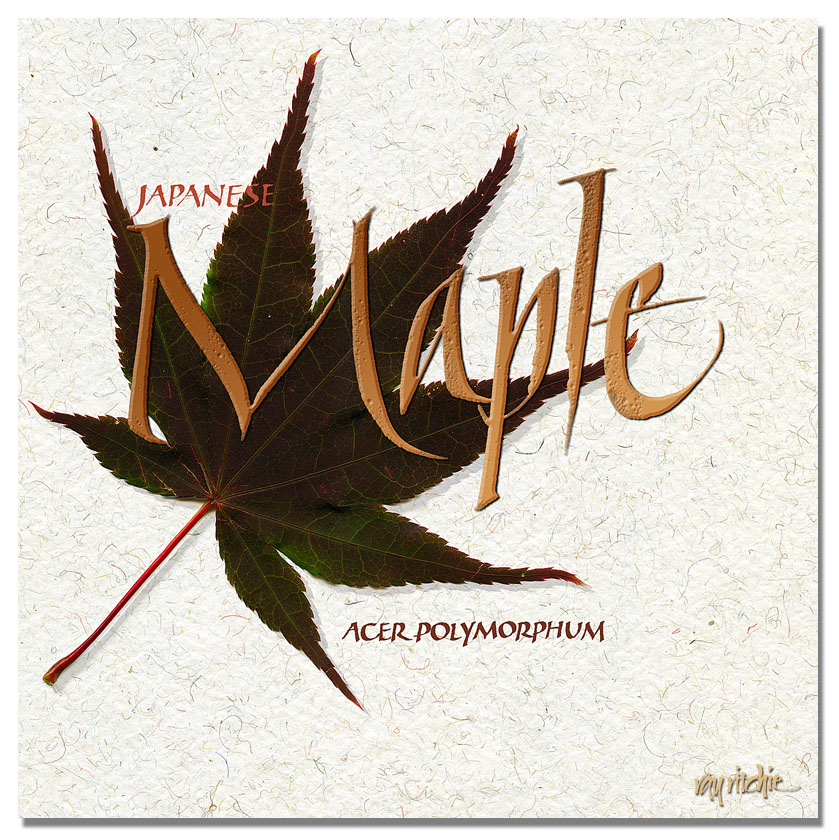
Anyway, I was reading an article a couple of days ago discussing using your scanner as a “camera” to capture images of objects, and I just got the urge to play with it. It’s almost time now for our Japanese maple to start changing its colors. The green summer leaves are just beginning to take on some red hues, and over the next month, the entire tree will turn almost scarlet. I grabbed a leaf from the tree, and scanned it at 600 dots per inch (dpi) resolution, essentially capturing a 10 megapixel image of this single leaf, which is about the same resolution as my Nikon D300. However, with the scanner, I have much better control over the captured image, in that I can get almost perfect illumination, and I don’t need a tripod to avoid vibrations.  I then scanned a piece of Indian banana fiber handmade paper for a background, and created some lettering to go with the image. Here’s my first cut at this experiment:

The word “Maple” in the main title above is a fairly typical example of the Italic style I seem to do the most these days – a free interpretation heavily influenced by several workshops with Denis Brown. It ranges from almost uniform to what Denis calls “polyrhythmic” –  that is, the letters are not necessarily uniform in weight, width, or line texture. In this case, though the letters other than the cap “M” are almost uniform in width, notice the ragged texture on the bottom of the “l,” and the big swag on the foot of the “e,” as a couple of examples of how this is different from formal Italic. The ragged strokes are produced by riding up onto a corner of the pen in the middle of a fast stroke. I particularly like the curves in the “M.” The large title was written in black gouache with a size 3A Automatic pen, and the smaller lettering with a Brause nib. The lettering was scanned and colorized in Photoshop, and I added some Bevel and Emboss, Drop Shadow, and a bit of color and gradient overlay to the lettering, just to make it a little more interesting.

If you can think of anything I can use this fragment for, let me know. Maybe it’s a note card. Maybe it’s the upper left-hand corner of a bigger piece. Maybe it’s a T-shirt. I haven’t decided yet.

Drought survivors

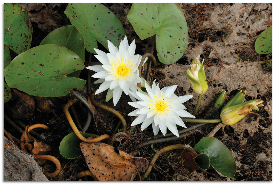
Our local lake, the Manasquan Reservoir, has been suffering the effects of our continued drought. The last time I was there, about a month ago, the water level was several feet below capacity, which is bad for our county water supply, but interesting for photographers. It means that areas of the reservoir normally under water were now exposed, and you could walk out to beds of water lilies that are normally too far offshore to make good photos. In fact, many of the lilies were no longer on water at all, but rather lying in the damp exposed sand, barely clinging to life. I’ve seen this before, a couple of years ago – here’s my first “drought survivor” image from 2008:

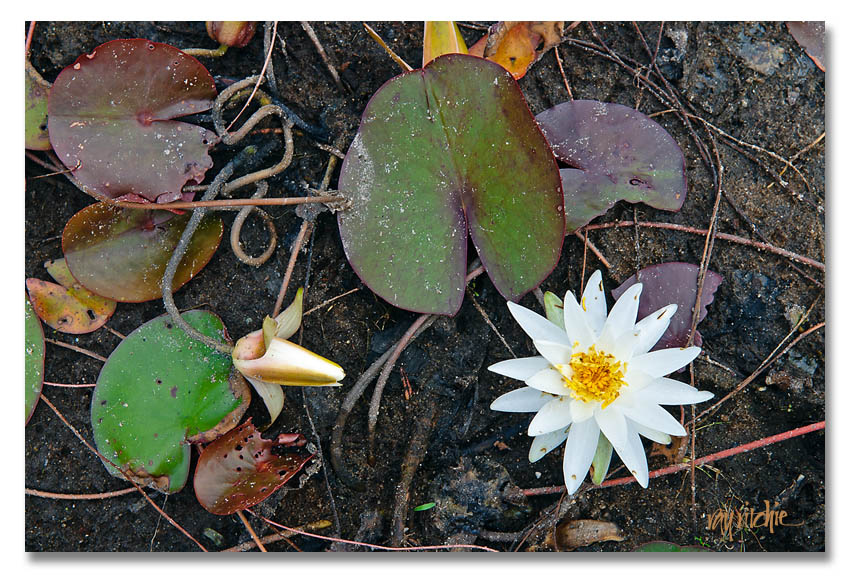
And here’s one of my favorite shots from this year:

Drought survivors 2

These lilies remind me of Japanese “cycle of life” flower paintings, as you see the flower at peak bloom, bud, and shriveling and dying and infested by insects, all at once. As the leaves and stems are exposed to the sun and begin to dry out, they take on deep oranges, yellows, and reds that you never see when the plants are completely immersed. They tell me a story of beauty, sadness, danger (global warming?), and at the same time, hope.

More of my water lily series can be seen on my flickr stream here. Until I get an etsy store or some other sales outlet set up on line, if you’re interested in prints, please use the contact page to let me know what you’d like. I print these myself in a variety of sizes, from 5×7 (matted to 8×10) up to 16×24. Larger prints can be made available, including canvas gallery wraps, but I have to outsource the printing of these, and it takes a little longer.

Postcards from Asbury Park (part 2)

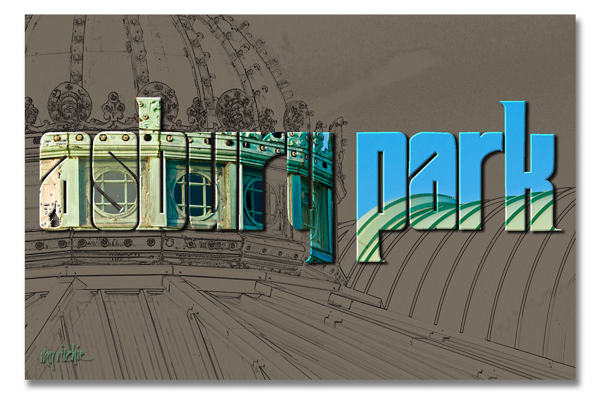
I’ll wrap up my discussion of the Sickel lettering design for Asbury Park with a couple of additional examples that show how the broad strokes of this lettering style give us an advantage for photographic effects.

The Old Casino

Here I’ve taken one of my photos of the roofline of the old Casino complex and turned it into a line drawing using the Photoshop “Find Edges” filter. I then used the same lettering as in the first postcard (see Postcards from Asbury Park – part 1) as a mask to let some of the color from the original color photo come through.

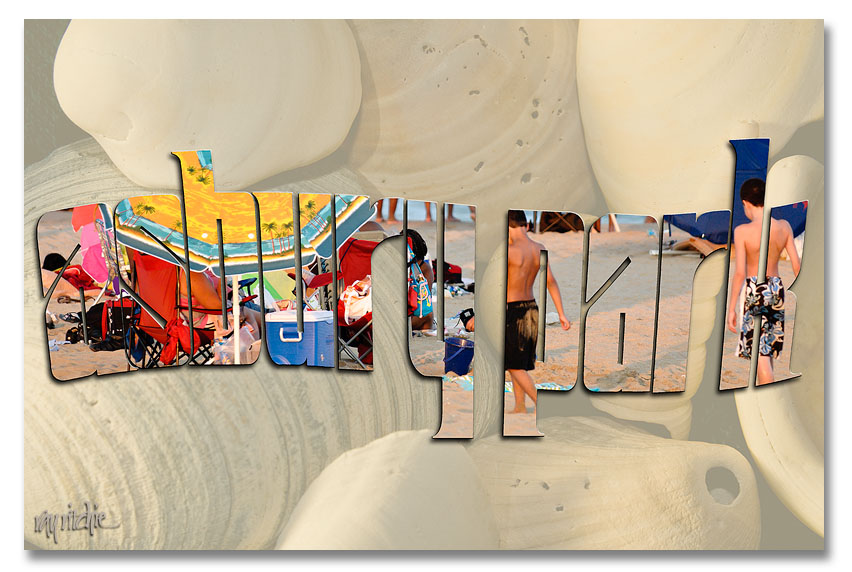
This one, obviously, is two separate photos. The background shell image is from my personal stock library, and the second was a beach scene made during the July 24 Photo Walk. I used a wavy version of the Asbury Park lettering to mask that second photo and layered it over a faded version of the shells.

I could as easily have used a font, rather than designing my own letters for these cards, of course. A font like Arial Black would also give me nice heavy strokes, but it wouldn’t be as distinctive – someone else could easily produce the same look. The combination of my own lettering with my photos gives the cards a unique look that hopefully would distinguish them from others on the rack.
I’ll have to decide now whether to actually do a commercial print run of any of these – it’s probably too late in the summer vacation season to do it for this year – if you have a favorite, please use the comment button or the contact form to let me know.