Wailin’

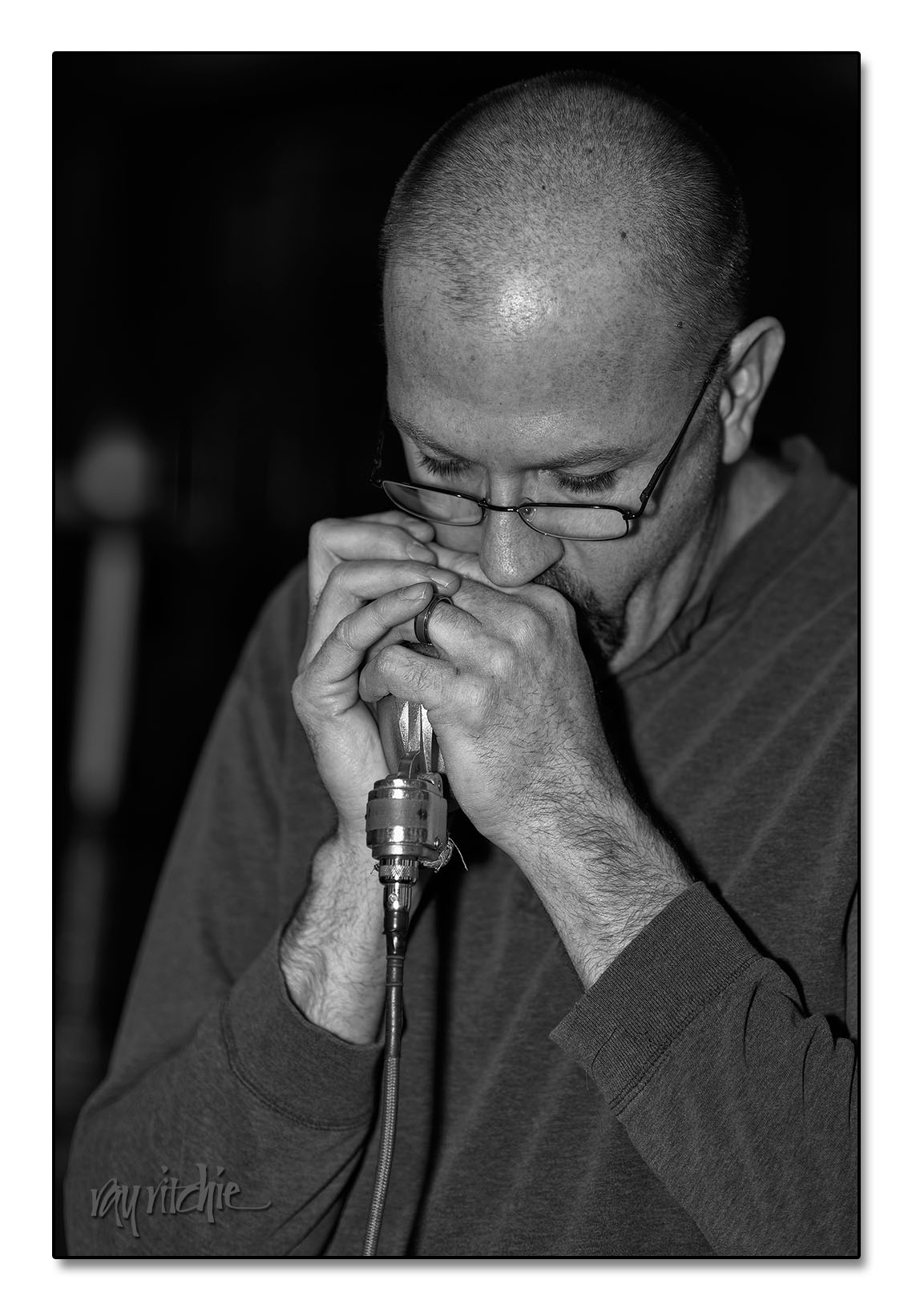
I’m just starting to shoot people shots with my new 85mm portrait lens, and I was practicing this past Sunday by shooting a rehearsal of our Joyful Noise praise band as they prepare for an upcoming concert. The best shot turned out to be this one of Tom, who was wailing away on the harmonica. I decided to process it in black and white, to hopefully give it a little of a “blues club” feel. I tried a couple of versions, but this is my current favorite, done with Photoshop and the Nik Silver Effects Pro plugin.

Wailin'

Shot on the D800 with the 85mm f/1.4g lens at ISO 100, f/1.8, and 1/60 sec., using an SB-800 flash mounted on-camera with mini-softbox. Right-click and choose “Open Image in New Window,” and you can see it at a much larger resolution.

[Aside: I just bought the Nik plug-in suite, as Google has recently acquired Nik, and is selling the software for a bargain price. You can get information here . Note that additional discounts are available.]

If you’re in the area, the concert will be Sunday, April 7, at 4:00 PM, at the First United Methodist Church, Freehold, NJ. We’ll be celebrating the installation of a new sound and video system for the sanctuary.

Memories

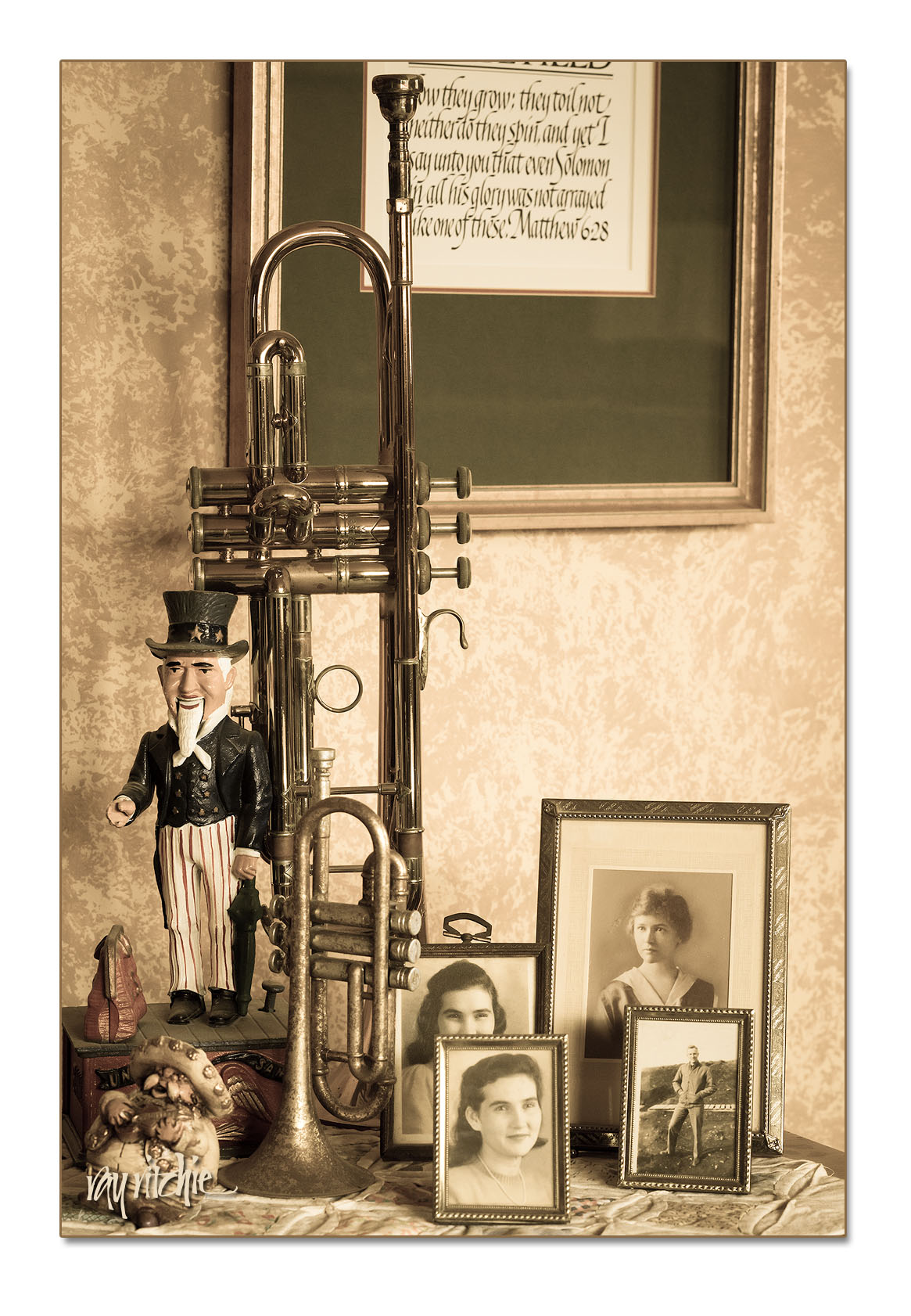
I’ve been testing a new lens this week (a Nikon 85mm f/1.4g, for those who may care), and this was one of the test shots. Each item has some memories attached to it – my old trumpet that I played in college and for many years afterwards, photos of Mom, Dad, and Grandma R., an Uncle Sam mechanical bank we once gave to Granddad Bourne for Christmas, one of a set of ceramic mariachi musicians Christina brought back to me from Mexico, and a “Lilies of the Field” print we bought from Michael Podesta when we met him at a craft show.

The image was processed in Lightroom 4 with some effects to give it more of an aged photo look.

Winter afternoon on Crow Hill

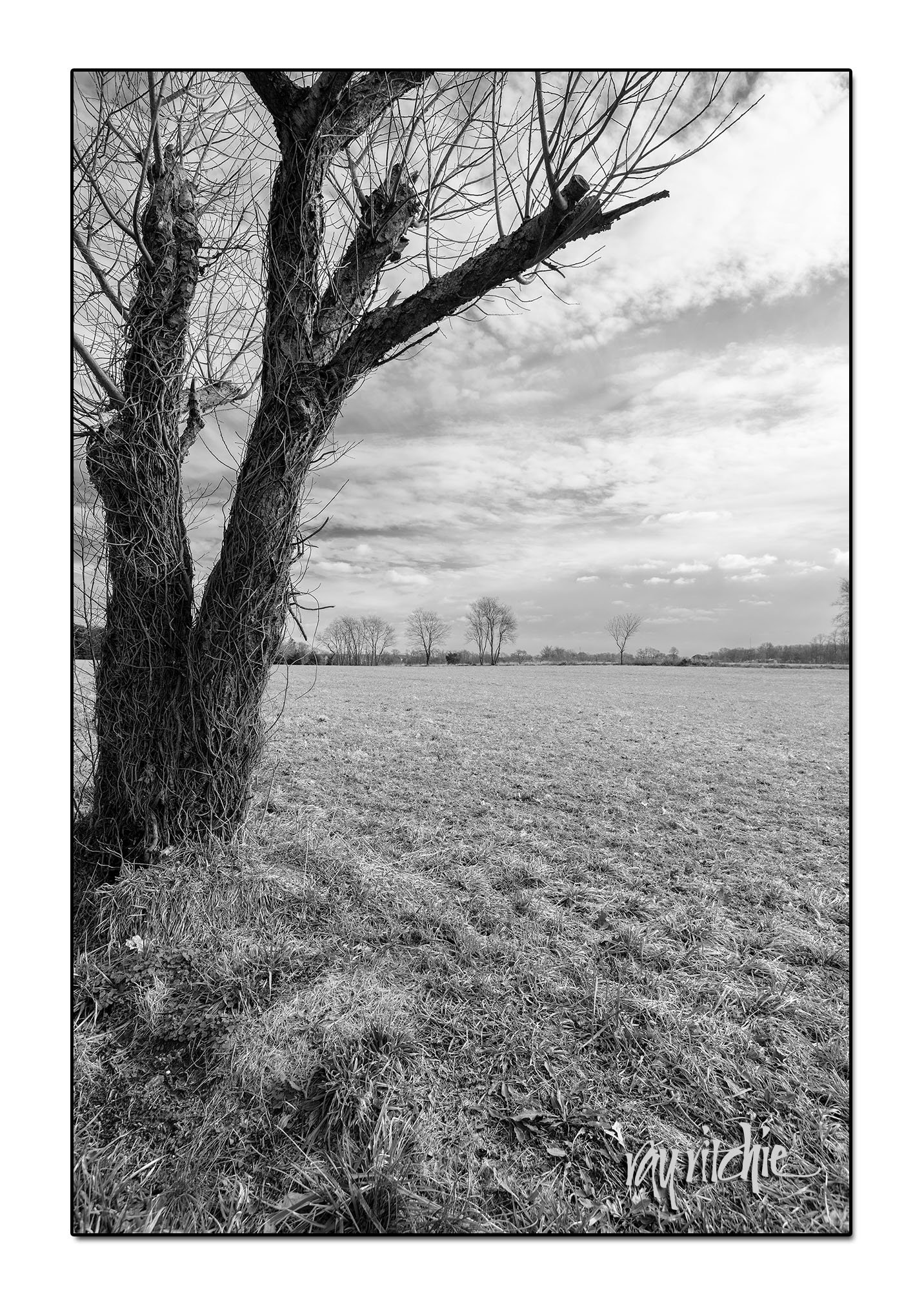
The winter has been mostly dreary and cold since we returned from our Christmas travels, and I haven’t been doing much photography. But a couple of days ago, we had a touch of passing sunshine, and I decided I’d take a photo walk around the neighborhood with the D800 and my Tamron 17-35mm zoom. Nothing much was catching my eye, even though the walk was about three miles, but when I got home and did some post-processing, I really liked the way this shot came out after a conversion to black and white:

I think this just says that I need to make the effort to get out and shoot more. A good resolution for the new year.

Merry Christmas 2012

I have probably been designing our Christmas cards for at least 30 years now, and just finished the design, printing and envelope addressing for 2012 (possibly excepting a few last-minute additions to our list).  I usually struggle with picking a text until it becomes clear that I have to make a decision and get on with it. After the devastation of Tropical Storm Sandy (the U S Weather Service apparently has decided it was no longer a hurricane when it hit us), my dominant feeling was simply gratitude – for having come through with no lasting damage or injury, for friends who helped us so much when we were without power, water, and heat, and for our family, who let us know we were cared about. After a lot of searching for a quote that had notes of both gratitude and Christmas, I again found myself up against deadlines, and decided to go with a traditional set of words for the Advent season – Hope, Joy, Peace and Love. These are usually the themes represented by the candles of the Advent wreath. Our adult class at church had been doing an Advent study centered around these themes, with the title “Christmas Gifts That Don’t Break,” so I wove “family” and “friends” into the background of the card design, and Anita and I decided on the inside text of “Wishing you gifts that last.”

Here’s the final design:
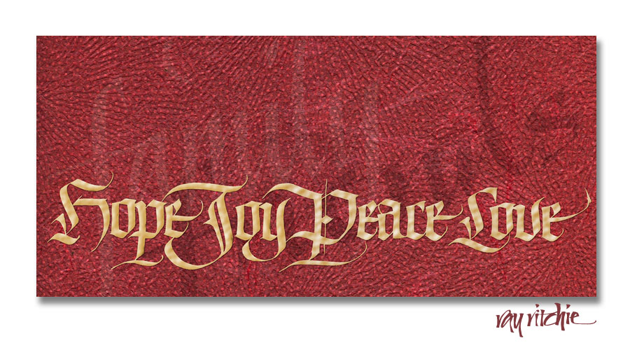
 As I usually do, I began the card design by doing the main lettering in black and white. When I first started thinking of the Hope-Joy-Peace-Love theme, I tried a number of different styles and layouts of letters, but none of them were working for me. So I took a break and started reading a recent issue of Letter Arts Review, which had some very fine examples of Blackletter and Fraktur. Seeing those, I knew immediately I wanted to do the words in some form of Blackletter, and for some reason, I knew they would run across the entire bottom of the card. I really had no idea at that point as to what the rest of the design would look like.

Using Blackletter was for me an unusual choice, as I don’t do much of it. I had taken a multiple-day workshop on Blackletter styles with Julian Waters several years back, though, and he’s one of the best in the world at this hand, so I felt reasonably confident that I understood enough about it to make it work if I took the time to dust off some of my cobwebs. I went through probably a dozen or more renditions before I got one that I liked. As I started to close in on getting all the letterforms more or less the way I wanted them, I marked up each draft with corrections and laid a sheet of thin layout bond over it so that I could adjust the next draft to correct the deficiencies of the previous one.

I did the lettering with a large Automatic pen (that’s a brand name, not a description of some magical powers in the way the pen works) and black gouache, which is my favorite writing fluid. In this case, the original letters were more than an inch high. Working large makes it much easier for me to see where I’ve made mistakes, which is important when I’m using a style I’m less comfortable with, and when I finally get the letters right, reducing them in size for the final reproduction makes them appear sharper and smoother than they were actually written.

Here’s a sample of near-final headline letters at close to their original size:

I next quickly wrote a couple of versions of the words “friends” and “family” in my usual Italic style, thinking that I would work them into the piece somehow, but with no specific idea of where they’d be used.

I needed a background, and I didn’t have an idea for an illustration, so I decided I’d just try to invent a texture. Going through my stocks of papers, I came up with a couple of unusual handmade Japanese papers that seemed like they might work. One was a brilliant red with a sort of radiating pattern of ridges and wrinkles, and the second was a translucent white with circular patterns of opaque white dots. I stacked the second paper on top of a sheet of pale green, just to make the white dots stand out more, and scanned the paper designs and the lettering into Photoshop. Once I had them stacked as layers in Photoshop, I decided the red was too brilliant, and would be hard to reproduce in print, so I toned it down with a touch of brown and orange.

After playing around with “family” and “friends” in the layout, I finally decided to bleed both words slightly off the page and orient them diagonally, so that neither was entirely revealed. I also cut back the opacity of these words so that they became only faintly visible – mostly I was using them as additional texture, and I wanted people who noticed them to think a little about what they said, rather than being able to immediately read them.

After I finished the design, Anita suggested that we add a small rhinestone on top of the diamond shape in the “P” of “Peace,” and I thought that touch of sparkle and dimension really added a lot.

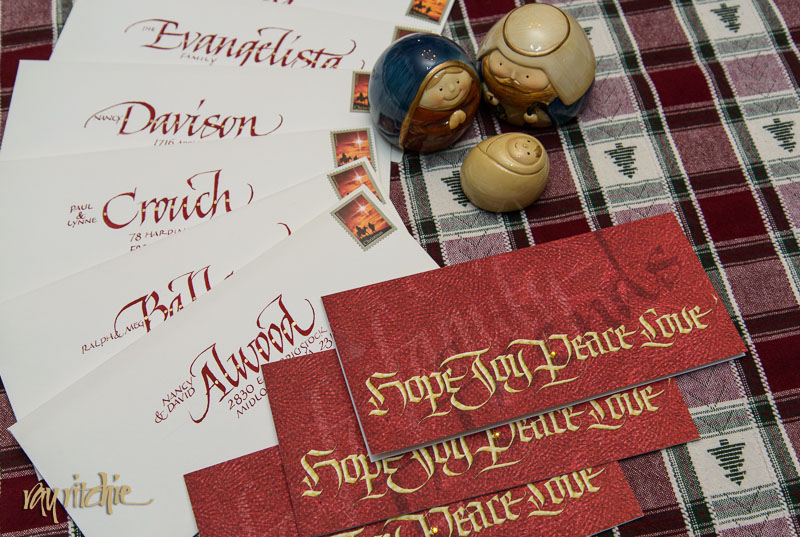
The envelopes were addressed in large red letters matching the card color, and coincidentally, I was able to find a Christmas postage stamp that had some of the same red-orange tones in it. Here’s a shot of some of the completed envelopes along with the cards – if you look closely, you’ll see the rhinestones I mentioned above:
 Here’s wishing you all gifts that last this Christmas and throughout 2013!


Sunflower Serendipity

Late August to early October or so is usually sunflower season in New Jersey, and there are often large fields of these huge flowers in the more rural areas of our county. This year, though, I noted with pleasure that one of the local farmers had planted sunflowers in a field normally used for raising sod grass, right on the road into Freehold, just in front of a former glass factory which is now used as a document storage and destruction facility. The owners of the field have planted a mix of sunflowers and various wildflowers, and the overall effect is spectacular.

Since I finally broke down two weeks ago and bought the Nikon D800 that I’ve been lusting after since February, I decided the sunflower field would make a great test subject. So I got myself out of bed before sunrise, and headed over to the field with the new camera with a couple of my lenses, just to see how each would perform on the D800. I was very pleased with the results, given that I don’t yet have enough experience to understand what lens to use when on this new tool, or whether I may yet need to purchase one or more additional new lenses to take full advantage of the 36 megapixel resolution (that’s three times the number of pixels of my D300, or about 80% higher resolution). I’m pretty sure the answer to that last question is “yes.” But since there have been so many Internet posts talking about how the D800 demands absolutely top-rated (i. e., expensive) glass, I was pleasantly surprised to see how well my 7-year old Tamron 17-35mm lens (probably worth about $250 on the used market) performs. Here’s an example from the morning shoot:

For those who care about such things, the image above was shot at f/7.1, 17mm, ISO 100, and 1/6 second, in Nikon’s raw NEF format, developed in Adobe Lightroom 4, and given some final touches in Photoshop 5.1.

I’ve been giving the D800, the Tamron, and a new lightweight “travel” lens (the Nikon 24-85 f/3.5-4.5 VR) a shakedown in Italy for about a week now, and will start posting photos from that series after I return home. But so far, I really love the new camera, and I’m really happy I went ahead and got it in time for this trip. And I’m delighted that I had these sunflowers available as my first subject.

The best camera

There’s a lot of less-than-valuable and less-than-accurate information on the Internet, but occasionally, some of the overused online quips contain real wisdom. On the photography forums that I follow, one of the most commonly repeated lines is “The best camera is the one you have with you.” As I mentioned in my previous post, I’ve been suffering from New Camera Acquisition Syndrome, but in the meantime, the camera I have with me is the Nikon D300, on which I usually have my 17-55mm Nikkor f/2.8 zoom lens mounted. This setup has been my most frequently-used camera and lens for about four and a half years now, and it has provided me with a lot of enjoyment, and here and there, a little revenue. But nothing I’ve gotten from this gear has meant as much to me as the photos I’ve shot since I became a grandfather last summer.

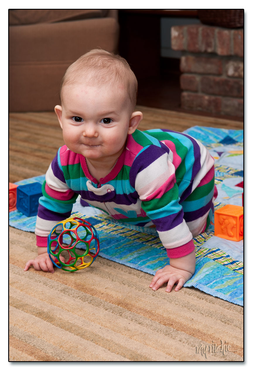
Our granddaughter, Anna, is now 9 months old, and was here for a visit last week, along with her parents and her Czech grandfather, so of course her American grandfather had the camera out constantly. Here’s one of my favorite shots from the visit:

I’ve never considered myself a “people” photographer, but Anna has been making me want to learn. She has a wonderfully expressive face, and changes each time we see her. She just started crawling recently, and now has to be watched every minute – which is a good excuse to take more photos, since we have to be watching her all the time anyway. And Anita and I now have iPhones full of baby pictures – the modern grandparents’ “brag book.”

Any camera I own someday in the future will have a hard time giving me the pleasure that I’ve already experienced by photographing her with the camera I have.

[Technical notes: Shot at f/6.3 and 55mm, ISO 200, with my 17-55 zoom and flash lighting. The flash was a single SB-800, mounted on the camera with a miniature "softbox" to diffuse the light, and aimed about 60 degrees upward, so that a portion of the light was reflected from the ceiling. I was having some troubles with my flash due to having inadvertently set the flash to the wrong mode, so the shot was underexposed by about one f-stop, and compensated in postprocessing in Lightroom 3 and Photoshop CS5.1. I also used Photoshop to darken and slightly blur the background, and to sharpen and enhance the brown in Anna's eyes, and finally, I removed a number of small scratches she had inflicted on herself with her fingernails as she slept]

Hamilton Watch Font

One of the hazards of being interested in lettering is that you sometimes find yourself looking more at form than content. We recently went to see the movie The Descendants, and during the opening credits I found myself looking at the form of the lettering and the backgrounds, and asking myself “How would I do that?” I have no idea what the credits actually said.

Similarly, when I was doing my recent post about my grandfather’s watch, I kept looking at the engraved lettering on the works of the watch and wondering “What does that alphabet look like?” and “What can it be used for?” You can see part of the lettering in the photo montage in the previous post – the full text on the case reads “Hamilton Watch Co., Lancaster PA., 21 Jewels.” Just for grins, I made a sketch of the letters one evening a week or two ago, and then started to imagine what some of  the missing letters of the alphabet might look like. Here’s a quickie Photoshop composition based on one of my sketches:

I started out by just sketching the letters above as black outlines. After scanning them into Photoshop, I filled them in with a solid color, and then touched up the edges to remove some of my pen bobbles and other irregularities. I then added the beveled debossed effect as a Layer Style, and generated a wavy background pattern to echo the fancy decorative milling on the actual watch works (again, you can see the authentic decorative milling patterns in my original post). Finally, just to add a little more interest and texture, I layered in one of my closeup photos of the actual watch.

As with many of the things I show on this blog, I don’t have any immediate application for this lettering, but I think the font could be useful someday as a titling font when I want something that suggests antiques. I’d have to clean it up, of course, but that is pretty straightforward to do (though tedious) using the vector drawing capabilities of either Photoshop or Adobe Illustrator. Here’s an example of what the letters look like when I start to clean up my sketches a little:

If I were really going to develop the full font, I’d need to look carefully at all the letter proportions relative to each other – that “D” looks a little wide to me right now compared to the “R,” for example – and I’d have to figure out the full set of decorative caps, as well as the lower case letters; but I may do it, if I find the right project that calls for an old-fashioned feel to the text. Can you think of any applications for these letters? I’d love to hear from you.

Before and after: photo restoration

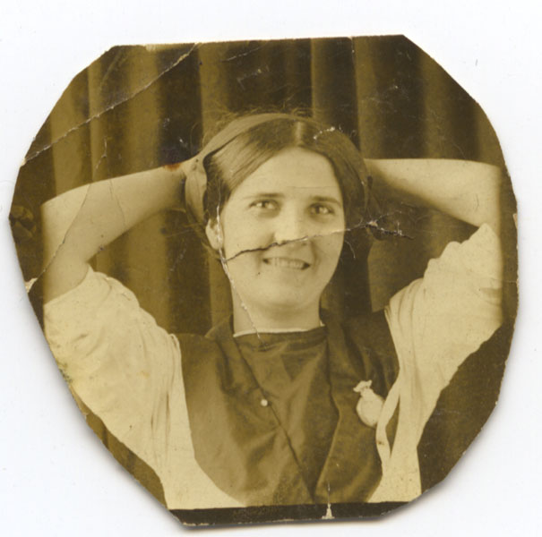
In my earlier post about my grandfather’s watch, I promised to make a future post showing the “before and after” of my photo restoration work on Grandma Bourne’s picture. My purpose here is not to give a detailed “how to,” but simply to give an illustration of what’s possible these days, as this photo was one of the most badly damaged pieces that I’ve ever worked on. Here’s what the photo looked like when it fell out of the watch:

As you can see, Grandma suffered a lot from 90 or so years in the back of Granddaddy’s watch. That photograph has just about all the impairments you’re likely to encounter in restoring old photos: foxing (the brown stains), scratches, bends, wrinkles, and rips. But as I discussed earlier, it was a unique photo, in that it showed my grandmother as young, smiling, and playful – a totally different view than any of the other family photographs I’d ever seen. Grandma worked for the Post Office in Washington, D. C. for a couple of years around the WWI timeframe, and I’m guessing this photograph was probably done during that period.

Photoshop CS5, which I am currently using, has several tools which help in this kind of work. The Healing Brush can be used to paint across blemishes – it looks at surrounding areas of the photo and replaces the painted-over area with a sort of average of the surrounding area. The Clone Stamp can be used to copy a texture from any arbitrary location; you can then “paint” with that copied area onto any other area; areas larger than the copied area will be painted with a repeating pattern. Both the Healing Brush and the Clone Stamp have been around for a long time, and have appeared in many past versions of Photoshop. New in CS5, though, is a tool called “Content Aware Fill.” WIth this tool, you can select an area of the image, hit “Delete,” and then choose from several options as to how to fill in the deleted area. One of these is “Content Aware,” which looks at the surrounding area and tries to make a good guess as to what the area being deleted should contain if it’s to look consistent with the rest of the image.

The Healing Brush is particularly effective on small blemishes surrounded by relatively smooth, undamaged areas – for example, it’s great at replacing a small scratch on the background curtain, or a pimple on an otherwise beautiful face. The Clone Stamp is good for working with areas that have some kind of texture, provided the area to be replaced isn’t too large (the pattern repetition of the Clone Stamp gets to be noticeable once the painted-over area becomes a lot larger than the original sampled area).  Content Aware Fill can be almost magical, but particularly when working with portraits, it also has its hazards – you can easily end up giving a person a third eye or an extra nostril, or hair in the middle of their cheeks, if you’re not careful.

The key in doing this restoration work is just to work patiently, trying the various tools to see which works for each blemish, and using the History palette when necessary to back up to the previous state when something unexpected and unacceptable happens. Careful adjustment of the brush size (for the first two tools) and the selected area can make a huge difference in the result.

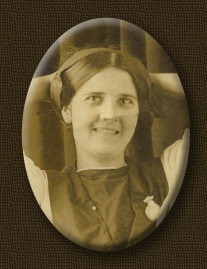
I used all three tools in working on this particular image. Because the edges of the photo were irregular, and partially cut off her arms anyway, I decided to crop the final restored image into an oval shape. After giving it a Bevel and Emboss effect to simulate a cameo, and a drop shadow to emphasize the 3-D effect, and a textured background, it came out like this:

You can still see things wrong that I could work on further if I chose to, such as changes to the tone of the skin of the face and neck, due to folds and wrinkles in the original that made the light from my scanner hit different areas from a different angle. But I usually stop on restoring old photos before everything has been smoothed away – I want the image to still look old. I’m happy with this result.

It’s still only a small image: the original was only a little bigger than an inch across, and this final version came out to something I could probably print at about twice the original size. My experience in scanning old prints tells me that it’s seldom worthwhile to try to print a copy bigger than 1-2 times the size of the original. But it’s a new addition to the family archives, and from my point of view, it was definitely worth the effort.


You never know what you’ll get

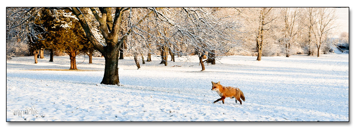
I really didn’t have Forrest Gump in mind when I wrote that title line. We had a light dusting of snow last night, and since there has been so little snow this winter, I decided I needed to make an early morning photo trek at Monmouth Battlefield State Park. I had my tripod set up on the hillside, overlooking the battlefield and the apple orchards, and was staring intently through my viewfinder framing the scene, when suddenly a red fox appeared, walking through my shot. Foxes aren’t really rare in our area, but I’ve probably only seen them four or five times in the last 30 years here, so this was pretty exciting for me. Unfortunately, I had the camera set up for a landscape shot, rather than wildlife, and I only managed to get off two shots before he saw me and ran away. Great light, but not a very sharp image due to the slow shutter speed, so I decided to make it more useable by giving it a drybrush painting effect. Click the image for a larger view.

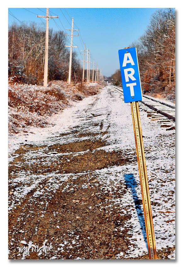
Here’s another shot from the same trip:

You know it’s art, because the sign says so.

Timeless mementos

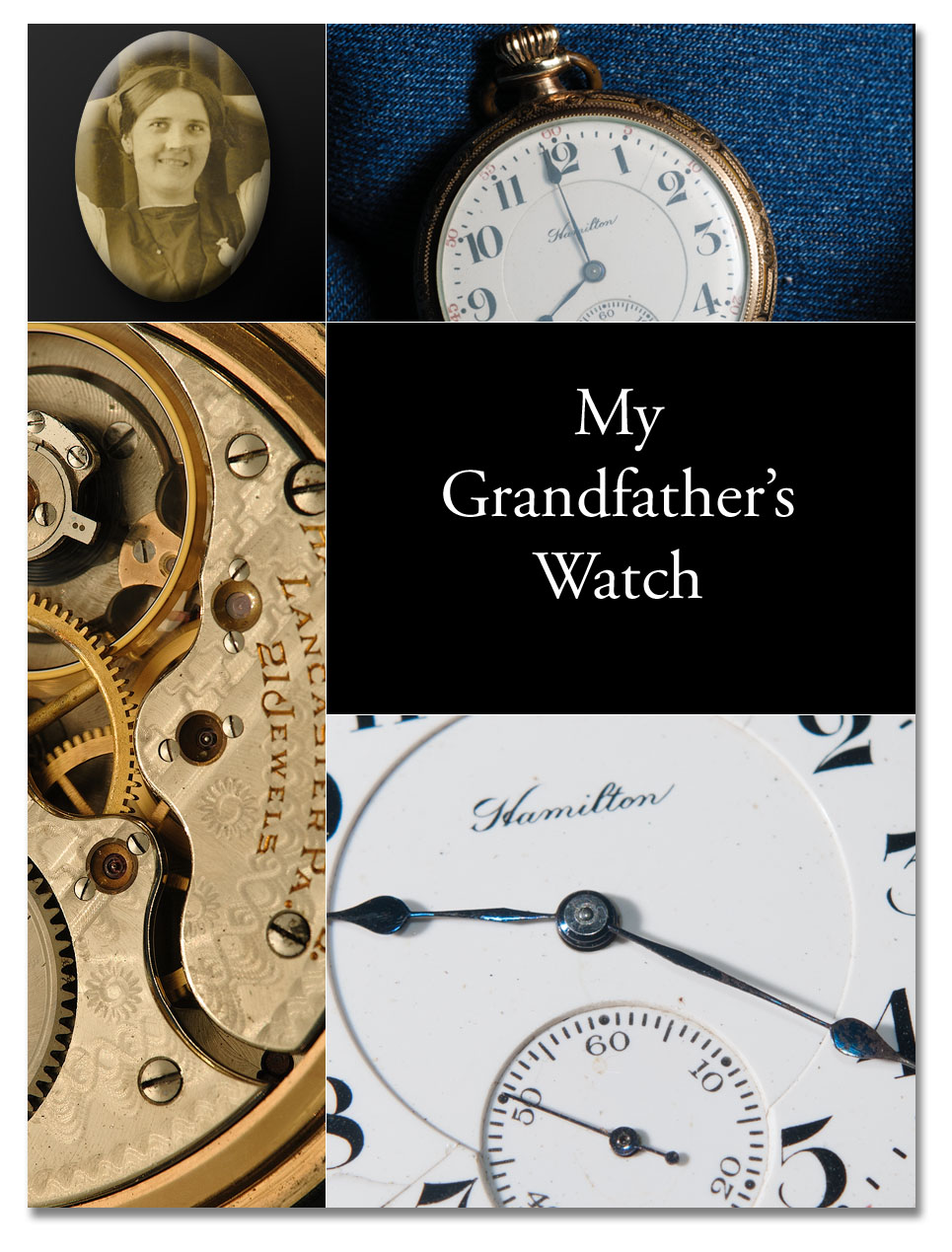
I recently inherited a pocketwatch. It’s a Hamilton Model 992 “railroad” watch, so-called because this model became one of the standard accessories of the railroad conductor in the US at the turn of the 20th century. This watch had been sitting on the dresser in my parents’ bedroom, mounted on a brass stand, for a number of years. I assumed the stand was something my mother had found for my dad, and that this was probably his father’s watch. When I first brought it home and wound it, it seemed to run fine, but I had no idea about how to set it, or even open the case. After a bit of web research, I learned that the case was a screw-on style, and that the watch could be set by opening the “crystal” (which is really a form of plastic) and pulling out a setting lever, which would then allow the hands to be set with the stem. I also saw photos on the web that showed that the watch serial number would appear on the works, beneath the back case. When I unscrewed the back, I was surprised by a tattered piece of paper falling to the floor. Picking it up and turning it over, I found a photograph, not of my father’s mother, but my mother’s mother. So now it appears this watch was owned by my Granddad Bourne, not Granddad Ritchie.

All the photos I had ever seen of Grandma Bourne in her young days were serious, unsmiling portraits, usually in a family group. This one, in contrast, is almost a glamor shot, with Grandma posed pulling up her hair behind her head, smiling – my guess is that it may have been a special memento she had made especially for Granddaddy, perhaps some time around World War I, when he was stationed at Camp Zachary Taylor, in Louisville, Kentucky. The camp was opened in 1917, and closed in 1920. Other than my grandfather, one luminary of note stationed there was F. Scott Fitzgerald.

From the serial number inside the case, I learned (from tables of serial numbers on several watch collector websites) that this watch was manufactured in Lancaster, Pennsylvania around 1905. Since Granddaddy would have been only 12 years old that year, it seems likely that the watch may have originally belonged to someone else – maybe his father.

The photo of Grandma in the montage above has been heavily retouched – the original had many cracks, scratches, and stains. I’ll try to do another post showing the “before” and “after” of that restoration. I don’t think the watch is especially valuable, but it’s at least a nice curiosity, since it works and was one of the earliest copies of this model. The 992 was apparently introduced in 1903, and I believe only about 8000 had been made by 1905; however, several hundred thousand copies were eventually manufactured, so it’s not a rare specimen. This particular watch has cracks in the porcelain face, which reduces its value to collectors. Still, to me it carries timeless, invaluable memories. It is now sitting on my dresser, keeping time to within about 30 seconds a day, and I think of my grandparents each day as I wind it.