Apache Wedding Blessing

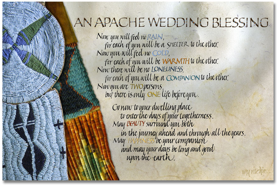
I feel like I should be doing a “Happy New Year” post today, but I don’t have any material on hand for that at the moment. What I do have is a piece that I’ve been wanting to share for about a month. I was waiting, though, until after we had given a framed version to our son and daughter-in-law. We finally got to share a belated Christmas with them, and so now I’ll share it here.

Apache Wedding Blessing

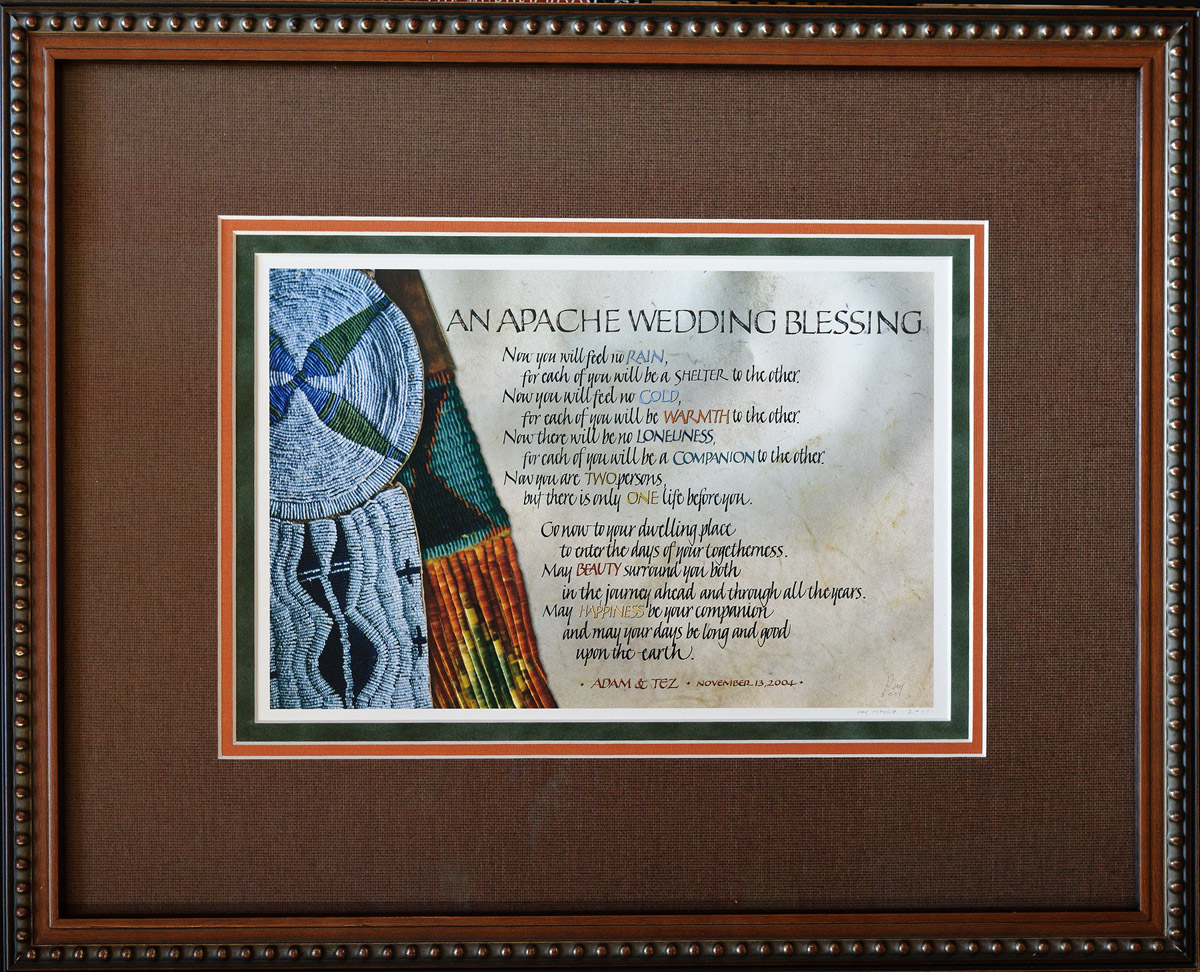
This blessing was used at our son and daughter-in-law’s wedding seven years ago, and they had asked me to do a version of it “when I got around to it,” so we see once again the hazards of not giving me a deadline. The text is very popular, but is usually not attributed, and in the piece above I have also omitted an attribution for now. From my Internet research, I’ve learned that it probably is not an authentic Apache blessing, but may have been created around 1947 for the novel Blood Brother by the author Elliott Arnold. That novel was later made into a very popular movie, Broken Arrow, starring James Stewart. I understand that versions of the blessing may appear in both the novel and the movie, but at this point, I haven’t had the time to research that. I hope to chase it down in the next month or two, so that I can ask for copyright permission to use the text, if that turns out to be necessary. Both the novel and the movie have received praise for their treatment of Apache culture, so hopefully the blessing is at least in keeping with the spirit of its supposed source.

The artwork here, as in many pieces posted on this blog, is a Photoshop composite from photographs. I found the two beaded pieces on display in 2003 in the David T. Vernon collection of American Indian Arts, which is normally exhibited at the Colter Bay Visitor Center in Grand Teton National Park. I understand, though, that the entire collection is now undergoing conservation and restoration treatment, and may not return to public display until funds can be raised for a suitable new museum to be constructed. I had made a separate photo of each of the pieces, and overlaid one on the other in Photoshop. Prior to this piece, the photos have just been sitting in my files, unused, for 8 1/2 years – a good argument for the “don’t throw anything away” school of digital photography. The rest of the background is a scan of a piece of calfskin vellum.

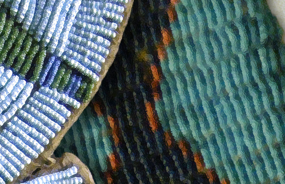
As I often do when I combine photos and calligraphy, I turned the beadwork photos into more of a painted effect, this time by using Photoshop’s Dry Brush filter. Here’s a close-up of the result of that filtering:

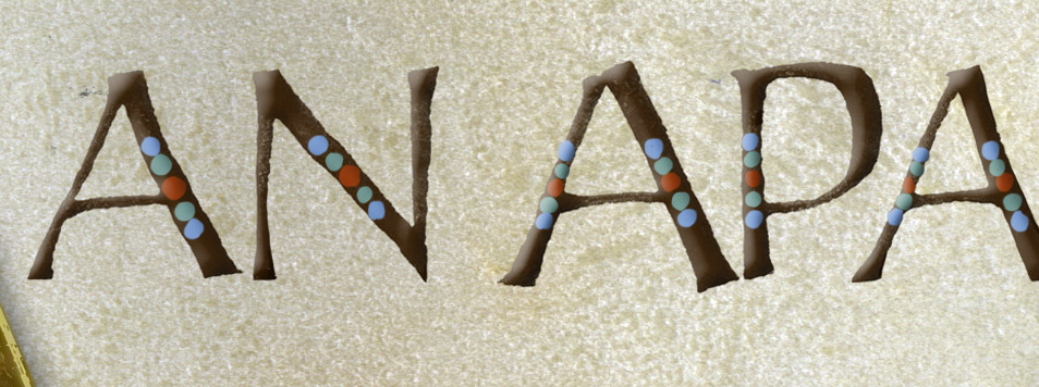
Part of my reason for using the filter in this case was that the original photos had been taken in relatively dim light, with no flash or tripod, in the museum, and so they were not particularly sharp or contrasty. The Dry Brush filter exaggerates the contrast and color saturation, and converts somewhat blurry edges into sharper features. When I did the headline lettering for the text, I decided to continue the beadwork motif, and decorated the caps with dots of color sampled from the beadwork photos:

The style of the Italic calligraphy was deliberately left a little rough, as I felt that was more in keeping with the artwork, background, and the supposed Apache roots of the text than a more polished style would have been. I may play a little more with that in the future.

Here’s a photo of the piece after personalizing it for Adam and Tez and having it matted and framed:

Angelic Details

I thought I’d share some of the details behind the design of the 2011 Christmas card, as I know there are at least a few readers who care about such things, and I usually enjoy sharing nerdy details, myself.

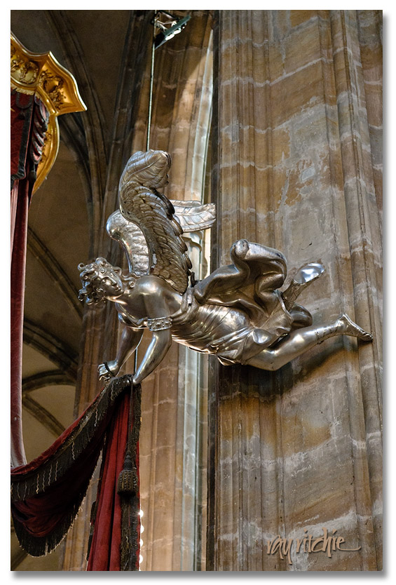
As I mentioned in the previous post, I usually start my designs from the text, as for the majority of cases, the text contains much of the message, and I’m usually trying to support that message with the artwork. In this case, for example, the text brought in the idea of angels, and I then remembered that I did have a nice angel photo in my personal stock library. Here’s the angel I used for the 2011 card, as I found her hanging in St. Vitus Cathedral in Prague:

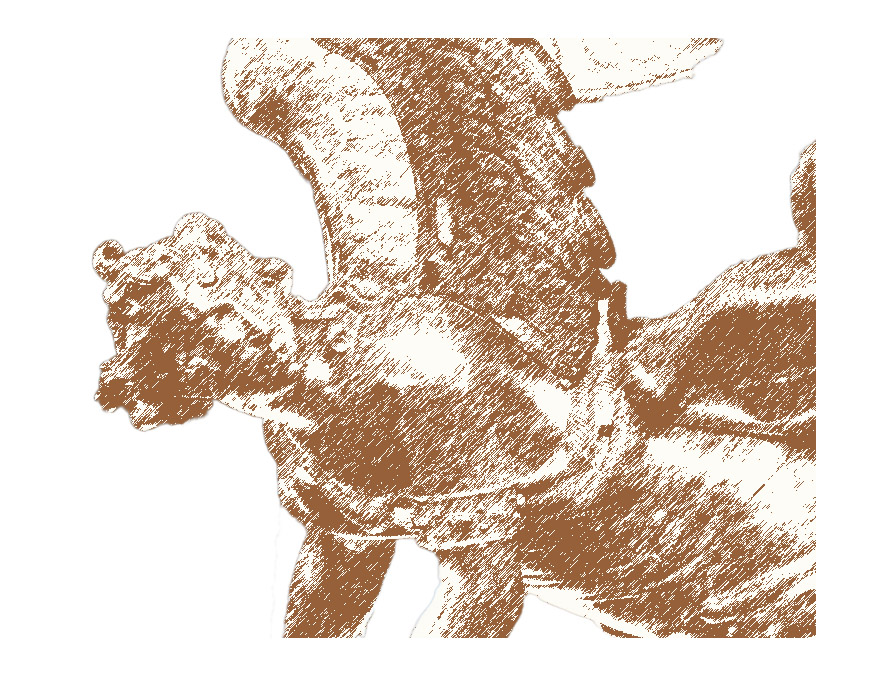
The first step was to extract the angel from her surroundings, as I wanted to use the angel alone, without the rest of the cathedral There are lots of ways to do this, but what I did was to duplicate the photo to a second layer, then use Photoshop’s Quick Select tool by clicking and dragging across the angel, and finally, I created a layer mask.  I then used the Refine Mask command to paint in (or out) those parts of the edges that were incorrectly selected. This extraction process probably took 15 or 20 minutes of work to get just what I wanted. After I was satisfied with my selection of the angel, I moved on to the problem of altering her appearance. The photo itself is pretty sharp and detailed, which is highly desirable from a photographic point of view. For my card designs, though, I’m often trying for more of a “painterly” effect, so I wanted change the photo to something that looked more like a drawing. I’ve talked about how to do that before, but for now, I’ll just say that I used Photoshop’s filters to do the job. Specifically, I used Filter>Sketch>Graphic Pen, which then gave me an angel that looked like this:

I wanted to set the angel against a night sky, partly because of the “angels’ footsteps passing in the night” phrase in my text, but also because I usually think of night when I think of Christmas. Christmas Eve services have always been a favorite part of the Christmas experience for me, and a night sky and a “star of Bethlehem” often find their way into my cards, as they did this year. I started by creating an inky blue background layer, and then laid my extracted angel on top of that. The colors in the angel sketch above were now wrong, so I started by inverting the colors to give light on dark instead of vice-versa, and then I added a color overlay to make the angel drawing more compatible with the blue of the background. I also wanted to take advantage of the fact that the angel is looking over her shoulder. I noticed that the strongest light in the cathedral in the original photo was coming from the upper right, which happens to be more or less the same direction she’s looking (a happy coincidence), so I decided that she would be looking towards a “heavenly light” coming from the upper right corner of the card. I created that light by adding a radial gradient fill above my background layer. As I further critiqued my work, I decided the plain blue background was too sterile and artificial-looking, so I decided to add some clouds (Filter>Render>Clouds), and I also added some random stars here and there with the Pencil tool and my Wacom tablet (you can use a mouse – it’s just not as easy to draw with). At this point, my background art was nearing completion, and I just needed to do a little adjusting of the blending of the various components to make everything fit together.

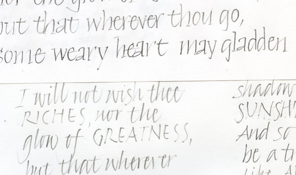
The final step was to add the calligraphy. I started with a couple of pencil sketches, just to give me a feeling for how the text would lay out in a couple of styles. Here’s a piece of my pencil drafts, just to give you an idea of how rough things were at this stage:

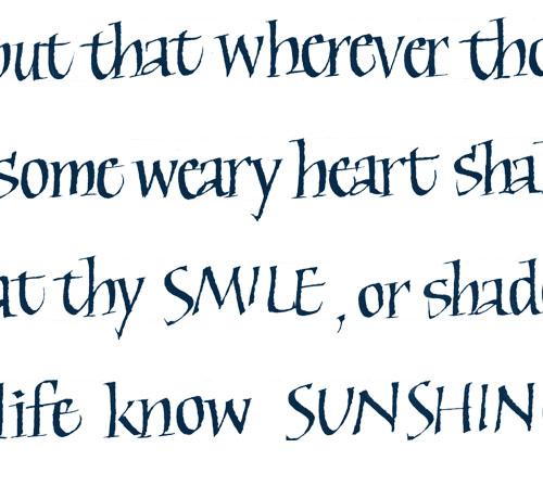
I originally imagined I might do the card text in a sort of modified bookhand (or “Foundational,” as Edward Johnston’s disciples called it). Here’s a detailed crop from the first draft of that idea:

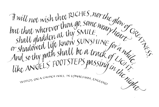
In my first paste-up of the entire card, I just put the text into a rectangular block. I was totally unhappy with the way this looked on the card, though, and immediately began playing with other approaches, finally settling on having the text follow curves which worked in to the curves of the angel’s pose. I made my first stab at that idea by using Photoshop’s Warp tool to add curves to my rectangular text block. Of course, just warping a block of text doesn’t give you very nice-looking letters, but it did give me a feeling for what the layout would look like, and I decided curved lines of text would work if I re-did the calligraphy; this time, because of the curved lines, I thought Italic would work better. You can see the final calligraphy fairly well on the photo of the full card (see post here), but here’s a slightly larger version of the text alone:

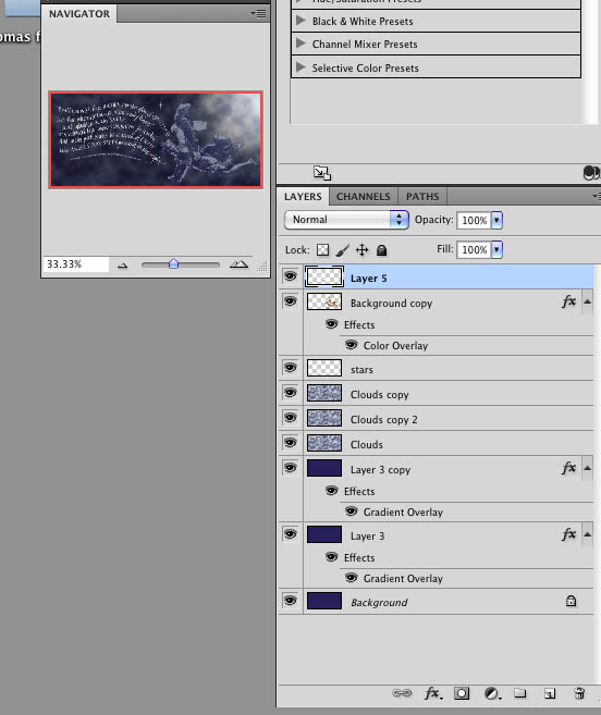
As always, I can still see lots of details that could be worked further, but at this point, I was happy enough with the card to print it and send it, and I was up against my deadlines for addressing and mailing, so for this year, the card was done. For those who are familiar with Photoshop, here’s what the overall design structure looked like once everything was assembled:

Each of those layers has a slightly different Blending Option, to change the strength of the effect and how the layer looks against the surrounding layers. Some of the duplicate layers were only added after making test prints, and deciding that some part of the design was printing too light or too dark.

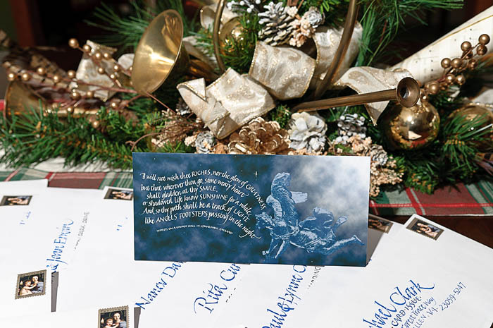
And here’s the final card, sitting on the dining room table on top of a pile of the addressed envelopes:


Smiles, Sunshine and Light

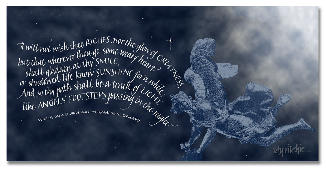
Almost all the Christmas cards finally got addressed and taken to the post office yesterday, so I’m ready to post our card online. I’ll share some of the background details of the design process later, but here’s the final result for this year:

Christmas, 2011

I’ve mentioned before that I’m always late in getting my annual Christmas card design done, and that I never get anything done without deadlines. One reason is that I’m always looking for just the right text to express what I’m feeling, or to go with other things that I want to share on the card. Because I was struggling with my feelings this year, I was having a hard time picking the text, until I found this little poem.

According to that highly reliable source, The Internet, these are “words on a church wall in Upwaltham, England,” though my attempts to track them down did not locate any Upwaltham source that acknowledges their existence there. But they still spoke to me, and as soon as I found them, I felt they were the words I needed this year. Anita put her finger on the reason as she wrote our Christmas newsletter to go with the card. She said that my mother had been a person who spread smiles, sunshine, and light all along her path in life, and I knew immediately that she was right.

So after finally finding a text last weekend, I felt ready to design the card, and it came together relatively quickly, at least relative to how such things usually go for me. The angel on the card (Mom loved angels) is from a photo I took at St. Vitus Cathedral, in Prague, during our visit there in 2009. She was a metal sculpture, hanging suspended in the air; unfortunately, I don’t know who the artist was. I’ll show the original photo in my follow-on post. I extracted her from her surroundings using various Photoshop tools, and turned her into more of a sketch appearance, which I often prefer when combining photography and calligraphy. I created the background night sky and “heavenly light” painting from scratch, and overlaid the photo and my scanned calligraphy, adjusting the blending of the layers to get the overall mood right, preserving the dark of the night sky while bringing out some of the detail of the misty clouds. I re-did the calligraphy a couple of times before I was satisfied with how the image and calligraphy worked together.

I still have a few more cards left to send to calligraphy colleagues. I have hundreds of “Internet friends” in calligraphy through Cyberscribes, as well as calligraphy friends I know much better through intensive workshops we’ve attended together. It’s not feasible to mail physical cards to all of them, of course, so I usually try to pick a dozen or so names not-quite-at-random to share a card by “real” mail. For the rest,sharing the card here and on the Cyberscribes graphics board will have to do. I hope  this greeting finds you all well, and that you, too, may find and spread smiles, sunshine, and light wherever your path may lead you in the coming year.

Please click on the image above, so that you can see the card closer to actual size.

Letters and Spirit

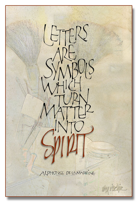
I’ve been in a production mode this week, as I’m going to a small local craft show at our church, and have been feeling that I didn’t have enough new things to show. I’m really terrible at guessing what will sell at these things, so I seem to wander in a lot of directions in my attempts to be “commercial.” The piece below probably isn’t going to be that successful for the current venue, but it’s a favorite quote for calligraphers, and I had never done it before, so once it came into my mind, I felt compelled to do it.

The letterforms of the main text should be familiar to you if you’re a follower of this blog, as they’re yet another variation of my loose modern caps, similar to those in my Beer Geek poster. I chose these forms because I feel they’re “mine” now, and different from most of the more formal treatments of this quote that I’ve seen. All the words were originally done in pencil, and then touched up on the Wacom tablet, after scanning them into Photoshop. The word “Spirit,” however, derives more from my pen and brush lettering than from the loose versal forms. The background started as a photograph, one of thousands I’ve taken over the years during various calligraphy workshops. It was turned into a sort of a sketch by a technique similar to that described in a previous post which you can see here. I then blended the photo with a scan of a very nice piece of calfskin vellum which has been sitting in my supply stores for over a year now, waiting for a project which justifies such an expensive material. I was glad I had it on hand, though, as I really love the look of the veins and the hair follicles for a piece so oriented towards calligraphy. And working in Photoshop like I was doing here, I was able to use it at no cost, as the vellum is still completely untouched. All of the letters have a small touch of shadow, to give a 3-D effect, but I deliberately gave a little more shadow to “Spirit,” to give it a sense of floating above the rest of the piece.

We’ll see whether it sells – if not, it won’t be the first time that something I have liked myself didn’t appeal to the public.

Pseudo Kanji

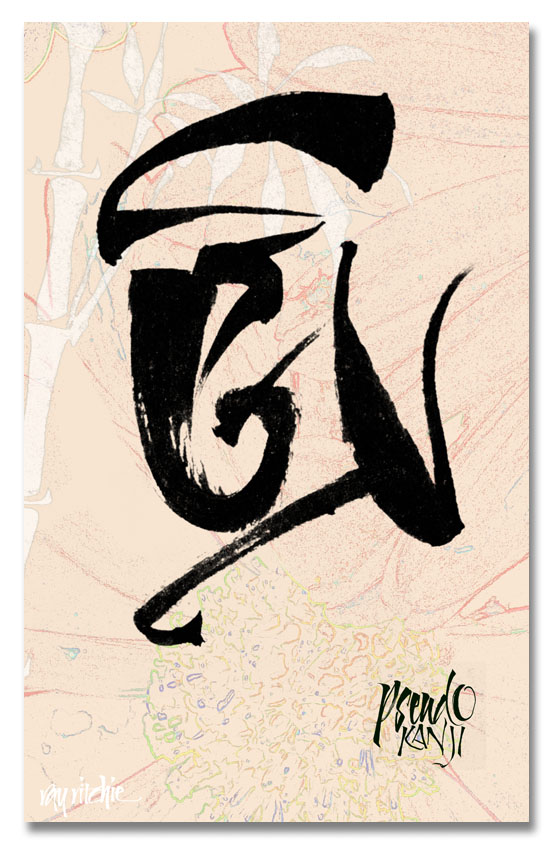
I have been interested in many aspects of Asian culture, and in particular, Japanese culture, for a long time. During my career in engineering, I had a lot of business dealings with Japanese companies, and had the opportunity to travel to Japan several times. Over the years, I picked up an interest in the board game of Go, and tried to teach myself some of the language. To me, the hardest aspect of the language was the writing system. Japanese uses several different alphabets, including Kanji (a set of pictograms for words derived from Chinese), Hiragana (a phonetic alphabet used for words of purely Japanese origin), Katakana (a phonetic alphabet for words of foreign origin), and occasionally, Romaji (Western Roman characters). Writing and reading Kanji, Hiragana, and Katakana are difficult because western eyes are not tuned to recognizing differences between characters, and because brush writing is a skill in itself. I do a lot of western brush calligraphy, and I do sometimes try writing certain common words in Kanji, but recently I was playing around with my brush, and decided just to create some marks that resembled Kanji, without concern for meaning. Here’s an example:

Here’s a second example, which I really did more as an exercise in creating a background texture than for the writing itself:

As far as I know, the above marks don’t actually say anything – they’re just interesting doodles. But when I do this kind of doodling, I feel like the Pogo character of Barnstable Bear, who could write, but couldn’t read, and had to have others to read it back to him before he knew what he had written. So if I have written something that offends you here, please let me know!

Beer Geek

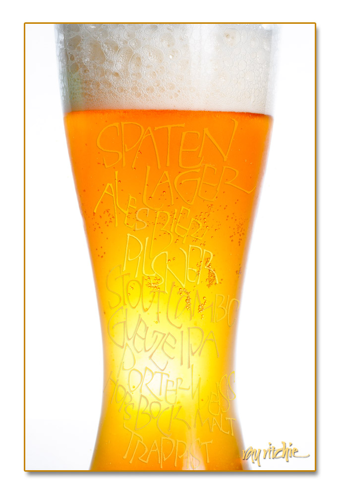
My son has been trying to convert me into a beer geek. Because of his interest in and love for craft-brewed beers, I’ve gotten into trying new beers at every opportunity. Since our part of New Jersey is almost a craft beer wasteland, most of those opportunities come when we travel, so that helps to keep me from going overboard. But I have begun to appreciate beer more than I used to, and I recently got interested in creating a poster, or possibly  a T-shirt, to celebrate this new interest.

Here’s the first draft:

I really need to do the photo and the lettering over again a little more carefully. I originally laid the lettering out in a roughly rectangular format, so when I “poured” it into the glass, in Photoshop, I had to use the Warp command to make it fit the glass. If I re-do it, I’ll do the lettering in a closer fit to the shape of the glass from the beginning.

The lettering was done in pencil, scanned into Photoshop, and then colored by sampling colors from the beer photo and using the Paint Bucket tool to pour the colors selectively into the different words and letters. The setup for the photo was a large sheet of styrofoam for the background, with one flash to light the background to almost pure white, and a second flash on a shoot-through umbrella stand to illuminate the glass of beer.

Footnote: The Beer Geek poster is available as a  12×18-inch art-quality print on watercolor stock or semigloss photo paper, for $40 plus shipping and handling. S/H to US domestic addresses usually run around $8.

Graphic botanicals

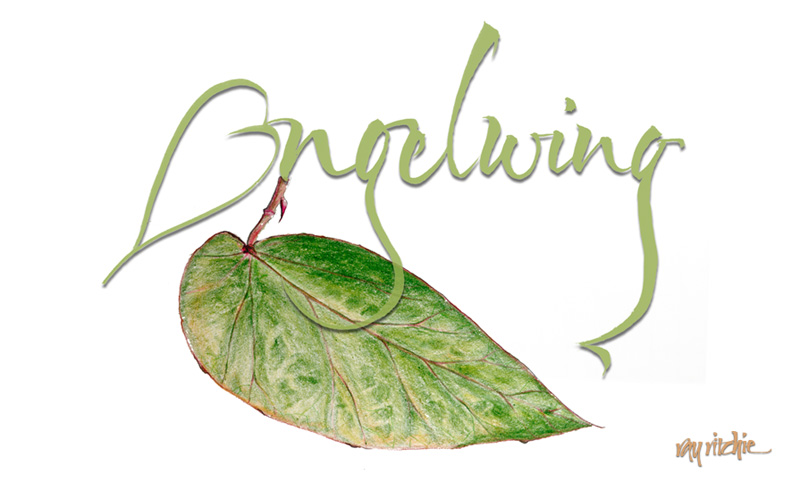
One of the plants we brought home to New Jersey from my mother’s collection was an heirloom Angelwing Begonia. Mom got her plant as a cutting from one of her mother’s plants, and there seems to be some family lore that suggests Grandma got it from her mother. I think the Angelwing Begonia was first hybridized around 1926, so that could be about right to support the oral tradition. Mom had propagated numerous cuttings of her original plant, and after she died, my brother was trying to make sure everyone knew where they came from, and to send a plant home with each member of the family. Recently I was using this plant as a model for my continuing study of botanical art, sketching with colored pencils. After I sketched the plant, I was playing around with the word “Angelwing” with my brush, and decided I’d like to combine the sketch with the lettering. Here’s the current layout:

If you have thoughts about other ways to combine these two elements, I’d welcome your comments!

Creating a sketch effect in Photoshop

Note: This post assumes familiarity with Photoshop.

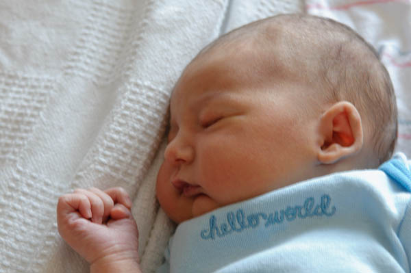
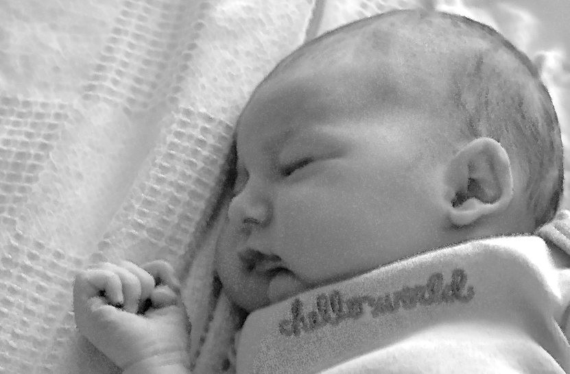
In my previous post, I showed a sketch portrait of my granddaughter Anna, created in Photoshop. There are lots of applications for this kind of effect – for example, in this case, I might want to use the sketch to make a printed birth announcement. Sometimes, too, an artistic rendering of a photograph can allow you to save a photo that would otherwise be too technically imperfect to use. In the case of my photo of Anna, for example, I loved the shot, but I was shooting in very dim hospital room lighting without a flash, resulting in a 1/10 second exposure time. I didn’t have a tripod there, so the shot was handheld, resulting in a photo with motion blur. Here’s the overall shot:

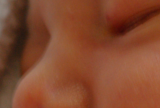
And here’s a close-up that allows you to see the blur I’m talking about:

That double line along her nose is due to my shaking hands as I shot the photo at 1/10 second. To non-photographers, it may seem insignificant, but this amount of motion blur would be at least slightly visible in even a small print, and would certainly prevent the shot being used for 8×10′s or larger.

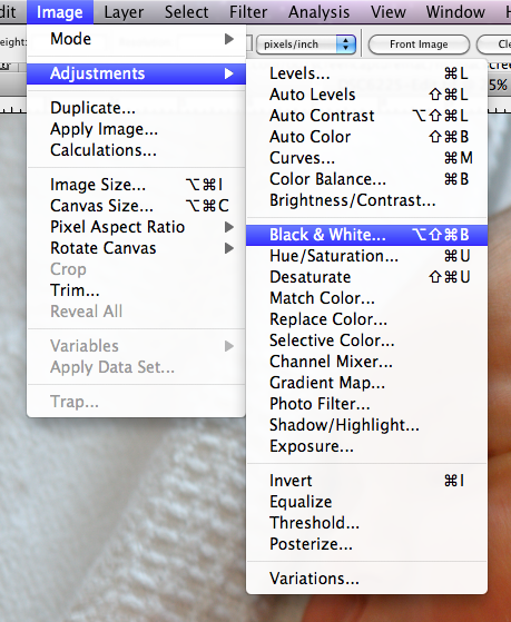
There are lots of ways to produce a sketch effect in Photoshop, but I’ll just describe what I did. First, I converted the image to black and white, using the Image menu:

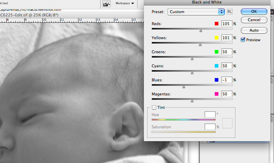
This brings up a set of sliders which allows control of the conversion. Since my image had a lot of red, yellow, and blue (from the skin and clothing), I adjusted those sliders to give me a B&W image with the desired contrast and tone. Here are the slider settings, along with a portion of the resulting conversion:

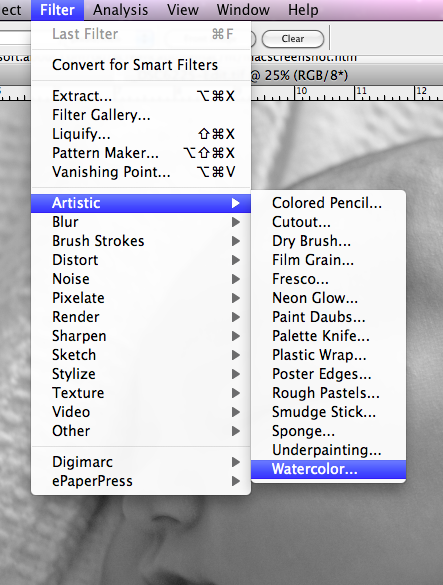
Next, I wanted to add the art effect. I started out by using the Watercolor filter:

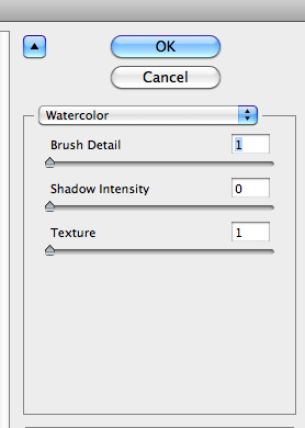
with these settings:

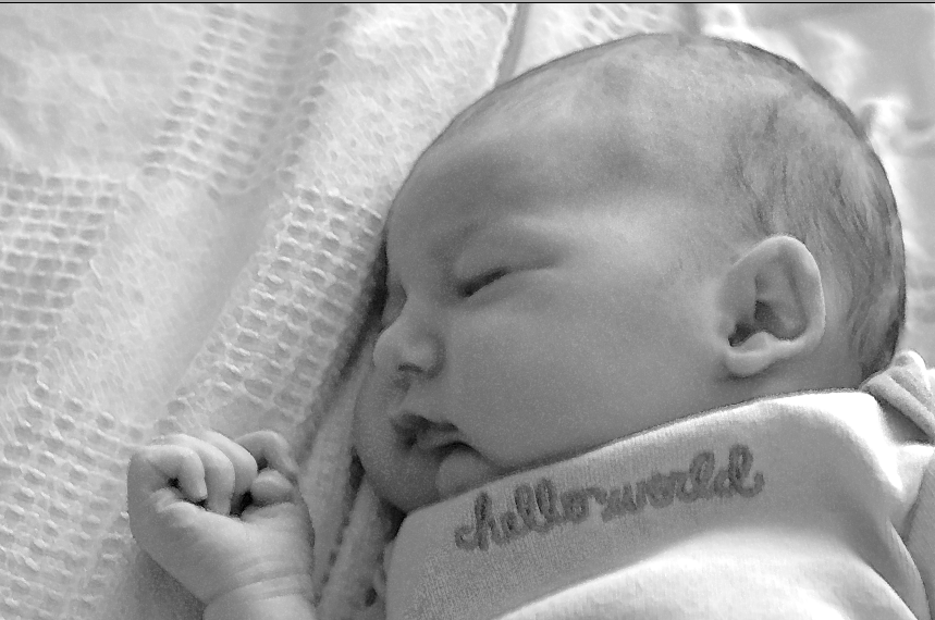
I experimented with other settings, of course, but what I found was that this filter deepens the shadows too much for any higher Shadow Intensity setting, and higher values for Texture gave me too much of a “spatter” effect. I kept the Brush Detail at 1 simply because that’s what it took in order to give a little of a non-photograph look. Here’s what I got from this filter:

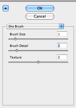
You can see that not many of the details are yet being affected. I wasn’t happy with the sketch effect yet, so I moved on to the Dry Brush filter:

which gave me this:

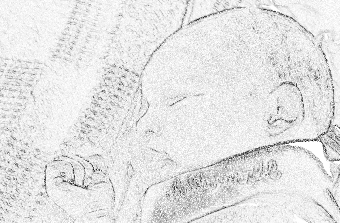
Better, but still not enough. Next, duplicated the image into a second layer (Command-J on the Mac), and applied the Find Edges filter (Filter>Stylize>Find Edges), which gave me this:

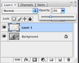
Too much! So now I simply adjusted the Opacity of this layer in Photoshop, so that the previous Dry Brush-filtered image could show through:


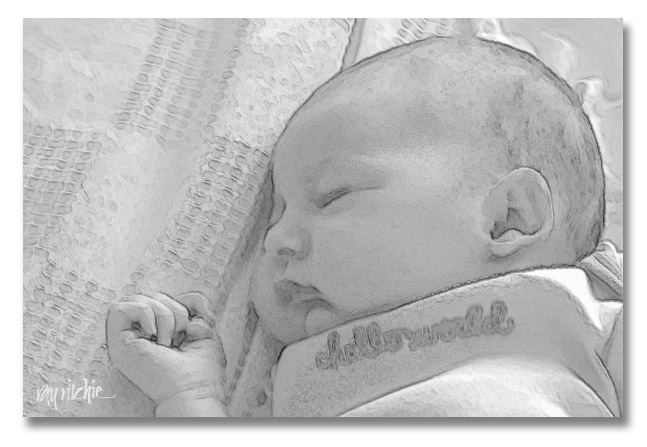
and that gave me the effect I was looking for:

I should note a couple of points for those who may be trying to do something similar on their own: First, the details of the appropriate filter settings will depend in part on the size and resolution of the image file you’re working with. In my case, I was using a 12 megapixel image from my Nikon D300. You’ll have to adjust the various filter sliders to your own case. And second, note that I probably didn’t have to use all three of the filters. Since the Watercolor filter had such a small effect at the settings I chose, I probably could have skipped it. And finally, don’t take the settings I describe above literally – my original result show here was done just for this blog, and I didn’t write down my settings. When I decided this morning to write this tutorial, I went back and tried to re-create my work, but I probably was off a little. Experiment on your own, and have fun!

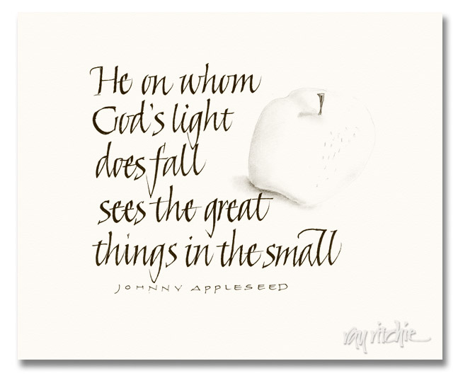
Great things

From the sketch pad last week:

I’m not sure about that attribution of the quote. I gave it to Johnny Appleseed (John Chapman) because we have some wallpaper that includes the quote, and the title of the pattern is something like Johnny Appleseed Prayer.

The great thing that has happened to me this past week is that I became a grandfather to little Anna. She seems so tiny, even though she’s probably slightly above average in size for a three-day old infant – how quickly we forget. Anita and I are enjoying our chance to get to know her, and she’s being quickly taught that her grandfather will have a camera in her face a lot of the time. Here’s her Photoshop sketch portrait:

The sketch was done by a black and white conversion (Image>Adjust>Black and White), followed by a couple of filters (Watercolor and Drybrush). I then duplicated the image in a second layer and used the Find Edges filter, and reduced the opacity of that layer until I was happy with the overall result.

Welcome to the family, Anna!

Independence Day

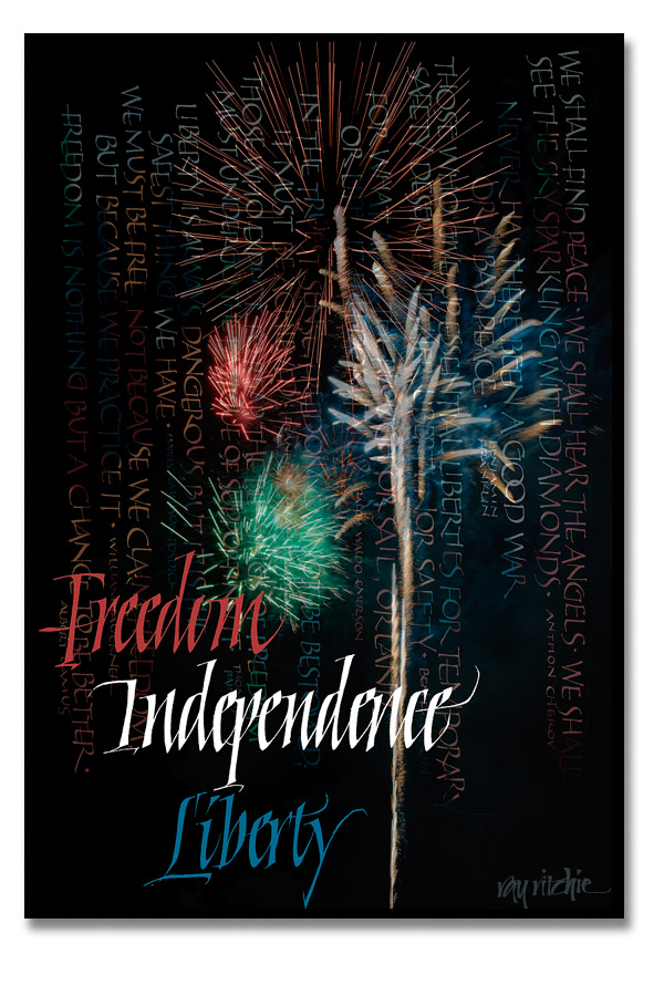
We usually go to the local fireworks display over the 4th of July weekend, but this year it was on July 3rd, and we were having local thunderstorms until very close to the time for the show, so we decided to skip it. But it seems they went ahead anyway, despite our absence, if I can believe the barrage of explosions I heard around 9:00 that night. Today I regretted not having gone, and decided to set myself a task of creating an Independence Day piece as a substitute for the first-hand celebration.

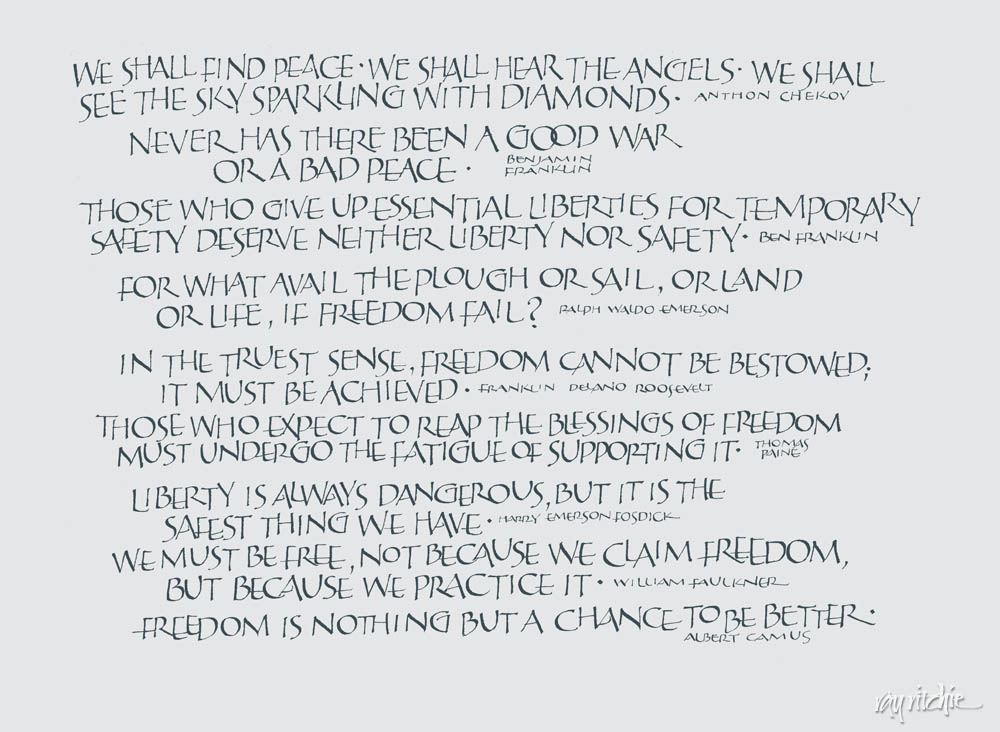
Having gone, camera in hand, to the fireworks display so many times in the past meant that I had lots of fireworks pictures on hand, so I composited several of them together in Photoshop to make up my background. I then dug into my quotes files and searched the Internet for quotes on independence, freedom, and liberty, and created a page of quotes, along with some headlines. I colored my quotes with colors sampled from the fireworks display, and then faded it into the background, before adding some headline title text to the foreground.

Here’s the finished product:

For those who’d like to be able to read the quotes a little easier, here’s the original quotes page:

I can see a lot of little imperfections to criticize, and will probably make some improvements to the piece if I decide to actually use it for anything other than this blog, but it was a fun project for the day. Hope you all had a great 4th.

ADDENDUM: We decided to run out for a celebratory hot dog in the evening, and discovered that we were wrong – they cancelled the fireworks on the 3rd and postponed them until the 4th. So we found ourselves stuck in the middle of a huge traffic jam, both on the local streets, and in the parking lot of the Jerzee Freeze. We could have stayed and watched the fireworks then, I guess, but there were no parking spots left, so we just came home. We were rewarded, though, by a spectacular crimson sunset just as we turned onto our road. Nice end to the holiday.