Happy 90th, Bill!

My father-in-law will be 90 on April 16th, and the family is throwing a party to celebrate, so I volunteered for the job of designing the invitations. Now that I’ve shipped the design to the printer, I thought I should post it here.

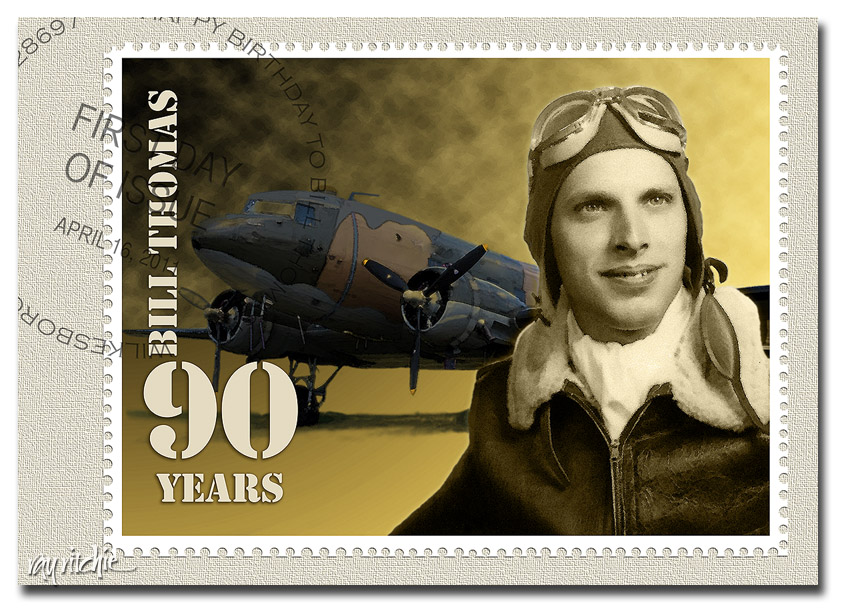
Bill was a C-47 pilot in World War II, and after the war he went to work for the U. S. Postal Service, eventually becoming an assistant postmaster. Since he has always loved stamps, I decided to “issue” a commemorative stamp and First Day Cover for his birthday. Here’s the front side of the invitation:

The photography here is not mine, and unfortunately, I don’t know who did the originals. The portrait was apparently done by an Army photographer when Bill graduated from his pilot training and received his lieutenant’s commission. In addition to the usual problems of restoring an old photo (cracks, scratches, a tear, and a lot of “foxing,” or spots of discoloration), this one had an additional oddity: there was some sort of metal brace behind his head, apparently holding him in a fixed position for the shot. I assume this may have been a production line kind of thing, perhaps for identity cards: each new lieutenant steps up, puts his head in the brace so that he’s exactly lined up for the camera, and the photographer snaps the shot – no retakes, no fiddling with multiple poses. What this meant to me was lots of Photoshop work with the Spot Healing Brush to take out the blemishes,  extract his photo from the background, and remove the offending metal brace with the eraser tool. The original photo was black & white, but I changed the coloring to more of a sepia tone, as I wanted to use a color scheme of yellow, brown, and olive to suggest the era. The original photo was just a head and shoulders shot, so I recreated his right arm for the stamp, to give a more natural look when the portrait was placed against the background.

The C-47 photo started as one of dozens of similar shots that I found on various websites discussing the history of aviation and WWII. None of them were large enough for my purposes, though – I needed to make a 4×6 invitation at 300 dpi, and I also wanted to create a large poster to be used as a decoration at the party. When I enlarged the largest photo I could find to the size I needed, it became very pixelated, blocky, and generally ugly. So I just used the original photo as a base pattern for color and general shape, and the painted in the details in Photoshop using my graphics tablet. I suspect that Bill’s original plane was solid khaki in color, but I saw lots of different color schemes in all the shots on the web, so since I was having to create a painting anyway, I used my artistic license and changed the color scheme to something that fit in with my selected color palette. I didn’t paint in the plane’s identity markings, since I didn’t know what markings would have been appropriate to his squadron, and I didn’t really want too much detail in the background, anyway.

The sky was created using the gradient tool, followed by Filter>Render>Clouds to create the storm clouds behind the nose of the plane. Finally, since I wanted the artwork to look like postage stamp art, and not a photograph, I used the Watercolor filter to create more of a painting effect. There’s a subtle touch of “Outer Glow” behind the portrait, just to give it a bit of separation from the background.

The finishing touches included the stencil font to suggest a typical utilitarian Army approach to lettering, and I tried to select fonts which resembled typical postmarks for the First Day cancelation. The perforations around the stamp were done by selecting portions of the border with the circle selection tool, then deleting the selection. Actually, many commemorative stamps today don’t even have perforations, as they’re usually adhesive stamps on a waxed backing material – but I like the look and texture of perforations, so I decided Bill’s stamp would have them. Finally, I placed the stamp on a cream-colored “envelope” background, and gave it a woven texture.

One nice benefit of transforming the photos into digital paintings was that the design enlarges really well. The original details have been somewhat obscured by the painting effect, so when I enlarge the image with Photoshop’s Image Size menu, it’s almost impossible to tell what details were in the original painting, and which have been interpolated. The fonts were left in separate text layers, and they enlarge perfectly as crisp, sharply defined letters, which actually seems to enhance the postage stamp look. It looks good on my 16×24 print, and I’ve tried a “virtual print” on the computer screen at 24×36, which still seems to hold up well.

Happy Birthday, Bill – we’re looking forward to the party!

Pencil Doodles

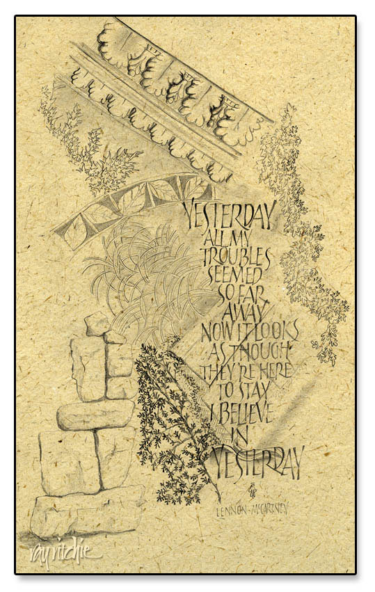
I’ve been reading a couple of books on art and drawing technique, and spending some time each day sketching on my lap board. Most of these sketches are really just doodles, and I’ve been concentrating on particular patterns and technique, rather than making any real effort at design. But I’ve been finding that interesting designs are emerging nevertheless, with no particular effort or conscious thought on my part. The background of the sketch below started with my copying the design of a piece of molding from a photo I had taken in the chapel at Les Invalides in Paris (site of Napoleon’s tomb). Then I began adding random other elements, with no intention of creating a unified piece. But when I looked at the page, I felt it suggested a sense of the past, and I thought of  the lyrics to “Yesterday” as a set of text. The lettering style is just something I had been playing with recently, and wasn’t chosen for any special reason.

This actually violates one of my usual practices, in that I try to avoid using copyrighted text – but since I have no plans to sell this piece, perhaps the Beatles lawyers won’t come after me. The original sketch was just done on white inkjet paper. I scanned a piece of banana fiber paper and then overlaid the sketch in Photoshop to give it a little more texture, and more of a finished appearance.

The books I’ve been reading, by the way, are Bert Dodson’s Keys to Drawing with Imagination, and Trudy Friend’s Artist’s Complete Problem Solver.  Both are full of examples and suggested exercises – good resources for a person like myself with relatively little formal art training.

Zen stones revisted

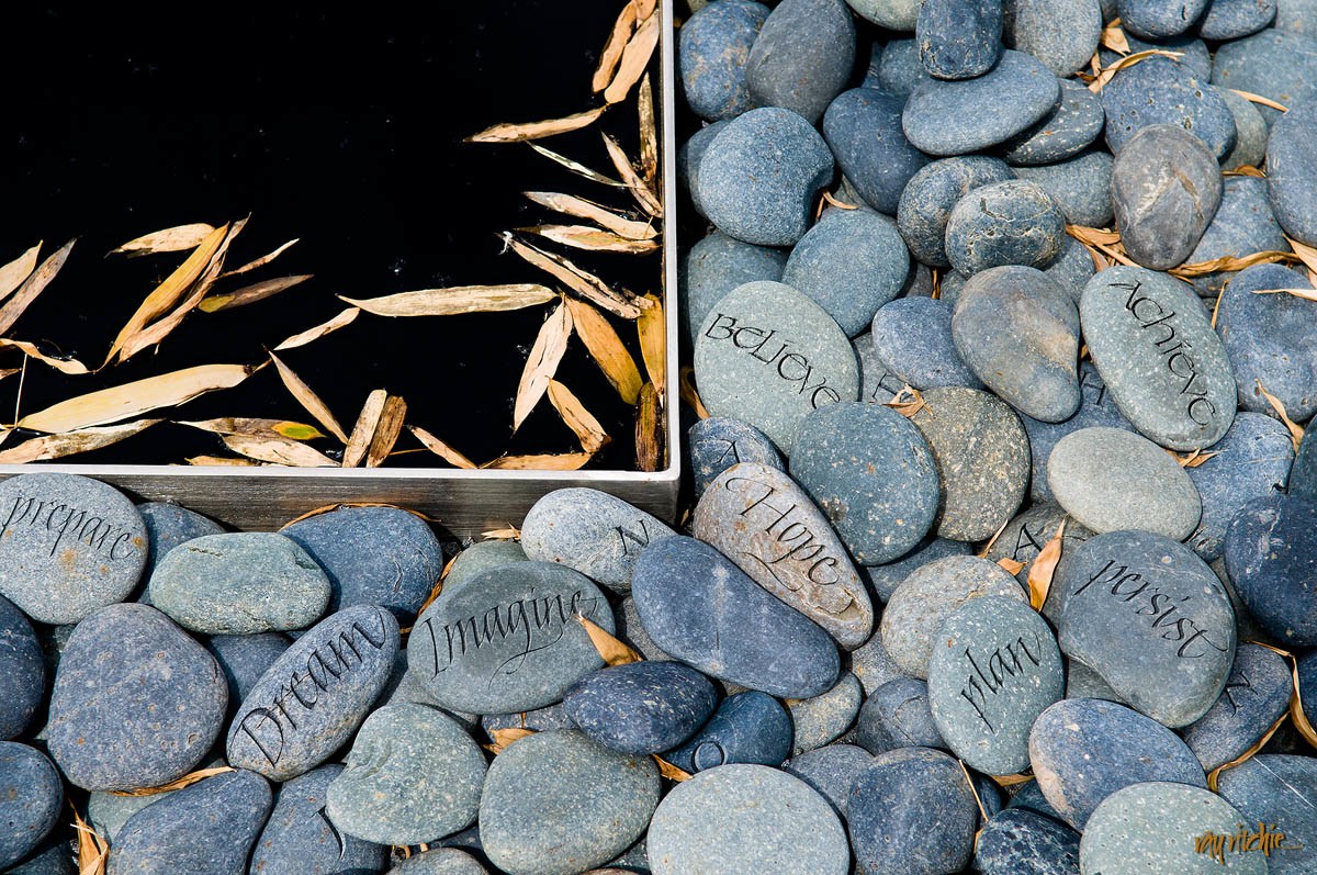
Some time ago, I made a post about “Image Seeking Word,” and asked for some thoughts about what words might be appropriate. During the Christmas season, someone who had seen the blog came to me and asked if I might make a customized version of that image for her son. She suggested that words like “Dream” and “Imagine” might be used, but asked that I pick some more of my own. Here’s what came out of that project:

The letters of the name of the recipient, “Jonathan,” are also sprinkled among the stones. Each word was written separately in black gouache, then scanned into Photoshop, and re-sized and warped to fit the contours of the stone, before finally being “etched” (using the Bevel and Emboss tools), so there’s a fair amount of work involved in using this many words, but I enjoyed it, and learned a lot in the process. I’ve since done a similar version, with a different name, for another customer.

I’d be interested in getting your feedback and further ideas about words for the image.

Seattle

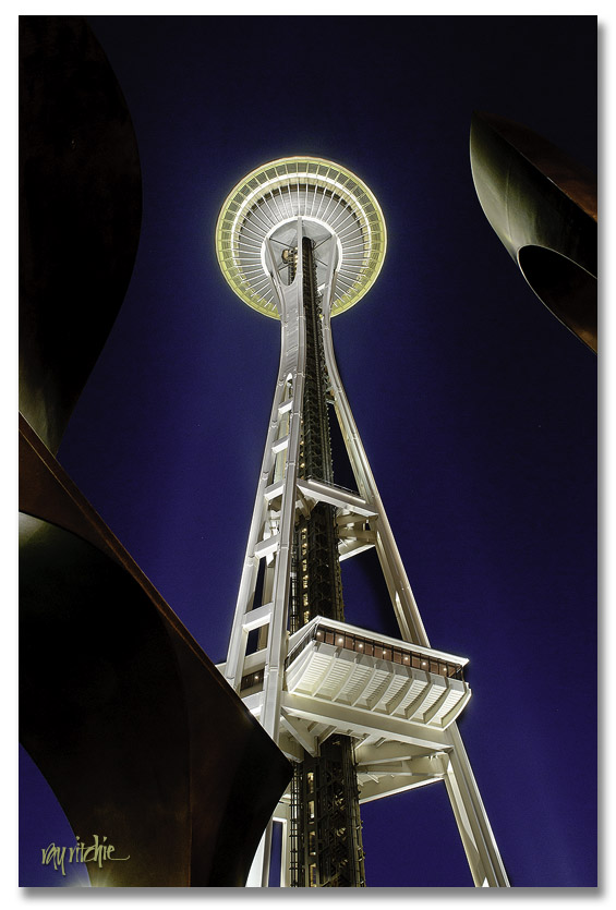
Our itinerary for the trip included flying into Seattle, spending the night and the next morning there, then moving on to Mt. Rainier, Mt. St. Helens, the Portland area, Crater Lake, and then returning up the Pacific Coast of Oregon. Since we were staying about three blocks from the Space Needle in Seattle, I had to get up early for some night shots of that. Here’s my favorite:

Those other-worldly pieces of metal framing the Needle are a nearby sculpture. This photo is what digital photographers would call a “High Dynamic Range” image – it’s made by blending one photo exposed for the sculpture with one exposed for the Space Needle. I made a number of photos from the top of the Space Needle on the return trip, but I’ll post those later.

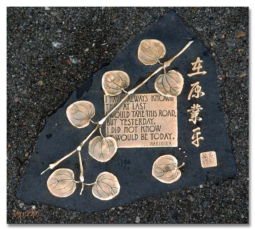
The next morning before leaving for Mt. Rainier, we made a trip to Pike Place Market, where we stumbled across this delightful piece of calligraphy embedded in the asphalt near the main entrance:

I assume that the chop in the lower right corner is the name of the artist, but I can’t read it. If anyone knows what it says, please let me know so that I can credit the artist properly. I’d love to know who it is and see some other examples of his/her work.

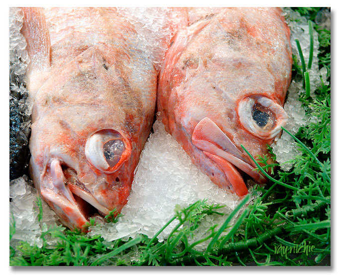
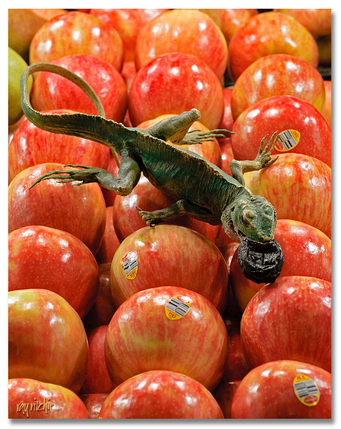
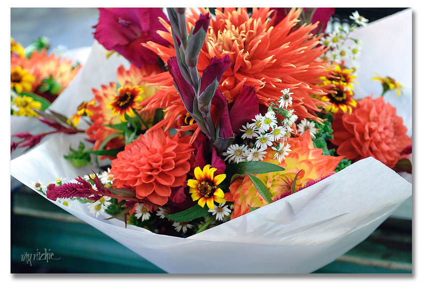
Pike Place Market has something like 600 shops, and I’m not sure that counts all the fishmongers, flower merchants, produce stands and craftspeople who come and go. We were actually there before most of the retail shops opened, though, so we saw mostly the food and flowers. Here’s a brief taste:

We could easily have spent the day (or several days) there, but that was true of almost everywhere we visited during this trip. Next post: on to Mt. Rainier.

A larger collection of the photos from the trip will be available on my Flickr page.

Scanner art

OK, I have to admit that I’m not really sure why I’m posting this, other than growing feelings of blogligation as a result of not having made a post for about a week now. Maybe this is just a fragment of something that will come to fruition later, or maybe it’s a dead end.

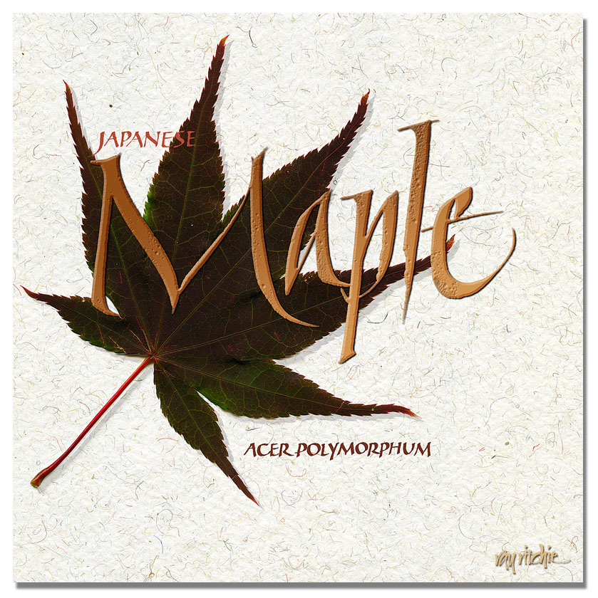
Anyway, I was reading an article a couple of days ago discussing using your scanner as a “camera” to capture images of objects, and I just got the urge to play with it. It’s almost time now for our Japanese maple to start changing its colors. The green summer leaves are just beginning to take on some red hues, and over the next month, the entire tree will turn almost scarlet. I grabbed a leaf from the tree, and scanned it at 600 dots per inch (dpi) resolution, essentially capturing a 10 megapixel image of this single leaf, which is about the same resolution as my Nikon D300. However, with the scanner, I have much better control over the captured image, in that I can get almost perfect illumination, and I don’t need a tripod to avoid vibrations.  I then scanned a piece of Indian banana fiber handmade paper for a background, and created some lettering to go with the image. Here’s my first cut at this experiment:

The word “Maple” in the main title above is a fairly typical example of the Italic style I seem to do the most these days – a free interpretation heavily influenced by several workshops with Denis Brown. It ranges from almost uniform to what Denis calls “polyrhythmic” –  that is, the letters are not necessarily uniform in weight, width, or line texture. In this case, though the letters other than the cap “M” are almost uniform in width, notice the ragged texture on the bottom of the “l,” and the big swag on the foot of the “e,” as a couple of examples of how this is different from formal Italic. The ragged strokes are produced by riding up onto a corner of the pen in the middle of a fast stroke. I particularly like the curves in the “M.” The large title was written in black gouache with a size 3A Automatic pen, and the smaller lettering with a Brause nib. The lettering was scanned and colorized in Photoshop, and I added some Bevel and Emboss, Drop Shadow, and a bit of color and gradient overlay to the lettering, just to make it a little more interesting.

If you can think of anything I can use this fragment for, let me know. Maybe it’s a note card. Maybe it’s the upper left-hand corner of a bigger piece. Maybe it’s a T-shirt. I haven’t decided yet.

Postcards from Asbury Park (part 2)

I’ll wrap up my discussion of the Sickel lettering design for Asbury Park with a couple of additional examples that show how the broad strokes of this lettering style give us an advantage for photographic effects.

The Old Casino

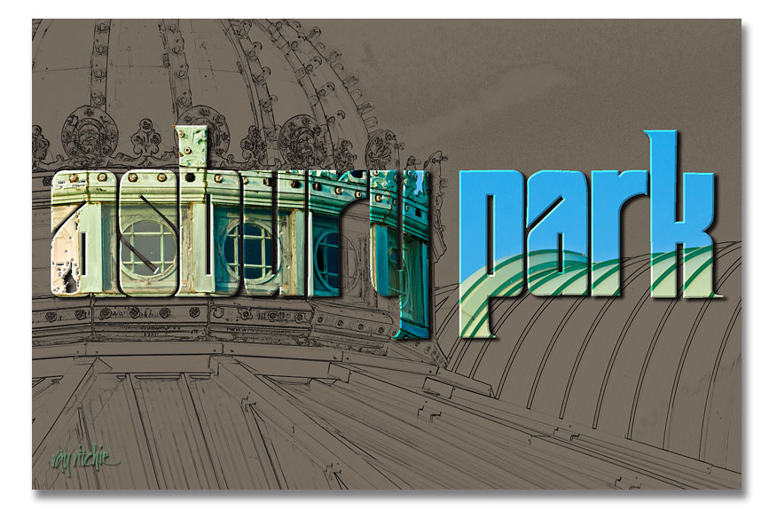
Here I’ve taken one of my photos of the roofline of the old Casino complex and turned it into a line drawing using the Photoshop “Find Edges” filter. I then used the same lettering as in the first postcard (see Postcards from Asbury Park – part 1) as a mask to let some of the color from the original color photo come through.

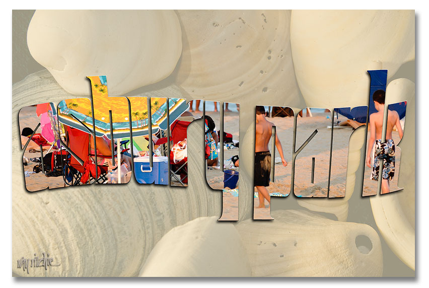
This one, obviously, is two separate photos. The background shell image is from my personal stock library, and the second was a beach scene made during the July 24 Photo Walk. I used a wavy version of the Asbury Park lettering to mask that second photo and layered it over a faded version of the shells.

I could as easily have used a font, rather than designing my own letters for these cards, of course. A font like Arial Black would also give me nice heavy strokes, but it wouldn’t be as distinctive – someone else could easily produce the same look. The combination of my own lettering with my photos gives the cards a unique look that hopefully would distinguish them from others on the rack.

I’ll have to decide now whether to actually do a commercial print run of any of these – it’s probably too late in the summer vacation season to do it for this year – if you have a favorite, please use the comment button or the contact form to let me know.

Postcards from Asbury Park (part one)

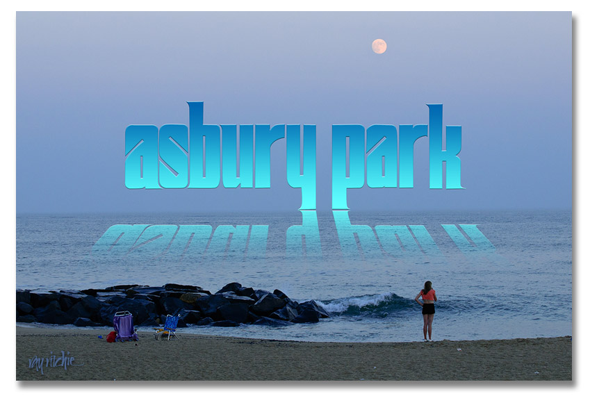
Continuing with the previous post on lettering (More on Lettering and Calligraphy), I promised to give some examples of how the draft versions of the Sickel lettering might be used with some of my photos from the Asbury Park photo walk. I decided I would develop a series of postcards, and see which I liked best. Here’s the first example:

The reflection effect was mostly based on an article by Corey Barker in the March 2010 issue of Photoshop User magazine. It involves adding a gradient to the lettering, then duplicating and flippling the duplicate layer to get the reflection, and masking and blending the “reflection” to allow it to blend into the water and disappear as the reflection gets further from the main title. I added the trick of distorting the reflection so that the reflection widens as it gets closer to the viewer.

Doing a self-critique here, I think the Sickel design doesn’t work as well as I’d like for this effect, as the descenders in the “y” and “p” cause the main part of the reflection to be too far from the main title. I might want to change the lettering to an all-caps style, or modify my Sickel design to eliminate these descenders if I were really going to use this design.

More on lettering and calligraphy

To take the exploration of lettering and calligraphy a little further, here are a few examples I’ve been playing with today.

A few weeks ago, I participated in Scott Kelby’s Third Annual Worldwide Photo Walk, an event in which groups of 50 or fewer photographers get together at sites all around the world and take photos for a couple of hours. My local walk was held in Asbury Park, New Jersey (the town where Bruce Springsteen and Jon Bonjovi first made names for themselves as rock musicians). A few of my photos can be seen in my photostream here. Since that time, I’ve been thinking of making some kind of poster, T-shirt, or other graphic with one or more of the photos – but I need some lettering that says “Asbury Park.”

Here’s a sketch for a possible base design, just as it came off my drawing board:

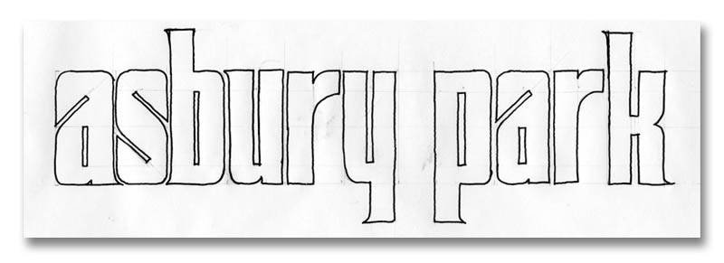
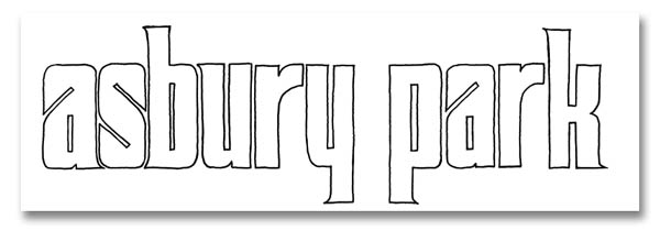
This is a variation of a style of lettering known as “Sickel,” which has been recently discussed on cyberscribes. Note the pencil lines – the design is drawn based on geometric proportions, and then quickly inked in with a pen. After a little cleanup in photoshop, it comes out looking like this:

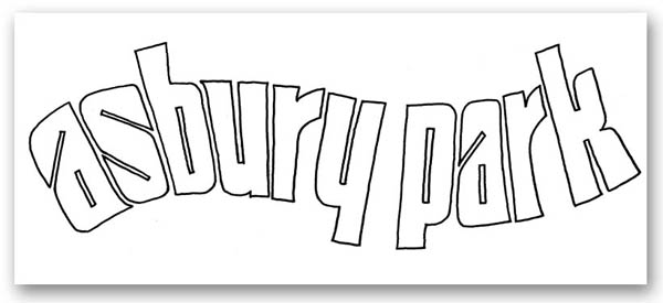
And if I want to clean it up further and make it easier to enlarge and distort the letters, I can import that drawing into Adobe Illustrator, and trace it with “bezier curves,” which will get rid of all the little bumps and rough spots in my hand drawing. I like this style of letters for this particular application, because 1) it has a “retro” feel that harkens back to the glory days of Asbury Park in the early 20th century, 2) the wide strokes give me lots of room for graphic effects, including using the letters as a mask that my photos will show through, and 3) it lends itself to manipulation and distortion. Here’s an example of that third point:

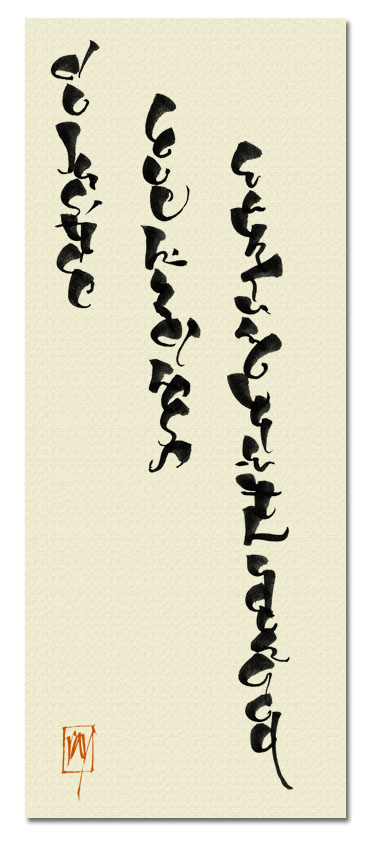
This Asbury Park letter design is an example of what I consider “lettering,” rather than “calligraphy.” It is drawn, rather than written, and will be extensively retouched and manipulated before I reach the final version. As a contrasting example of “calligraphy,” here’s a design based on something I discovered in my inspiration files last night:

This lettering was written with a brush, and I was deliberately playing with the brush characteristics, trying to see if by exaggerating the thicks and thins, and stacking the letters, I could get something that resembled an oriental script. In this case, I haven’t manipulated the original letters at all – I just layered them over a textile background in Photoshop, and added a “chop” in a typical orange-red. The text, in case you can’t read it, is from Micah 6:8: “And what does the Lord require of you, but to do justice, to love kindness, and to walk humbly with your God?”

Next, I’ll try to show an example of using the Asbury Park lettering with a photo.

Understanding Engineers

I just finished reading a post on DPreview criticizing the engineering team who developed Lightroom 3, one of my primary photo post-processing tools. As a retired engineer, I thought I should try to help people understand engineers better, so here are a couple of takes passed along to me by another retired old-timer from Bell Labs:

Take 1: An optimist sees the glass as half full. A pessimist sees the glass as half empty. An engineer sees a glass that’s twice as big as it needs to be.

Take 2: Lots of us believe, “If it ain’t broke, don’t fix it.” Engineers believe “If it ain’t broke, it doesn’t have enough features yet.”

Back to the main topics tomorrow.

Zen flow

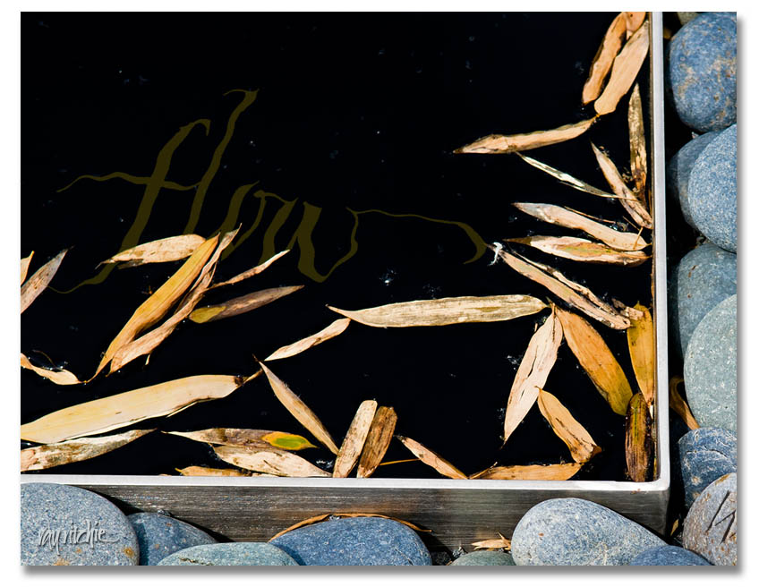
After some private feedback from a fellow member of cyberscribes (see my blogroll for a link), I was prompted to play around with the idea of having some text in the water of the “Zen stones” piece. This required a little re-thinking about the layering and filtering of the image and text in Photoshop, but here’s the result of the first experiment:

There would be multiple challenges with this idea. First, there’s the danger of losing the character of the calligraphy if I distort it too much with the Photoshop “Ripple” filter. Then there’s a technical detail issue: the Ripple filter is 8-bits, whereas I try to do all my image processing in 16-bit mode until I’m ready to publish or post. For reduced-size web images like I’m doing here, it will probably never matter, but in a 12×18 or larger print, there may be some small impact on quality. And most importantly, there’s the design issue of dominance. My feeling in combining text with photos is usually that “less is more;” in other words, I probably don’t want text too many places in the photo, so if I decide to incorporate, say, a quotation in the water, I’d probably want to limit myself to only a few words among the stones. Photos and text always compete with each other for dominance of the viewer’s attention, so I need to decide what amount of text (and what placement) is right for the overall feel of the piece. More food for thought.

Hopefully, I’ll eventually post a completed product for the Zen Stones piece. For now, I’ll probably just respond to comments, if any, and go on to another topic in the next post.