Note: This post assumes familiarity with Photoshop.
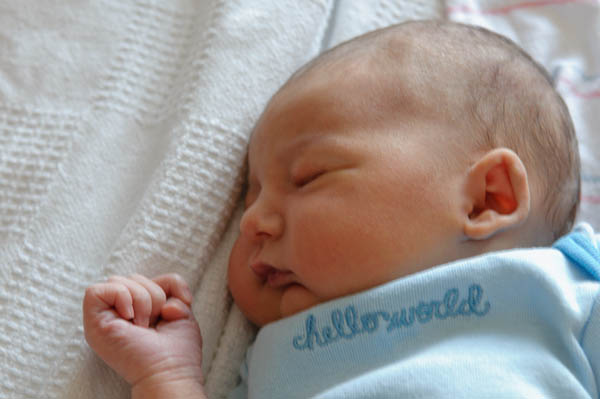
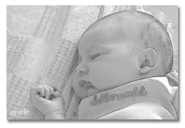
In my previous post, I showed a sketch portrait of my granddaughter Anna, created in Photoshop. There are lots of applications for this kind of effect – for example, in this case, I might want to use the sketch to make a printed birth announcement. Sometimes, too, an artistic rendering of a photograph can allow you to save a photo that would otherwise be too technically imperfect to use. In the case of my photo of Anna, for example, I loved the shot, but I was shooting in very dim hospital room lighting without a flash, resulting in a 1/10 second exposure time. I didn’t have a tripod there, so the shot was handheld, resulting in a photo with motion blur. Here’s the overall shot:

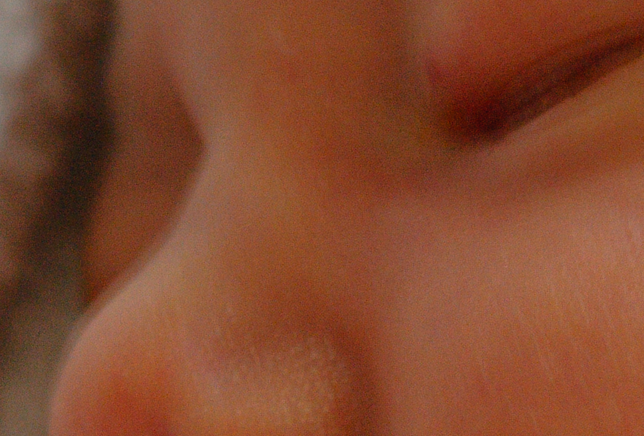
And here’s a close-up that allows you to see the blur I’m talking about:
 That double line along her nose is due to my shaking hands as I shot the photo at 1/10 second. To non-photographers, it may seem insignificant, but this amount of motion blur would be at least slightly visible in even a small print, and would certainly prevent the shot being used for 8×10′s or larger.
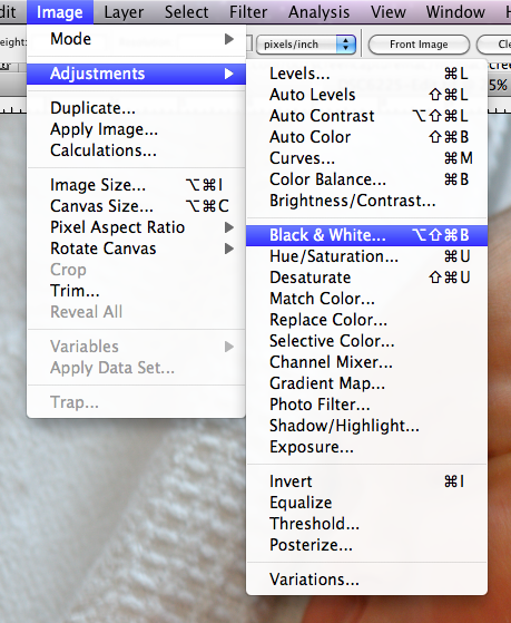
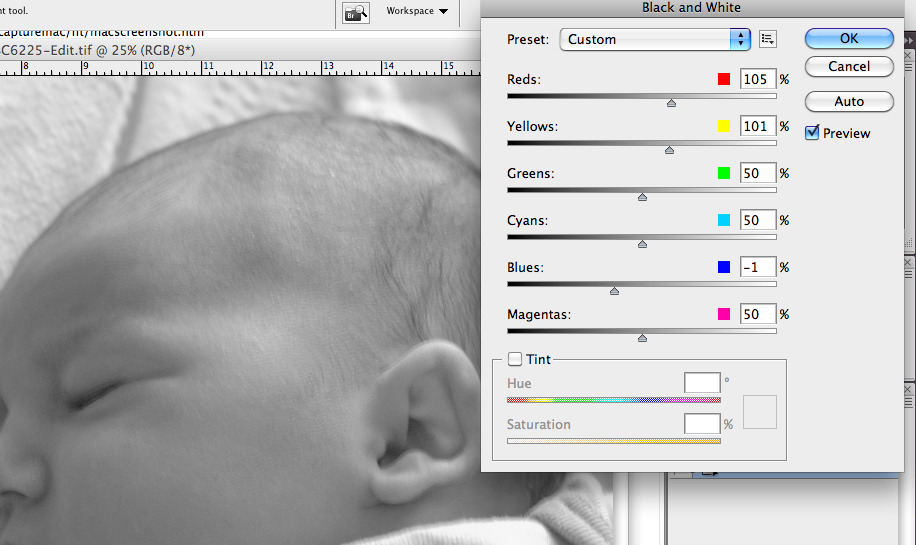
There are lots of ways to produce a sketch effect in Photoshop, but I’ll just describe what I did. First, I converted the image to black and white, using the Image menu:
 This brings up a set of sliders which allows control of the conversion. Since my image had a lot of red, yellow, and blue (from the skin and clothing), I adjusted those sliders to give me a B&W image with the desired contrast and tone. Here are the slider settings, along with a portion of the resulting conversion:
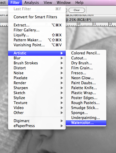
 Next, I wanted to add the art effect. I started out by using the Watercolor filter:
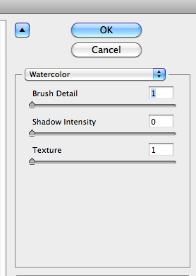
 with these settings:
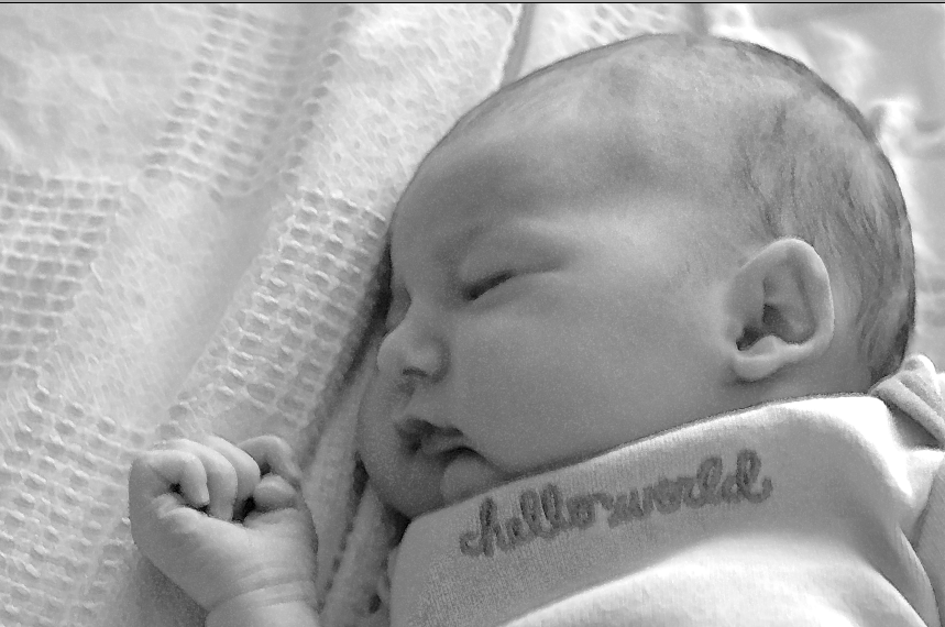
 I experimented with other settings, of course, but what I found was that this filter deepens the shadows too much for any higher Shadow Intensity setting, and higher values for Texture gave me too much of a “spatter” effect. I kept the Brush Detail at 1 simply because that’s what it took in order to give a little of a non-photograph look. Here’s what I got from this filter:
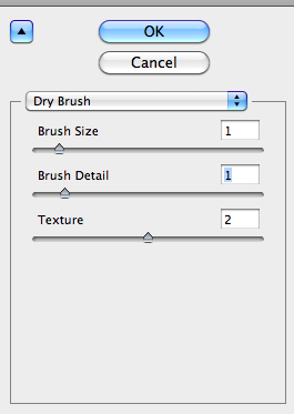
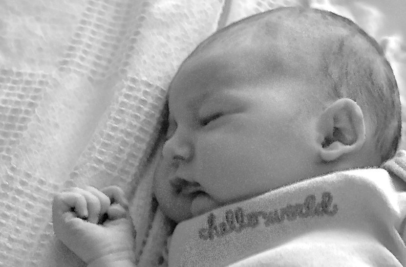
 You can see that not many of the details are yet being affected. I wasn’t happy with the sketch effect yet, so I moved on to the Dry Brush filter:
 which gave me this:
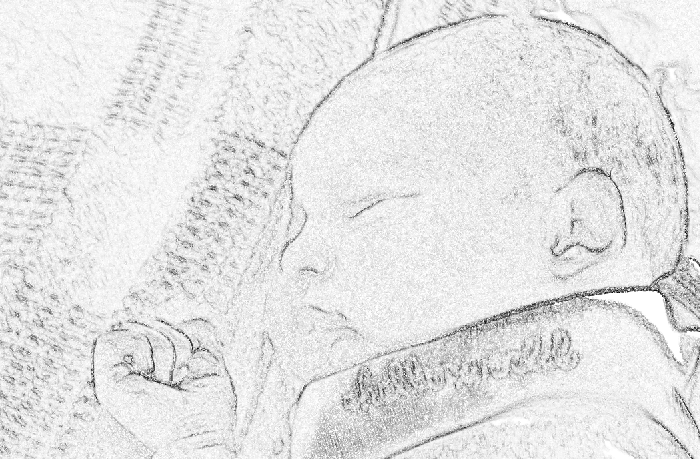
 Better, but still not enough. Next, duplicated the image into a second layer (Command-J on the Mac), and applied the Find Edges filter (Filter>Stylize>Find Edges), which gave me this:
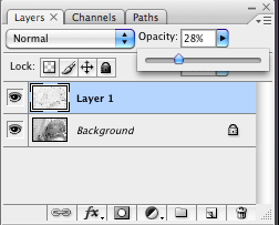
 Too much! So now I simply adjusted the Opacity of this layer in Photoshop, so that the previous Dry Brush-filtered image could show through:

and that gave me the effect I was looking for:
 I should note a couple of points for those who may be trying to do something similar on their own: First, the details of the appropriate filter settings will depend in part on the size and resolution of the image file you’re working with. In my case, I was using a 12 megapixel image from my Nikon D300. You’ll have to adjust the various filter sliders to your own case. And second, note that I probably didn’t have to use all three of the filters. Since the Watercolor filter had such a small effect at the settings I chose, I probably could have skipped it. And finally, don’t take the settings I describe above literally – my original result show here was done just for this blog, and I didn’t write down my settings. When I decided this morning to write this tutorial, I went back and tried to re-create my work, but I probably was off a little. Experiment on your own, and have fun!

