I’ve been holding off from my usual practice of posting my Christmas card, as I was late getting it out, and I like for the physical cards to arrive before the virtual card appears here. But now I’m up against a deadline again, with only two days until Christmas day, so I need to pound out a blog post.
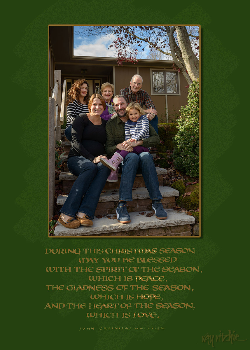
I’ve been doing these calligraphic cards for probably thirty years or more now, and they’re usually dominated by the calligraphic design. But for several years, we’ve also included a family photograph with the mailed cards, so Anita asked if we couldn’t have a family photograph card this year. The family was all here for Thanksgiving, so we bundled up, posed ourselves on the front steps for the camera on the tripod, and then quickly threw off our coats and hid them behind us while I ripped off a quick sequence of a dozen or so shots with the remote. As usual, each individual person looked their best in a different shot, but we all seemed to agree on one as the cutest overall, thanks mostly to Anna’s expression.
I added a quote from John Greenleaf Whittier in a modernized version of medieval “artificial uncial” calligraphy below the photo, created a quick background in Photoshop, and then sent the whole thing off to Shutterfly for printing – also a change for me, as I’ve usually done all the printing myself. Here’s the card front:
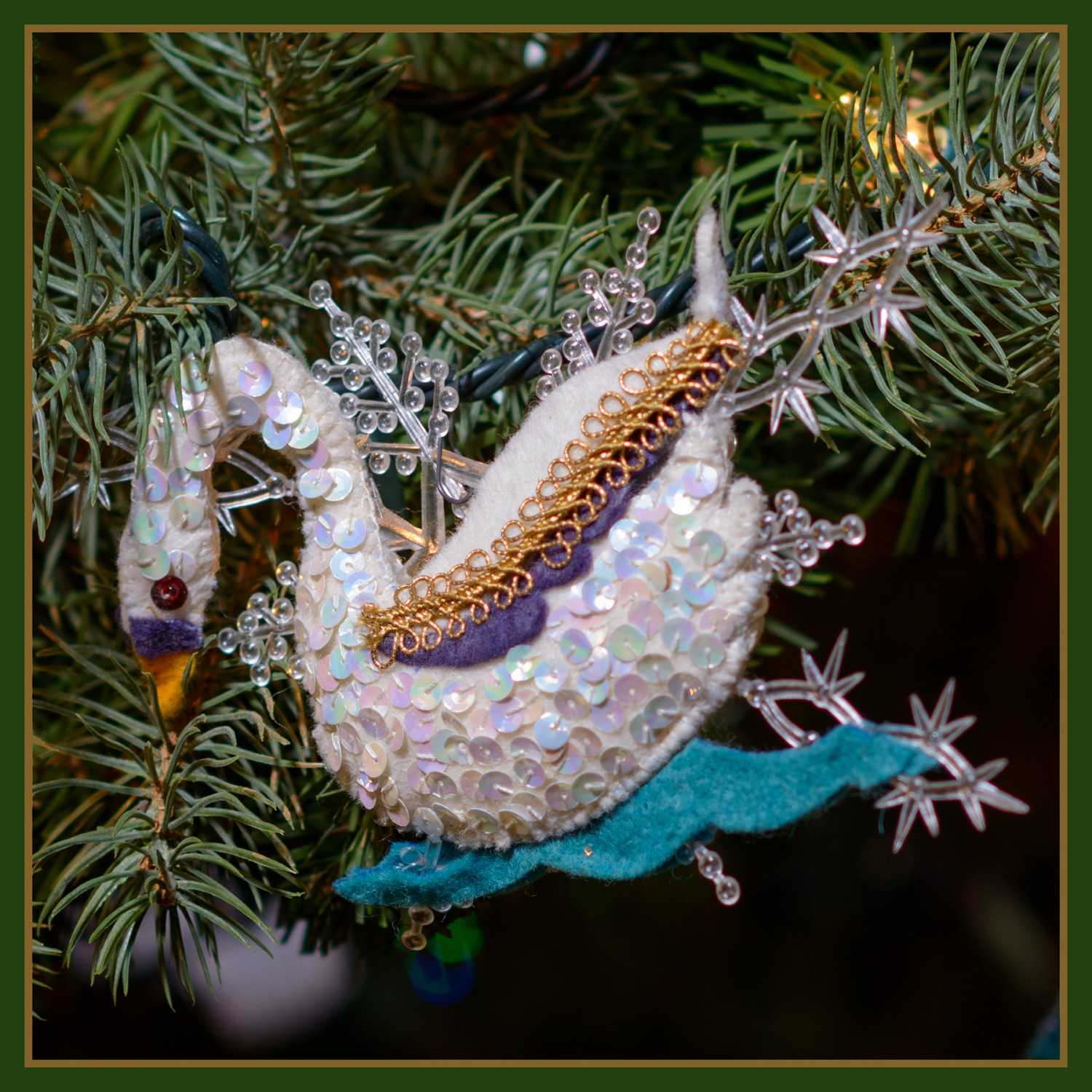
 Since the Shutterfly templates allow a small image on the reverse side of the card, I decided to include a tiny image of one of our “12 Days of Christmas” tree ornaments that Mom made for us over a period of several years. Here’s the “Swans a-swimming” ornament I used:
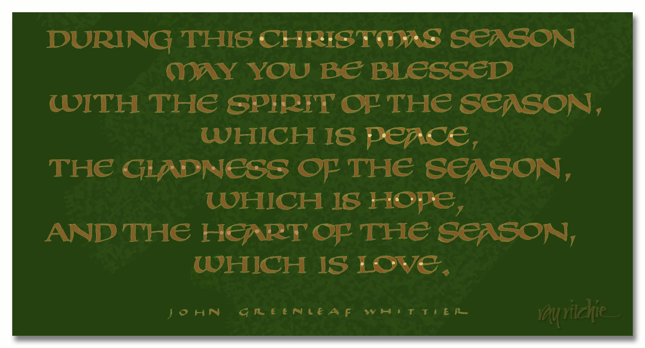
  and here’s a bigger crop of the calligraphy, for those whose interest runs that way:
Here’s wishing you all the blessings of Christmas, and a wonderful 2015.
========================= Technical Notes ===========================
This style of calligraphy is a little more difficult than some forms of uncial, as it uses a fair amount of pen-twisting and skating on the corners of the nib. You may notice that not all the downstrokes are the same width – that’s deliberate, but since uncial is normally written with the nib held almost horizontal, to get a thinner downstroke, you have to twist the nib quickly from horizontal to a more vertical angle as you move it down. In the case of the downstrokes of the N’s, it’s twisted completely vertical almost immediately. To get the little triangular serifs on the T’s I used a quick counter-clockwise flick on the left corner of the nib for the left serif, and then after the horizontal stroke, a clockwise flick on the right corner for the right side. A somewhat similar technique is used for the serifs on the lower left and upper right of the S’s.
You may also notice that there are two forms of A’s in the quote. Most of the A’s are an older form typical of lettering from the 1500′s, but at the beginning of the penultimate line, I used a more modern, conventional form. I did that just because the word “And” is relatively unimportant, and I didn’t want the eye to pause there as much.
Both photos were done with the Nikon D800. The family photo was done with a Sigma 35mm f/1.4 lens, and the ornament with the 85mm f/1.4G.

