OK, I have to admit that I’m not really sure why I’m posting this, other than growing feelings of blogligation as a result of not having made a post for about a week now. Maybe this is just a fragment of something that will come to fruition later, or maybe it’s a dead end.
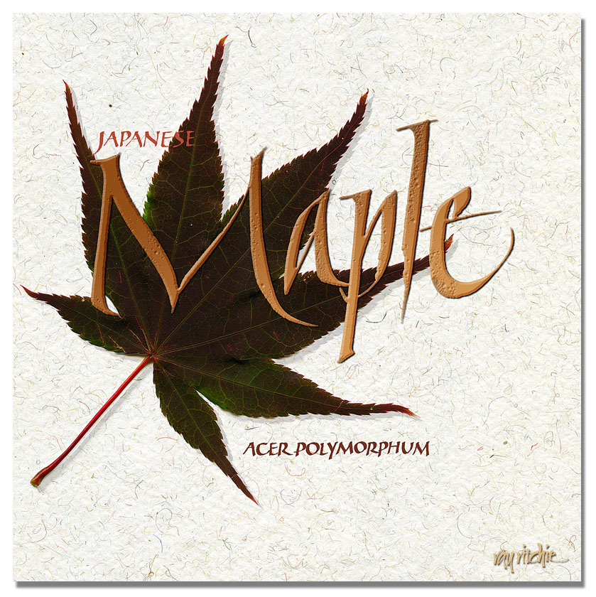
Anyway, I was reading an article a couple of days ago discussing using your scanner as a “camera” to capture images of objects, and I just got the urge to play with it. It’s almost time now for our Japanese maple to start changing its colors. The green summer leaves are just beginning to take on some red hues, and over the next month, the entire tree will turn almost scarlet. I grabbed a leaf from the tree, and scanned it at 600 dots per inch (dpi) resolution, essentially capturing a 10 megapixel image of this single leaf, which is about the same resolution as my Nikon D300. However, with the scanner, I have much better control over the captured image, in that I can get almost perfect illumination, and I don’t need a tripod to avoid vibrations. I then scanned a piece of Indian banana fiber handmade paper for a background, and created some lettering to go with the image. Here’s my first cut at this experiment:
The word “Maple” in the main title above is a fairly typical example of the Italic style I seem to do the most these days – a free interpretation heavily influenced by several workshops with Denis Brown. It ranges from almost uniform to what Denis calls “polyrhythmic” – that is, the letters are not necessarily uniform in weight, width, or line texture. In this case, though the letters other than the cap “M” are almost uniform in width, notice the ragged texture on the bottom of the “l,” and the big swag on the foot of the “e,” as a couple of examples of how this is different from formal Italic. The ragged strokes are produced by riding up onto a corner of the pen in the middle of a fast stroke. I particularly like the curves in the “M.” The large title was written in black gouache with a size 3A Automatic pen, and the smaller lettering with a Brause nib. The lettering was scanned and colorized in Photoshop, and I added some Bevel and Emboss, Drop Shadow, and a bit of color and gradient overlay to the lettering, just to make it a little more interesting.
If you can think of anything I can use this fragment for, let me know. Maybe it’s a note card. Maybe it’s the upper left-hand corner of a bigger piece. Maybe it’s a T-shirt. I haven’t decided yet.


Ray, I know why you posted this…to make us love you more! It’s great! What a fun way to make better use of our technology ‘stuff’.
Thanks,
Jan
Thanks, Jan!
Ray