When I’m teaching beginning students, I often see that they don’t feel comfortable using liquid ink, and they have difficulty in getting the nib fully in contact with the paper. One exercise I sometimes use to help remedy this problem is to have them letter with a carpenter’s pencil, a flat lead pencil which can be easily sharpened to a chisel point. For some students, the softer feel of graphite on paper seems to be more familiar than the feel of a metal nib with liquid ink, and they are then more able to concentrate on getting to know the characteristics of a chisel nib. In fact, I often do calligraphic sketching with only a pencil, and find that it frees me from some of my own hang-ups and allows me to attempt letterforms that I can’t yet do easily with a metal nib. Soft pencil lead doesn’t snag easily on paper fibers, and the pencil doesn’t really care about direction of stroke, so I can feel more free to execute the shape in my mind without worrying about the skill issues involved in metal pen and ink work.
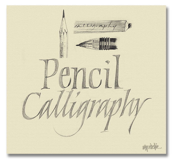
Here’s a sketch from this morning, just to make the point visually:
In the sketch above, the calligraphy was done with my carpenter’s pencil (sketched in upper row, right), and touched up slightly with a 0.7mm mechanical pencil (2nd row). This isn’t intended as finished work, of course, but the pencil does give a softness and range of tones that’s not possible with a pen and ink, and I enjoy integrating the small sketches with the pencil calligraphy. For me, the pencil is mostly a sketching tool for doing assessments of design ideas, but some calligraphers have taken pencil calligraphy to amazing levels. Sheila Waters has done a number of formal pieces in colored pencil, and Letter Arts Review frequently features pieces done partially or completely in pencil.
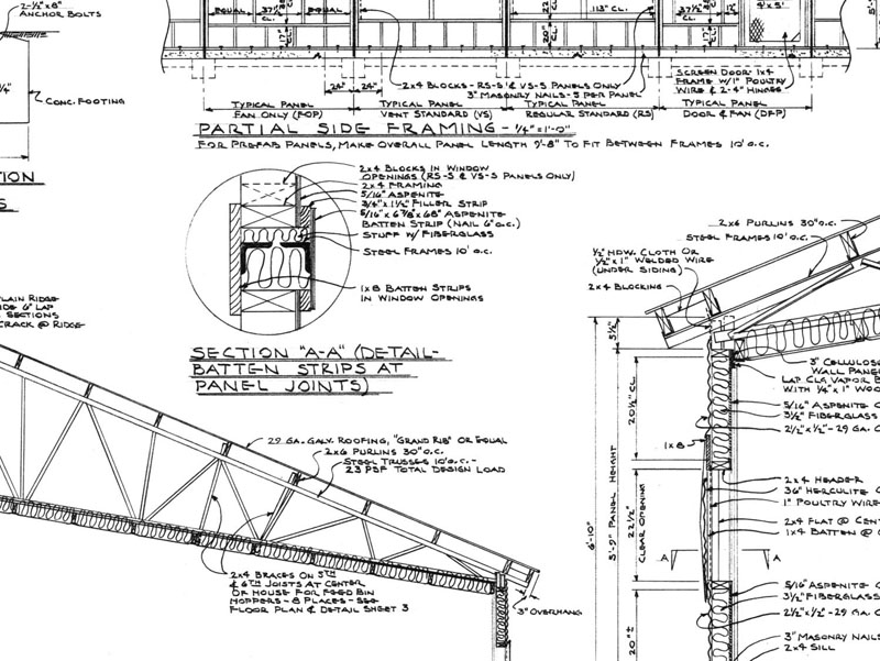
I’m sure part of my fondness for pencil dates back to my introduction to lettering, which came from watching my father do hand-drawn building plans like this one:
Dad worked almost entirely in pencil, and must have produced thousands of large pages (24 x 36 inches or more) of detailed plans like this during his working career as an agricultural engineer specializing in farm building design (I think the above image is a portion of a plan for a commercial chicken house). He never thought of his lettering as much more than “competent,” but I was drawn to it as a child, and I still admire it greatly. Long before I studied calligraphy, I learned to do architectural lettering by trying to copy his style. By the time I was about 15 or 16, I had gotten to be good enough at it that he would sometimes have me re-do one of his plan sheets, when a change in the building design required a major re-layout of an entire page (no computer cut-and-paste in those days!), and from about the age of 17, I worked a number of summer and part-time jobs as a draftsman.
Dad died six years ago this week. I still miss him.


Your tribute to Dad brought tears to my eyes.