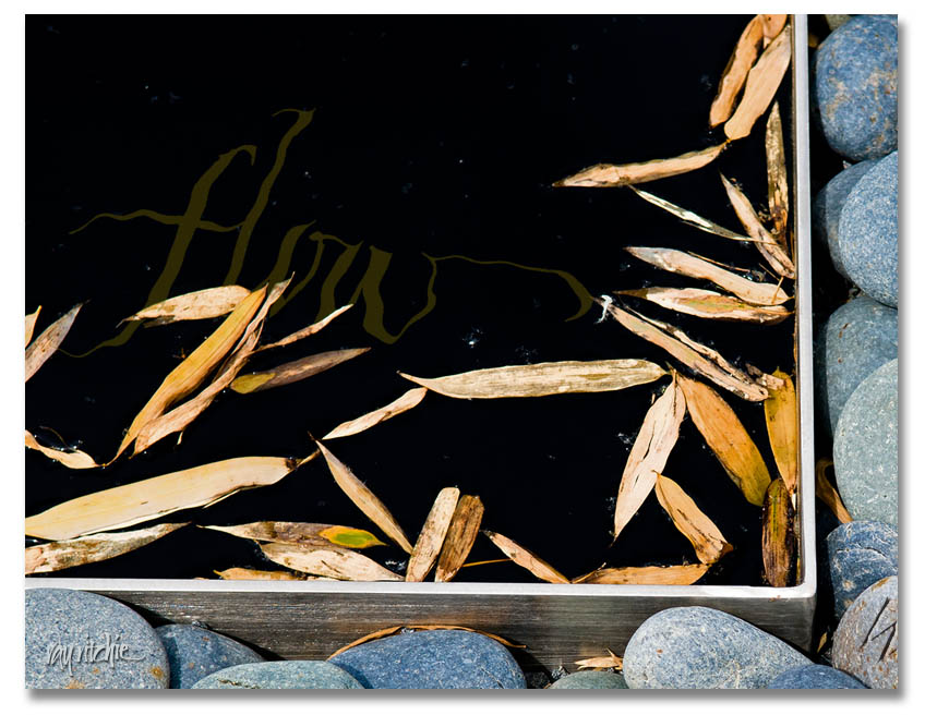
After some private feedback from a fellow member of cyberscribes (see my blogroll for a link), I was prompted to play around with the idea of having some text in the water of the “Zen stones” piece. This required a little re-thinking about the layering and filtering of the image and text in Photoshop, but here’s the result of the first experiment:
There would be multiple challenges with this idea. First, there’s the danger of losing the character of the calligraphy if I distort it too much with the Photoshop “Ripple” filter. Then there’s a technical detail issue: the Ripple filter is 8-bits, whereas I try to do all my image processing in 16-bit mode until I’m ready to publish or post. For reduced-size web images like I’m doing here, it will probably never matter, but in a 12×18 or larger print, there may be some small impact on quality. And most importantly, there’s the design issue of dominance. My feeling in combining text with photos is usually that “less is more;” in other words, I probably don’t want text too many places in the photo, so if I decide to incorporate, say, a quotation in the water, I’d probably want to limit myself to only a few words among the stones. Photos and text always compete with each other for dominance of the viewer’s attention, so I need to decide what amount of text (and what placement) is right for the overall feel of the piece. More food for thought.
Hopefully, I’ll eventually post a completed product for the Zen Stones piece. For now, I’ll probably just respond to comments, if any, and go on to another topic in the next post.

