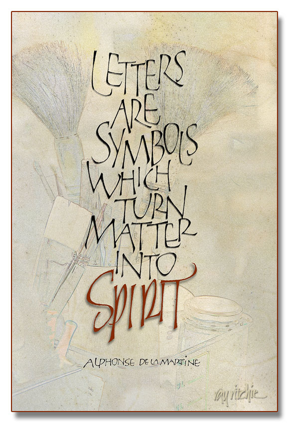
I’ve been in a production mode this week, as I’m going to a small local craft show at our church, and have been feeling that I didn’t have enough new things to show. I’m really terrible at guessing what will sell at these things, so I seem to wander in a lot of directions in my attempts to be “commercial.” The piece below probably isn’t going to be that successful for the current venue, but it’s a favorite quote for calligraphers, and I had never done it before, so once it came into my mind, I felt compelled to do it.
The letterforms of the main text should be familiar to you if you’re a follower of this blog, as they’re yet another variation of my loose modern caps, similar to those in my Beer Geek poster. I chose these forms because I feel they’re “mine” now, and different from most of the more formal treatments of this quote that I’ve seen. All the words were originally done in pencil, and then touched up on the Wacom tablet, after scanning them into Photoshop. The word “Spirit,” however, derives more from my pen and brush lettering than from the loose versal forms. The background started as a photograph, one of thousands I’ve taken over the years during various calligraphy workshops. It was turned into a sort of a sketch by a technique similar to that described in a previous post which you can see here. I then blended the photo with a scan of a very nice piece of calfskin vellum which has been sitting in my supply stores for over a year now, waiting for a project which justifies such an expensive material. I was glad I had it on hand, though, as I really love the look of the veins and the hair follicles for a piece so oriented towards calligraphy. And working in Photoshop like I was doing here, I was able to use it at no cost, as the vellum is still completely untouched. All of the letters have a small touch of shadow, to give a 3-D effect, but I deliberately gave a little more shadow to “Spirit,” to give it a sense of floating above the rest of the piece.
We’ll see whether it sells – if not, it won’t be the first time that something I have liked myself didn’t appeal to the public.


very nice.
I like how the background sets off the lettering