I thought I’d share some of the details behind the design of the 2011 Christmas card, as I know there are at least a few readers who care about such things, and I usually enjoy sharing nerdy details, myself.
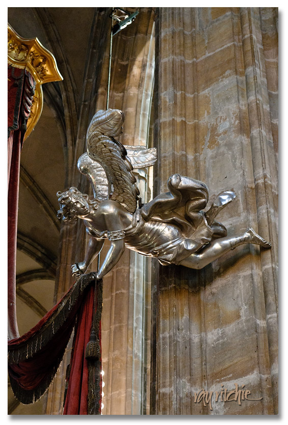
As I mentioned in the previous post, I usually start my designs from the text, as for the majority of cases, the text contains much of the message, and I’m usually trying to support that message with the artwork. In this case, for example, the text brought in the idea of angels, and I then remembered that I did have a nice angel photo in my personal stock library. Here’s the angel I used for the 2011 card, as I found her hanging in St. Vitus Cathedral in Prague:
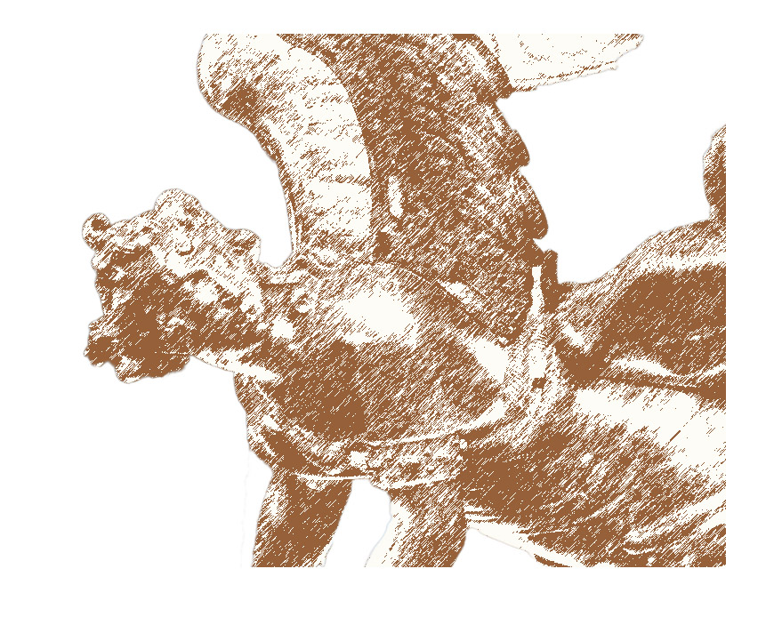
The first step was to extract the angel from her surroundings, as I wanted to use the angel alone, without the rest of the cathedral There are lots of ways to do this, but what I did was to duplicate the photo to a second layer, then use Photoshop’s Quick Select tool by clicking and dragging across the angel, and finally, I created a layer mask. I then used the Refine Mask command to paint in (or out) those parts of the edges that were incorrectly selected. This extraction process probably took 15 or 20 minutes of work to get just what I wanted. After I was satisfied with my selection of the angel, I moved on to the problem of altering her appearance. The photo itself is pretty sharp and detailed, which is highly desirable from a photographic point of view. For my card designs, though, I’m often trying for more of a “painterly” effect, so I wanted change the photo to something that looked more like a drawing. I’ve talked about how to do that before, but for now, I’ll just say that I used Photoshop’s filters to do the job. Specifically, I used Filter>Sketch>Graphic Pen, which then gave me an angel that looked like this:
I wanted to set the angel against a night sky, partly because of the “angels’ footsteps passing in the night” phrase in my text, but also because I usually think of night when I think of Christmas. Christmas Eve services have always been a favorite part of the Christmas experience for me, and a night sky and a “star of Bethlehem” often find their way into my cards, as they did this year. I started by creating an inky blue background layer, and then laid my extracted angel on top of that. The colors in the angel sketch above were now wrong, so I started by inverting the colors to give light on dark instead of vice-versa, and then I added a color overlay to make the angel drawing more compatible with the blue of the background. I also wanted to take advantage of the fact that the angel is looking over her shoulder. I noticed that the strongest light in the cathedral in the original photo was coming from the upper right, which happens to be more or less the same direction she’s looking (a happy coincidence), so I decided that she would be looking towards a “heavenly light” coming from the upper right corner of the card. I created that light by adding a radial gradient fill above my background layer. As I further critiqued my work, I decided the plain blue background was too sterile and artificial-looking, so I decided to add some clouds (Filter>Render>Clouds), and I also added some random stars here and there with the Pencil tool and my Wacom tablet (you can use a mouse – it’s just not as easy to draw with). At this point, my background art was nearing completion, and I just needed to do a little adjusting of the blending of the various components to make everything fit together.
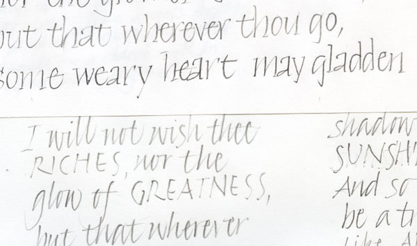
The final step was to add the calligraphy. I started with a couple of pencil sketches, just to give me a feeling for how the text would lay out in a couple of styles. Here’s a piece of my pencil drafts, just to give you an idea of how rough things were at this stage:
I originally imagined I might do the card text in a sort of modified bookhand (or “Foundational,” as Edward Johnston’s disciples called it). Here’s a detailed crop from the first draft of that idea:
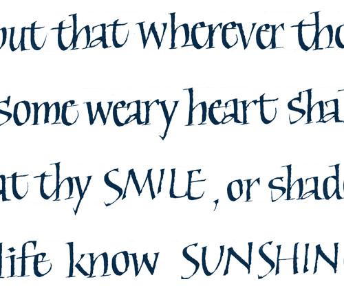
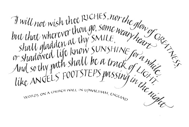
In my first paste-up of the entire card, I just put the text into a rectangular block. I was totally unhappy with the way this looked on the card, though, and immediately began playing with other approaches, finally settling on having the text follow curves which worked in to the curves of the angel’s pose. I made my first stab at that idea by using Photoshop’s Warp tool to add curves to my rectangular text block. Of course, just warping a block of text doesn’t give you very nice-looking letters, but it did give me a feeling for what the layout would look like, and I decided curved lines of text would work if I re-did the calligraphy; this time, because of the curved lines, I thought Italic would work better. You can see the final calligraphy fairly well on the photo of the full card (see post here), but here’s a slightly larger version of the text alone:
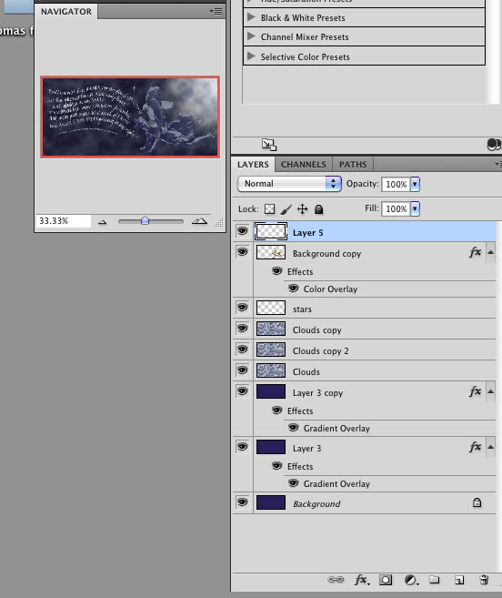
As always, I can still see lots of details that could be worked further, but at this point, I was happy enough with the card to print it and send it, and I was up against my deadlines for addressing and mailing, so for this year, the card was done. For those who are familiar with Photoshop, here’s what the overall design structure looked like once everything was assembled:
Each of those layers has a slightly different Blending Option, to change the strength of the effect and how the layer looks against the surrounding layers. Some of the duplicate layers were only added after making test prints, and deciding that some part of the design was printing too light or too dark.
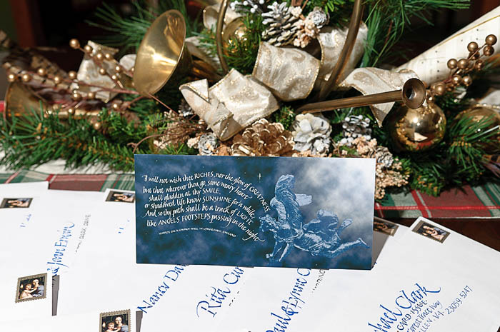
And here’s the final card, sitting on the dining room table on top of a pile of the addressed envelopes:

Ray, your lettering is exquisite! Thank you for the ‘instruction’/explanation of your card process. It’s beautiful!