One of the hazards of being interested in lettering is that you sometimes find yourself looking more at form than content. We recently went to see the movie The Descendants, and during the opening credits I found myself looking at the form of the lettering and the backgrounds, and asking myself “How would I do that?” I have no idea what the credits actually said.
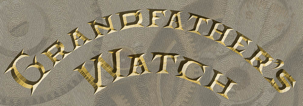
Similarly, when I was doing my recent post about my grandfather’s watch, I kept looking at the engraved lettering on the works of the watch and wondering “What does that alphabet look like?” and “What can it be used for?” You can see part of the lettering in the photo montage in the previous post – the full text on the case reads “Hamilton Watch Co., Lancaster PA., 21 Jewels.” Just for grins, I made a sketch of the letters one evening a week or two ago, and then started to imagine what some of the missing letters of the alphabet might look like. Here’s a quickie Photoshop composition based on one of my sketches:
I started out by just sketching the letters above as black outlines. After scanning them into Photoshop, I filled them in with a solid color, and then touched up the edges to remove some of my pen bobbles and other irregularities. I then added the beveled debossed effect as a Layer Style, and generated a wavy background pattern to echo the fancy decorative milling on the actual watch works (again, you can see the authentic decorative milling patterns in my original post). Finally, just to add a little more interest and texture, I layered in one of my closeup photos of the actual watch.
As with many of the things I show on this blog, I don’t have any immediate application for this lettering, but I think the font could be useful someday as a titling font when I want something that suggests antiques. I’d have to clean it up, of course, but that is pretty straightforward to do (though tedious) using the vector drawing capabilities of either Photoshop or Adobe Illustrator. Here’s an example of what the letters look like when I start to clean up my sketches a little:
If I were really going to develop the full font, I’d need to look carefully at all the letter proportions relative to each other – that “D” looks a little wide to me right now compared to the “R,” for example – and I’d have to figure out the full set of decorative caps, as well as the lower case letters; but I may do it, if I find the right project that calls for an old-fashioned feel to the text. Can you think of any applications for these letters? I’d love to hear from you.


