Explore

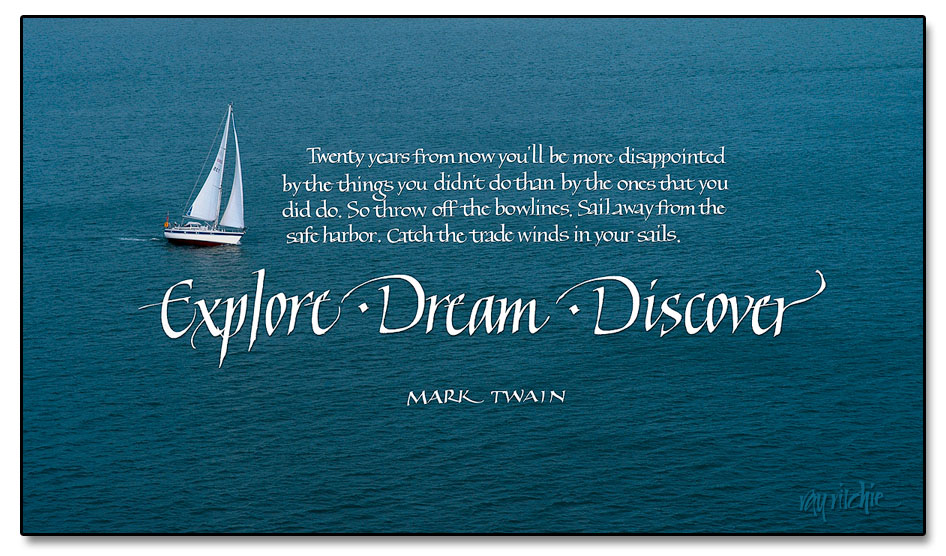
I originally created this piece about a year ago, but the quotation was set in type rather than hand calligraphy, and that never made me quite happy. Today I re-worked it with a calligraphic treatment, and I think I’m much happier with it now. This is one of those quotes that I saw somewhere, wrote down in my notebook, and never really questioned the attribution. I hope Mark Twain really said it; some Internet sources seem to cast doubt on that. I like it, anyway.

The photo was taken several years back when we were on a cruise around the British Isles  - I believe we were pulling out of Southampton harbor at the time. As usual, you can click on the image above to see a larger version.

Note for those sharp-eyed readers who may have seen the original version of this post: Yes, I did make a couple of changes. I decided that my two “D’s” in “Dream” and “Discover” were too different in shape, so I replaced one of them by a copy of the other. And after looking at the image awhile longer, I decided the word “Explore” was a little too compressed compared to the other two title words, so I did a small amount of manual kerning by sliding the letters around in Photoshop. Ah…all better now. (If you’d like to compare the two, the original can still be seen in the comments log at http://www.rritchie.com/wordpress/?attachment_id=788#comments)

Graphic botanicals

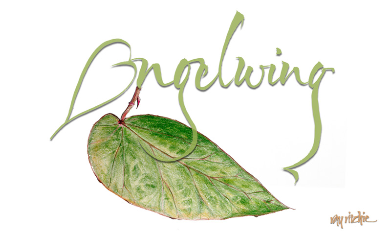
One of the plants we brought home to New Jersey from my mother’s collection was an heirloom Angelwing Begonia. Mom got her plant as a cutting from one of her mother’s plants, and there seems to be some family lore that suggests Grandma got it from her mother. I think the Angelwing Begonia was first hybridized around 1926, so that could be about right to support the oral tradition. Mom had propagated numerous cuttings of her original plant, and after she died, my brother was trying to make sure everyone knew where they came from, and to send a plant home with each member of the family. Recently I was using this plant as a model for my continuing study of botanical art, sketching with colored pencils. After I sketched the plant, I was playing around with the word “Angelwing” with my brush, and decided I’d like to combine the sketch with the lettering. Here’s the current layout:

If you have thoughts about other ways to combine these two elements, I’d welcome your comments!

Unfolding (and folding) Directions

To follow up on the earlier post about folded calligraphy, here are three examples illustrating potential directions that the combination of calligraphy and folding can go:

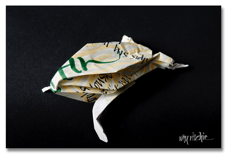
We can do traditional origami, such as a frog design

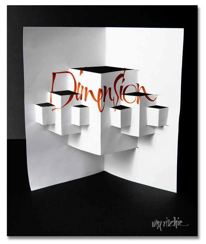
or, we might use a more graphical, structural approach, say, for greeting cards, shadowboxes, and wall art

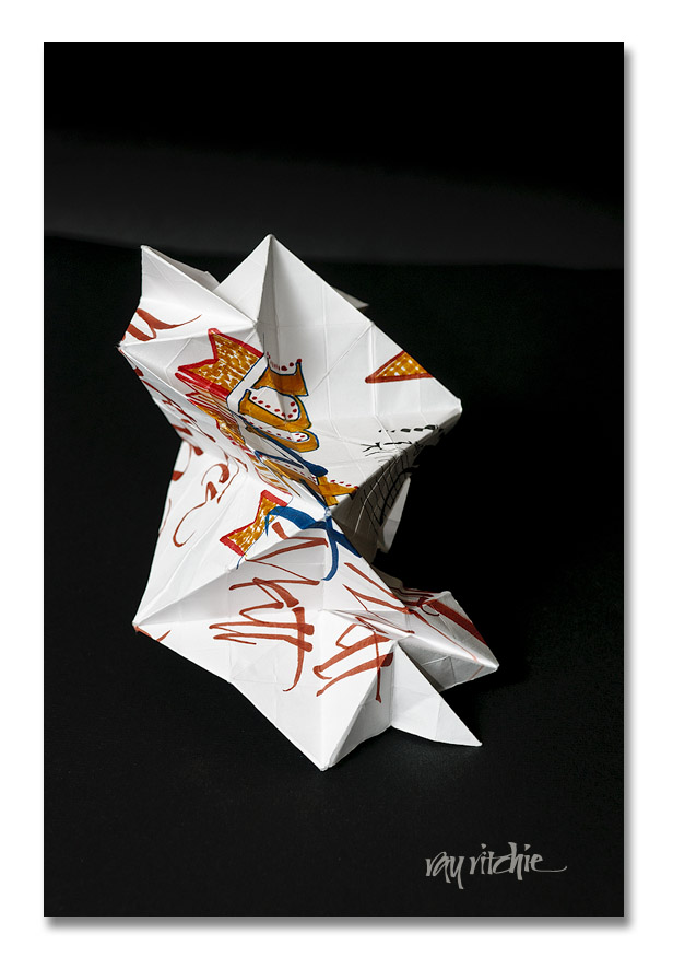
or, as in the example of the previous post, we can go with abstract sculptural approach

These are still just prototype examples, of course; I can see that there will be an art to be learned about where to put the calligraphy on the original unfolded paper if I want it to display best, but I’ve made no real effort to coordinate the placement with the folds at this point. And since I haven’t yet really decided what I might want to use this for, I don’t know if one of the three approaches is more relevant for me personally. Or maybe there are additional approaches I should consider. What do you think?

Folded calligraphy

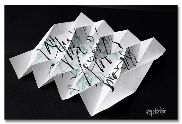
A few days ago, in browsing the Roku for something interesting to watch, we happened across the documentary Between the Folds, by Vanessa Gould. This is a short film about the art and science of paper folding. I have played a little with origami in the past, but the level of skill and the intricacy of the patterns shown in this movie was so far beyond anything I had seen before that I felt an irresistible urge to pick up a sheet of paper and start folding.

As it happened, the closest sheet of paper to me was a piece of scrap paper on which I had been sketching ideas for a envelope design for my nephew Matt’s upcoming birthday (Happy Birthday, Matt!). I just started by making semi-random folds, not trying to create anything in particular, but folding the sheet into a fan pattern in one direction, then un-folding it and doing the same with the sheet turned 90 degrees, and finally, I started throwing in various folds that I remembered from simple origami patterns I had learned years ago. My main thought was just to create something with enough complexity of facets and textures that it might enhance or add interest to the calligraphy. Here’s a photo that suggests what can emerge from this process:

This was just a preliminary experiment, but the result intrigues me, and motivates me to want to learn more about the current state of the art in paper-folding. If any reader has had experience in combining calligraphy and folding, I’d be particularly interested in hearing from you!

Pencil Doodles

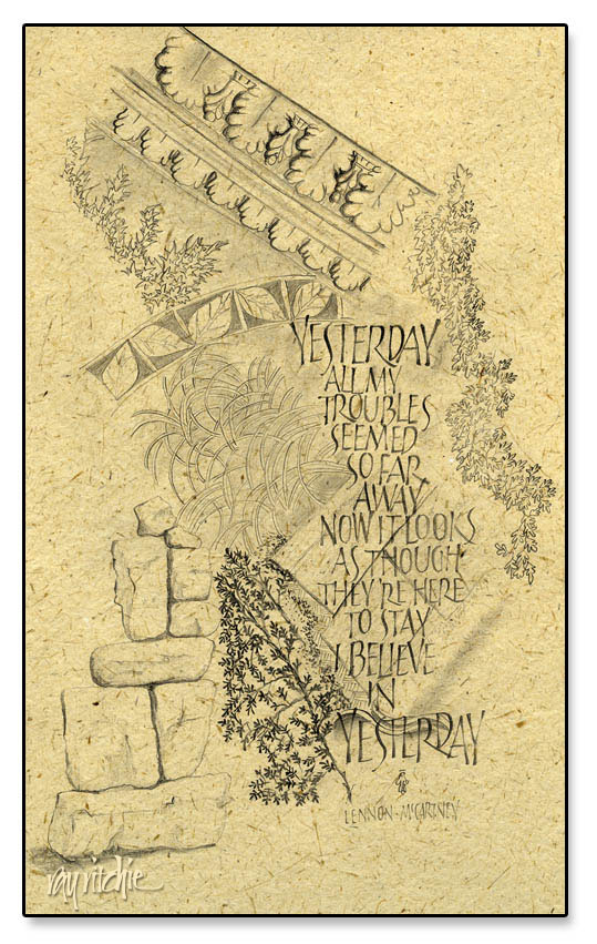
I’ve been reading a couple of books on art and drawing technique, and spending some time each day sketching on my lap board. Most of these sketches are really just doodles, and I’ve been concentrating on particular patterns and technique, rather than making any real effort at design. But I’ve been finding that interesting designs are emerging nevertheless, with no particular effort or conscious thought on my part. The background of the sketch below started with my copying the design of a piece of molding from a photo I had taken in the chapel at Les Invalides in Paris (site of Napoleon’s tomb). Then I began adding random other elements, with no intention of creating a unified piece. But when I looked at the page, I felt it suggested a sense of the past, and I thought of  the lyrics to “Yesterday” as a set of text. The lettering style is just something I had been playing with recently, and wasn’t chosen for any special reason.

This actually violates one of my usual practices, in that I try to avoid using copyrighted text – but since I have no plans to sell this piece, perhaps the Beatles lawyers won’t come after me. The original sketch was just done on white inkjet paper. I scanned a piece of banana fiber paper and then overlaid the sketch in Photoshop to give it a little more texture, and more of a finished appearance.

The books I’ve been reading, by the way, are Bert Dodson’s Keys to Drawing with Imagination, and Trudy Friend’s Artist’s Complete Problem Solver.  Both are full of examples and suggested exercises – good resources for a person like myself with relatively little formal art training.

Seattle

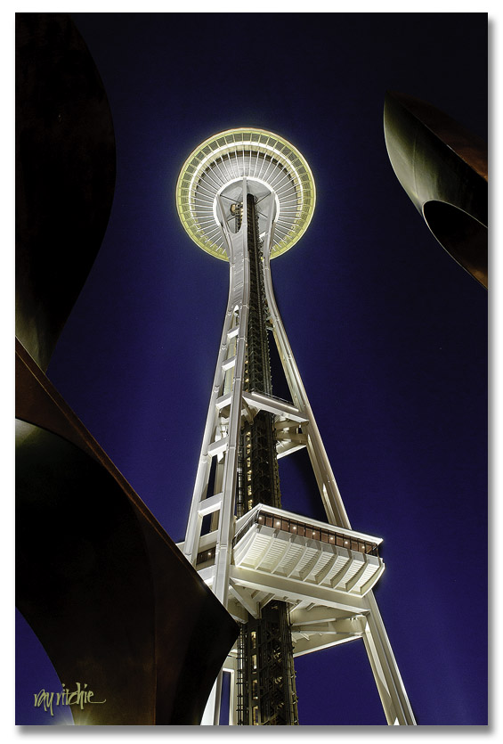
Our itinerary for the trip included flying into Seattle, spending the night and the next morning there, then moving on to Mt. Rainier, Mt. St. Helens, the Portland area, Crater Lake, and then returning up the Pacific Coast of Oregon. Since we were staying about three blocks from the Space Needle in Seattle, I had to get up early for some night shots of that. Here’s my favorite:

Those other-worldly pieces of metal framing the Needle are a nearby sculpture. This photo is what digital photographers would call a “High Dynamic Range” image – it’s made by blending one photo exposed for the sculpture with one exposed for the Space Needle. I made a number of photos from the top of the Space Needle on the return trip, but I’ll post those later.

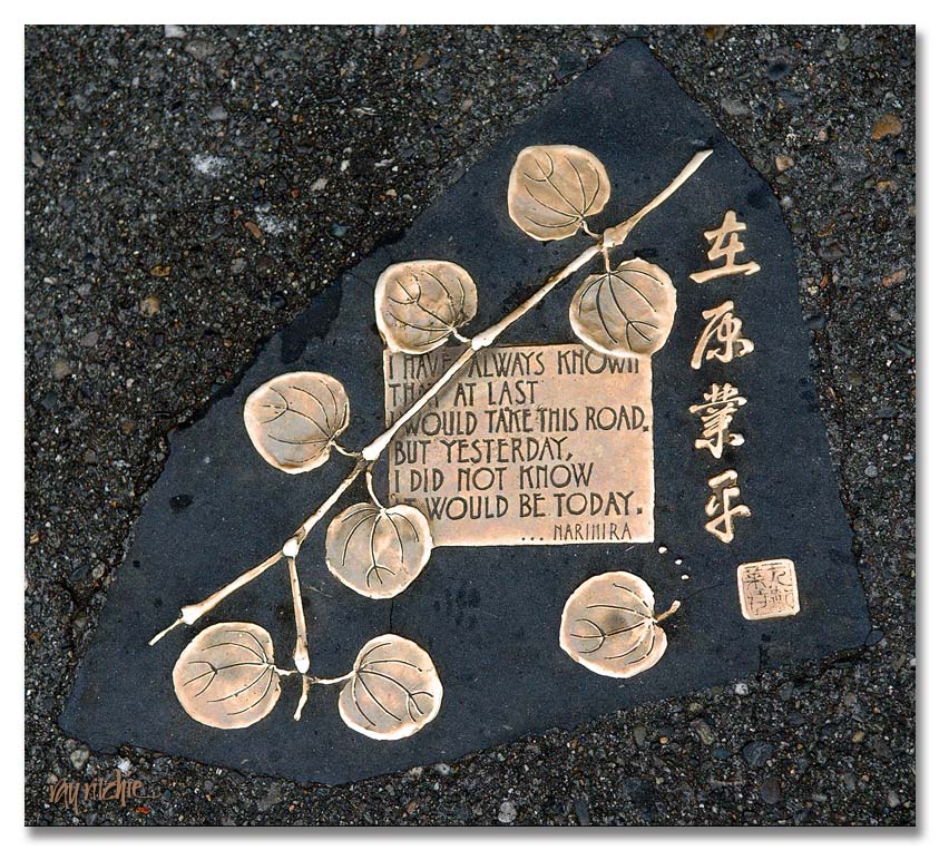
The next morning before leaving for Mt. Rainier, we made a trip to Pike Place Market, where we stumbled across this delightful piece of calligraphy embedded in the asphalt near the main entrance:

I assume that the chop in the lower right corner is the name of the artist, but I can’t read it. If anyone knows what it says, please let me know so that I can credit the artist properly. I’d love to know who it is and see some other examples of his/her work.

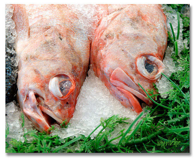
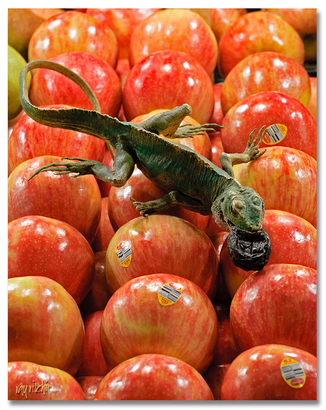
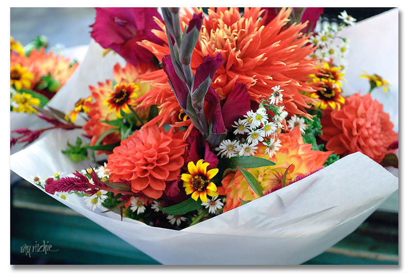
Pike Place Market has something like 600 shops, and I’m not sure that counts all the fishmongers, flower merchants, produce stands and craftspeople who come and go. We were actually there before most of the retail shops opened, though, so we saw mostly the food and flowers. Here’s a brief taste:

We could easily have spent the day (or several days) there, but that was true of almost everywhere we visited during this trip. Next post: on to Mt. Rainier.

A larger collection of the photos from the trip will be available on my Flickr page.

On to something different

I’ve been writing mostly on calligraphic topics for awhile now, but yesterday we returned from a 10-day trip to the Pacific Northwest (Washington and Oregon, that is), and I have tons of photos I’m dying to share with someone, so the next few posts will be a mini-travelogue. A larger collection of photos will be available for viewing on my Flickr page. As usual, if you see something you’d like to own, just drop me a line using the email link on my contacts page.

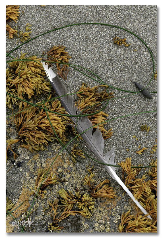
Since we’re shifting gears from lettering and calligraphy, here’s a transitional photo. This pile of seaweed with the seagull feather looked very calligraphic to me when I found it on Harris beach in southwestern Oregon:

I was amazed by the Oregon beaches – very different from anything I’ve experienced on the east coast of the US, and especially different from the Outer Banks of North Carolina, which is where 90% of my beach-going experience has taken place. Oregon is somewhat like the area around Bar Harbor, Maine and Arcadia National Park – lots of rocky beach, tidal pools, and mountains that drop right into the ocean. We were on a madcap tour, trying to cover too much ground in 10 days, but I could easily have picked one beach in Oregon and spent most of our time there. My favorites were Harris, Bandon, and Ecola/ Cannon, and even though I was doing a lot of “run and gun” photography, I came home with at least a few images from each spot that pleased me enough to share. Over the next week or two, I’ll highlight a few of my favorites.

Cards and envelopes

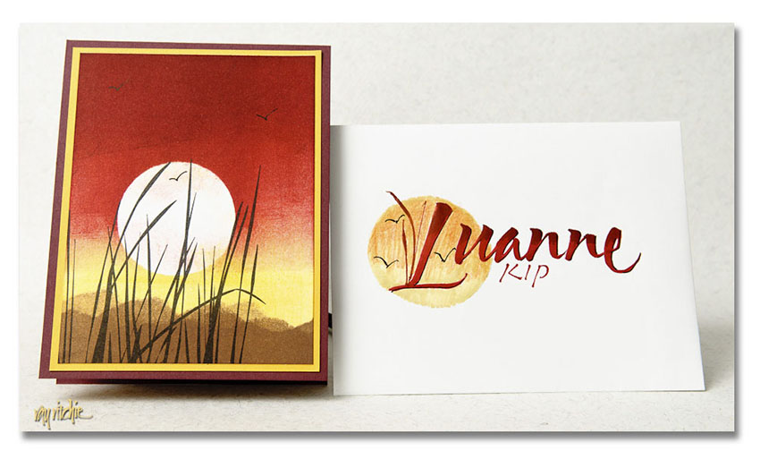
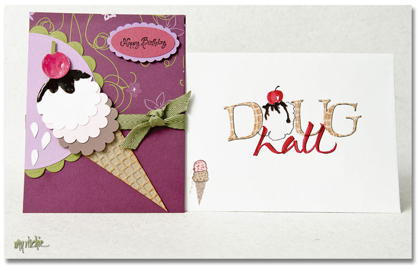
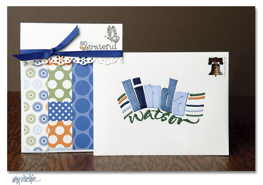
Anita is a dedicated card maker. She must make several hundred cards each year, most of them sent to friends and relatives, but occasionally made for sale or for support of some particular organization she’s involved in. Each of these cards is a fairly elaborate construction, perhaps involving rubber stamping, punched or die-cut elements, embossing, layering of papers and textures, and hand coloring and brayering, just to mention a few of the techniques she sometimes uses. After the card is ready, it usually comes to me for design of a matching or complementary envelope.

These envelopes are good opportunities for me to play with styles and colors and experiment with designs I might not do for my own projects. The envelopes, in contrast to Anita’s carefully worked out designs, are usually only about one step above a doodle. I typically grab a felt-tip brush marker (we have a set of colors that match most of her card stock colors and stamping inks), make some quick sketches on a piece of scrap paper, and then do the envelope. I may use colored pencils, ballpoint pens, and Rapidograph, Pigma, or Uniball pens for some final details and highlighting – whatever is handy at the time. Brush scripts are usually written directly with the marker, and other letter styles are usually drawn with a pencil and then painted in; I rarely go upstairs to my drawing board for my calligraphy pens, gouache, brushes, etc. for casual envelopes like these. Unless I make a major mistake, whatever comes out of the first attempt is what goes in the mail. But it’s fun, and I often like the overall effect. Here are a few recent examples of these collaborations:

Anita asks that I note that the first card above is based on a design by Tami White, the second is based on one by LeeAnn Greff, and the third inspired by a card by Becky Roberts.

Postcards from Asbury Park (part 2)

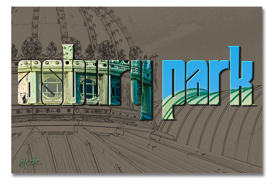
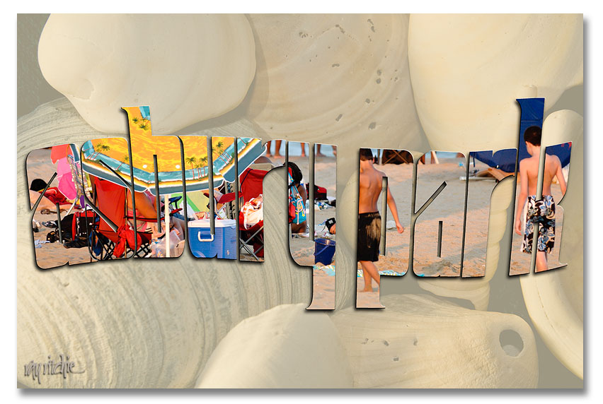
I’ll wrap up my discussion of the Sickel lettering design for Asbury Park with a couple of additional examples that show how the broad strokes of this lettering style give us an advantage for photographic effects.

The Old Casino

Here I’ve taken one of my photos of the roofline of the old Casino complex and turned it into a line drawing using the Photoshop “Find Edges” filter. I then used the same lettering as in the first postcard (see Postcards from Asbury Park – part 1) as a mask to let some of the color from the original color photo come through.

This one, obviously, is two separate photos. The background shell image is from my personal stock library, and the second was a beach scene made during the July 24 Photo Walk. I used a wavy version of the Asbury Park lettering to mask that second photo and layered it over a faded version of the shells.

I could as easily have used a font, rather than designing my own letters for these cards, of course. A font like Arial Black would also give me nice heavy strokes, but it wouldn’t be as distinctive – someone else could easily produce the same look. The combination of my own lettering with my photos gives the cards a unique look that hopefully would distinguish them from others on the rack.

I’ll have to decide now whether to actually do a commercial print run of any of these – it’s probably too late in the summer vacation season to do it for this year – if you have a favorite, please use the comment button or the contact form to let me know.