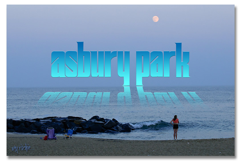
Continuing with the previous post on lettering (More on Lettering and Calligraphy), I promised to give some examples of how the draft versions of the Sickel lettering might be used with some of my photos from the Asbury Park photo walk. I decided I would develop a series of postcards, and see which I liked best. Here’s the first example:
The reflection effect was mostly based on an article by Corey Barker in the March 2010 issue of Photoshop User magazine. It involves adding a gradient to the lettering, then duplicating and flippling the duplicate layer to get the reflection, and masking and blending the “reflection” to allow it to blend into the water and disappear as the reflection gets further from the main title. I added the trick of distorting the reflection so that the reflection widens as it gets closer to the viewer.
Doing a self-critique here, I think the Sickel design doesn’t work as well as I’d like for this effect, as the descenders in the “y” and “p” cause the main part of the reflection to be too far from the main title. I might want to change the lettering to an all-caps style, or modify my Sickel design to eliminate these descenders if I were really going to use this design.


