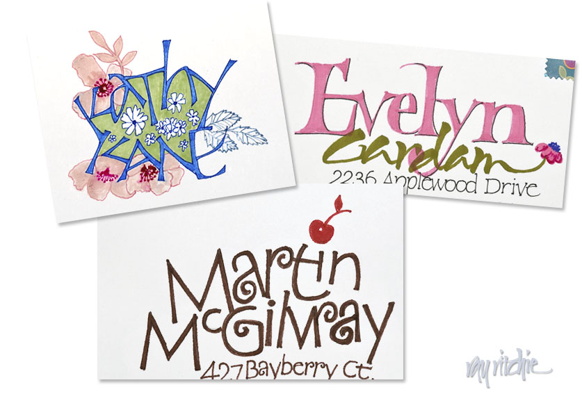
I haven’t done much finished calligraphic work for awhile, but Anita’s constant flow of cards always require envelope addressing, and that keeps me somewhat in practice. Here’s a recent sampling of three names with different treatments:
These envelopes are almost always done with brush markers and/ or fine Zig Micron pens. I enjoy doing them because they give me a chance to experiment with lots of different styles and ideas. The color and decoration scheme usually take their cue from the card design, and the letterforms are sometimes related to the forms used on the card, if I like the style. In the three cases above, Kathy’s envelope has letters that are my own design and unrelated to the card, but the decorative floral treatment is a take-off related to the card design. Martin’s envelope has lettering similar to that on the card, but I’ve changed the weight of the monoline forms, and added tilts and curves that weren’t in the typeface on the card. The cherry over the “i” in “Martin” is from the card design. Evelyn’s color scheme is the same as the card, and the small flower at the end of her name is related to the card design, but the letterforms themselves are my own, and are completely different from the card lettering.
My general rule with these kinds of envelopes is that I put my emphasis on color and design, but don’t try to hold myself to a “finished art” standard, as that would probably at least double the time required. I try to push myself to try something new as often as possible, but I do find that I develop certain formulas that I like and I re-use them fairly often, especially when I’m faced with a stack of cards that need to go out quickly. I rarely take the cards to my drawing board in my office/ studio, but usually just do them on a lapboard in the den. I only allow “do-overs” when I make an irretrievable error, so some of my envelopes please me much less than others – luckily, though, my audience for these is pretty uncritical and appreciative.

