To follow up on the earlier post about folded calligraphy, here are three examples illustrating potential directions that the combination of calligraphy and folding can go:
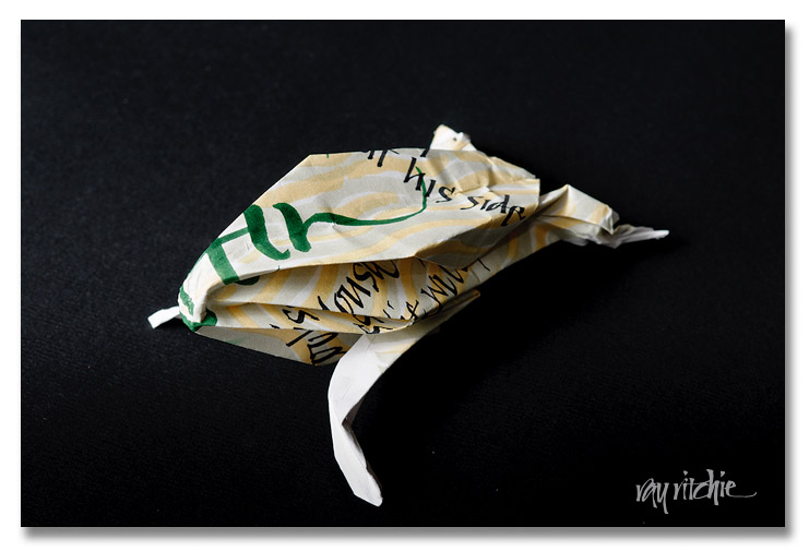
We can do traditional origami, such as a frog design
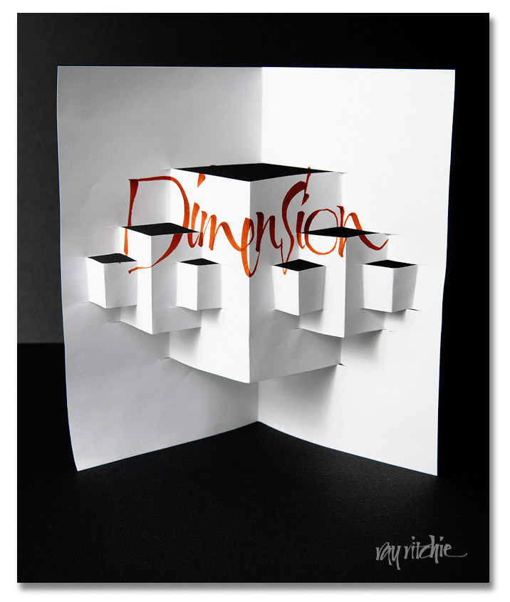
or, we might use a more graphical, structural approach, say, for greeting cards, shadowboxes, and wall art
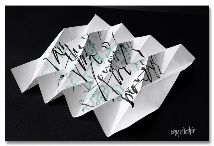
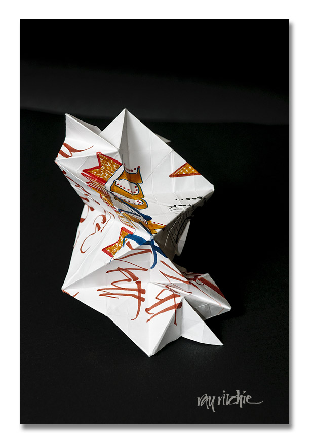
or, as in the example of the previous post, we can go with abstract sculptural approach
These are still just prototype examples, of course; I can see that there will be an art to be learned about where to put the calligraphy on the original unfolded paper if I want it to display best, but I’ve made no real effort to coordinate the placement with the folds at this point. And since I haven’t yet really decided what I might want to use this for, I don’t know if one of the three approaches is more relevant for me personally. Or maybe there are additional approaches I should consider. What do you think?


