Geekletters

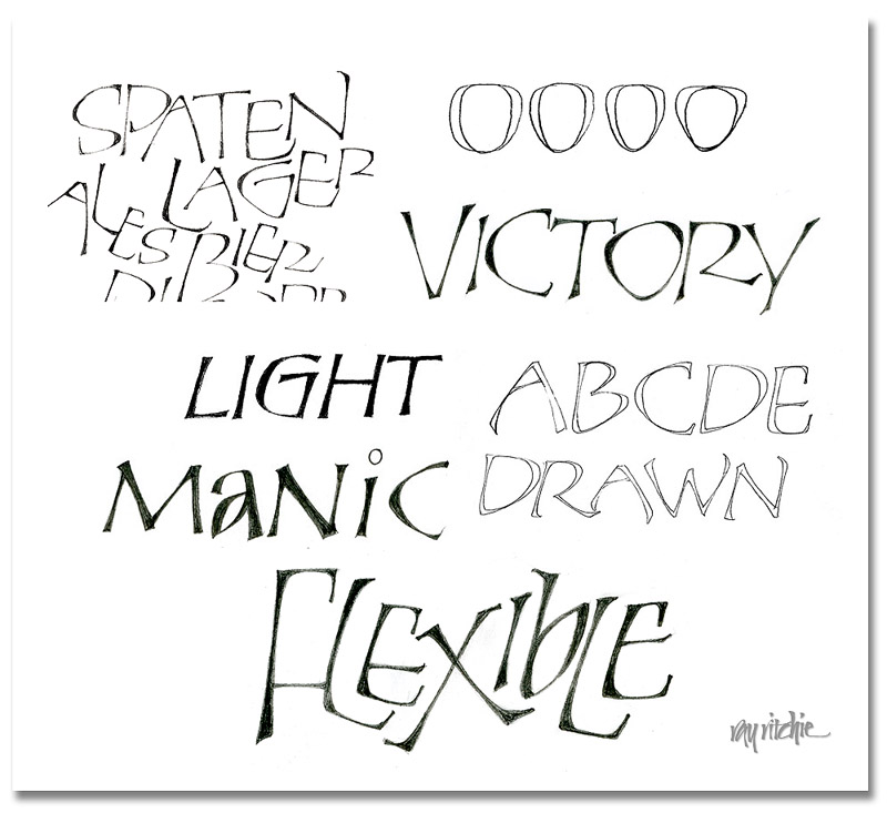
I promised to show some more examples of the Perkins-inspired letters, which we’ll call “Geekletters” for now, lacking a better word to cover a fairly broad category. Here’s a paste-up of examples from various scratch sheets that I had on my drawing board:

In the upper left, you see a crop from the original letters for the Beer Geek poster, which were first done as pressure-release monoline pencil shapes, and then were slightly retouched to add weight at various points. One of the original distinguishing characteristics of the “Perkins” caps for me was their use of a somewhat triangular shape in most of the curves. You can see this illustrated in the row of four “O” shapes at the upper right. This row progresses from a shape that is almost a classical “O” (though a little more of an “apple” shape) to a shape that is distinctly triangular. In the word “Victory,” you can see that the O, C, and the bowl of the R have taken on this triangular shape. To the left of that word, however, you see the word “Light,” in which the G still retains a more rounded (here, almost square) form.

The word “Manic” illustrates another quirk – I often mix caps and lower case forms within a word. This can give a distinctive and eye-catching quality, and breaks the monotony of seeing the same forms over and over.

The drawn nature of the letters is illustrated by the “ABCD Drawn” lines, which are an un-retouched scan of my pencil lettering. When I’m doing these sorts of letters, I often do only a fairly approximate sketch of my idea in pencil, then scan it into Photoshop, and do all the final development of the letters there, using my Wacom tablet as my pen and paper.

One of the main reasons I love pencil lettering is that it’s extremely flexible, as in the word “Flexible” above. Here you can hardly recognize any of the original Perkins origins, and yet the letters evolved from the same source as the other examples above.

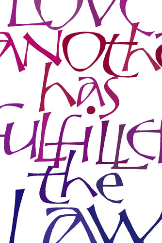
Here’s a color example, cropped from a piece based on Romans 13:8:
I’m still looking for a good name for this letter family, and would welcome your thoughts.

Pure and Simple

It seems that every time we enter a new election cycle, the public appetite for simple solutions to complicated problems increases. We hear calls for the “simple, unvarnished truth,” as though there really is someone somewhere who is sufficiently wise to discern what that might be, given all the unknowns and complications we face.

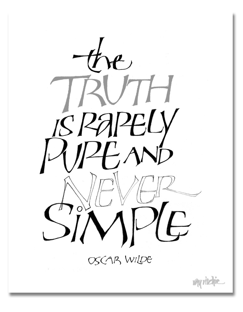
I got some queries about the lettering on the Beer Geek poster in the previous post, and I thought I should do some further posts about that style of lettering. As I was thinking about that, and as I was reading the latest reports of the political posturing going on across the country, I was reminded of this quote:

I started doing letters like this a number of years ago; I usually think of them as “Perkins Caps,” because I originally started doing them after seeing some work by Tom Perkins. I really haven’t studied Tom’s work for years now, though, and my forms have continued to evolve, so I need to think of a new name for them, and stop blaming Tom for something for which he should bear no responsibility. Maybe I should call them “Geek.”

The letters above are a heavier-weight form related to the letters of the previous post. They are a drawn and filled form. They start out for me as pencil outlines – you can see an example above in the word “Never.” I usually outline with a fairly hard pencil, such as a 3H or 4H, and then fill them in with something like a B or softer. Doing this kind of lettering is a slow, deliberate process, much like doing any other kind of pencil drawing, but it allows great control over the forms, and lots of flexibility, since you’re constrained only by your imagination. I’ll show a number of variations in the next post.


Pencil Gestures

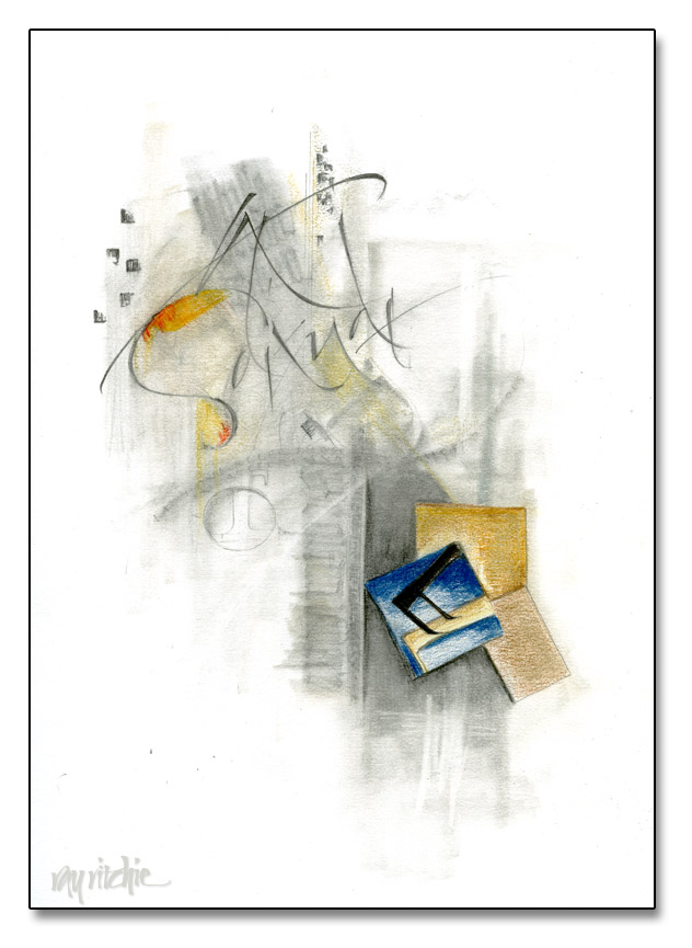
Last week I received my copy of Yves Leterme’s new book, Thoughtful Gestures, and I’ve been thoroughly enjoying reading it. I met Yves a couple of years back when he was teaching a class at a Camp Cheerio Calligraphy Workshop (I was in the other class, taught by Denis Brown), and I really resonated with the work he was doing and the work his students were producing. So for the past week or so, I’ve been playing around with gestural writing, trying to get more of a free feel to my work. A lot of my practice has been with a pointed brush and sumi ink, but as usual when I’m playing with something new, I also have done a lot of pencil work. Here’s an example, using graphite and colored pencils:

Solitude

Yves talks a lot in his book about his process of working with gesso, and how he will often wash things off and re-work and paint over portions of the piece as it develops. In the piece above, I did something similar by overwriting, smudging, and erasing. I want to continue to experiment with this process, and try the gesso process as well. More to come, I hope.

Pencil sketching

When I’m teaching beginning students, I often see that they don’t feel comfortable using liquid ink, and they have difficulty in getting the nib fully in contact with the paper. One exercise I sometimes use to help remedy this problem is to have them letter with a carpenter’s pencil, a flat lead pencil which can be easily sharpened to a chisel point. For some students, the softer feel of graphite on paper seems to be more familiar than the feel of a metal nib with liquid ink, and they are then more able to concentrate on getting to know the characteristics of a chisel nib. In fact, I often do calligraphic sketching with only a pencil, and find that it frees me from some of my own hang-ups and allows me to attempt letterforms that I can’t yet do easily with a metal nib. Soft pencil lead doesn’t snag easily on paper fibers, and the pencil doesn’t really care about direction of stroke, so I can feel more free to execute the shape in my mind without worrying about the skill issues involved in metal pen and ink work.

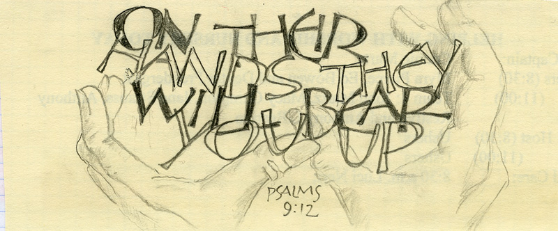
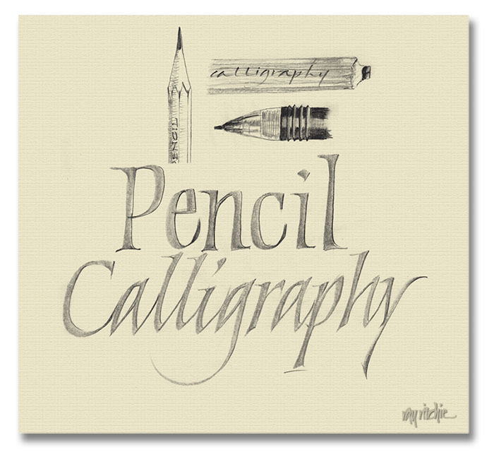
Here’s a sketch from this morning, just to make the point visually:

In the sketch above, the calligraphy was done with my carpenter’s pencil (sketched in upper row, right), and touched up slightly with a 0.7mm  mechanical pencil (2nd row).  This isn’t intended as finished work, of course, but the pencil does give a softness and range of tones that’s not possible with a pen and ink, and I enjoy integrating the small sketches with the pencil calligraphy. For me, the pencil is mostly a sketching tool for doing assessments of design ideas, but some calligraphers have taken pencil calligraphy to amazing levels. Sheila Waters has done a number of formal pieces in colored pencil, and Letter Arts Review frequently features pieces done partially or completely in pencil.

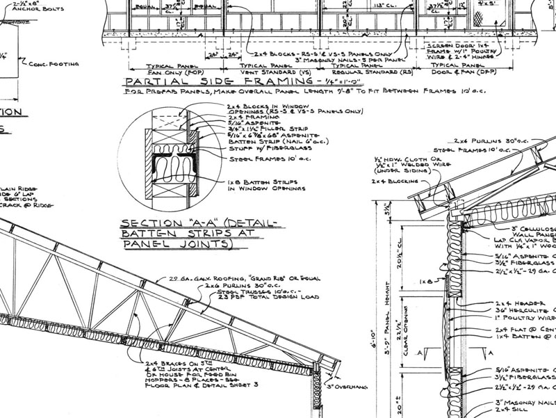
I’m sure part of my fondness for pencil dates back to my introduction to lettering, which came from watching my father do hand-drawn building plans like this one:

Dad worked almost entirely in pencil, and must have produced thousands of large pages (24 x 36 inches or more) of detailed plans like this during his working career as an agricultural engineer specializing in farm building design (I think the above image is a portion of a plan for a commercial chicken house). He never thought of his lettering as much more than “competent,” but I was drawn to it as a child, and I still admire it greatly. Long before I studied calligraphy, I learned to do architectural lettering by trying to copy his style. By the time I was about 15 or 16, I had gotten to be good enough at it that he would sometimes have me re-do one of his plan sheets, when a change in the building design required a major re-layout of an entire page (no computer cut-and-paste in those days!), and from about the age of 17, I worked a number of summer  and part-time jobs as a draftsman.

Dad died six years ago this week. I still miss him.