Postcards from Asbury Park (part 2)

I’ll wrap up my discussion of the Sickel lettering design for Asbury Park with a couple of additional examples that show how the broad strokes of this lettering style give us an advantage for photographic effects.

The Old Casino

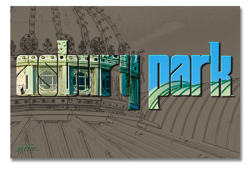
Here I’ve taken one of my photos of the roofline of the old Casino complex and turned it into a line drawing using the Photoshop “Find Edges” filter. I then used the same lettering as in the first postcard (see Postcards from Asbury Park – part 1) as a mask to let some of the color from the original color photo come through.

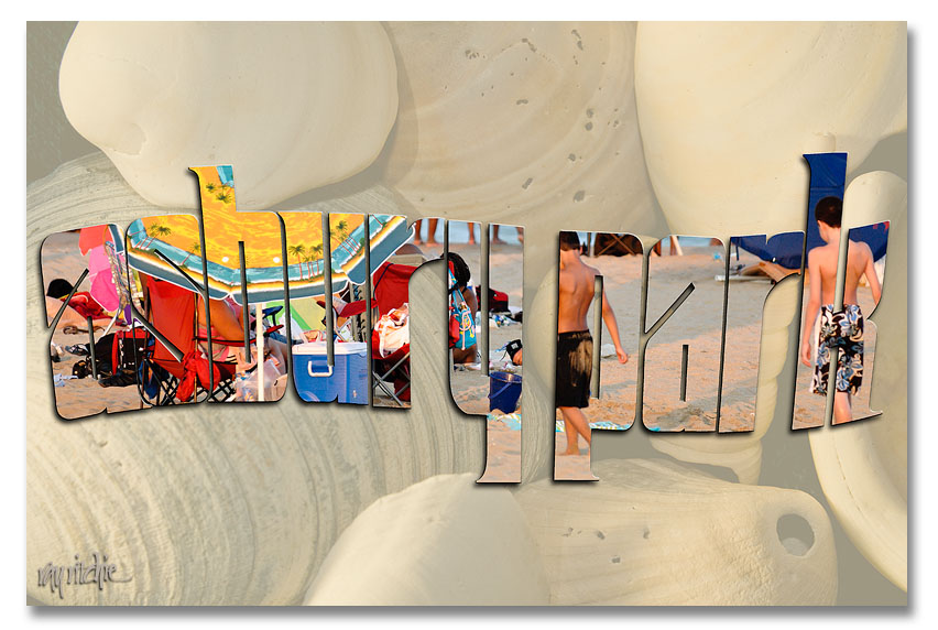
This one, obviously, is two separate photos. The background shell image is from my personal stock library, and the second was a beach scene made during the July 24 Photo Walk. I used a wavy version of the Asbury Park lettering to mask that second photo and layered it over a faded version of the shells.

I could as easily have used a font, rather than designing my own letters for these cards, of course. A font like Arial Black would also give me nice heavy strokes, but it wouldn’t be as distinctive – someone else could easily produce the same look. The combination of my own lettering with my photos gives the cards a unique look that hopefully would distinguish them from others on the rack.

I’ll have to decide now whether to actually do a commercial print run of any of these – it’s probably too late in the summer vacation season to do it for this year – if you have a favorite, please use the comment button or the contact form to let me know.

Postcards from Asbury Park (part one)

Continuing with the previous post on lettering (More on Lettering and Calligraphy), I promised to give some examples of how the draft versions of the Sickel lettering might be used with some of my photos from the Asbury Park photo walk. I decided I would develop a series of postcards, and see which I liked best. Here’s the first example:

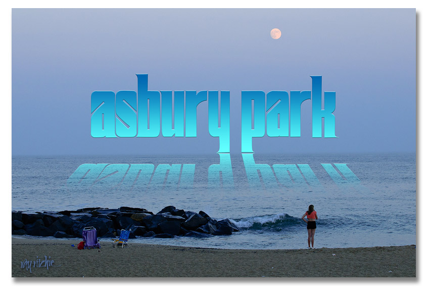
The reflection effect was mostly based on an article by Corey Barker in the March 2010 issue of Photoshop User magazine. It involves adding a gradient to the lettering, then duplicating and flippling the duplicate layer to get the reflection, and masking and blending the “reflection” to allow it to blend into the water and disappear as the reflection gets further from the main title. I added the trick of distorting the reflection so that the reflection widens as it gets closer to the viewer.

Doing a self-critique here, I think the Sickel design doesn’t work as well as I’d like for this effect, as the descenders in the “y” and “p” cause the main part of the reflection to be too far from the main title. I might want to change the lettering to an all-caps style, or modify my Sickel design to eliminate these descenders if I were really going to use this design.

Styles in development

People sometimes ask me “What style of calligraphy do you do?” but I never have an easy answer. I do whatever I’m currently hooked on, whatever I think the job may require, and whatever I really wish I could learn to do. Much of what I do is based on Italic and uncial, two of my earliest calligraphic loves, but a lot of my recent stuff has been heavily influenced by the brush. I work a lot on my Romans, but they’re never good enough to make me happy.

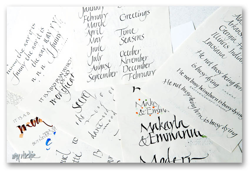
The easiest way for me to give examples is just to dig into my files of practice sheets and drafts. I do a lot of calligraphic doodling as I sit in my chair in the den, theoretically watching TV, and I accumulate huge piles of practice sheets and doodles. Most of them have no value at all, but when I get a stack an inch or so high, I usually go through them and find the 10 or 12 pages that might have a hint of something interesting on them. Those go into a box that’s used for an “inspiration file” when I’m looking for a new direction for a “real” piece. If you’re looking for finished work, this is not the place, but here’s a look at one of the piles:

Looking at that picture reminds me of “there must be a pony in here somewhere!” If you don’t recognize that punchline, try Googling “the pony joke.”

Zen flow

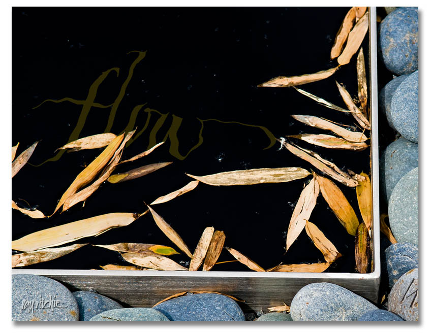
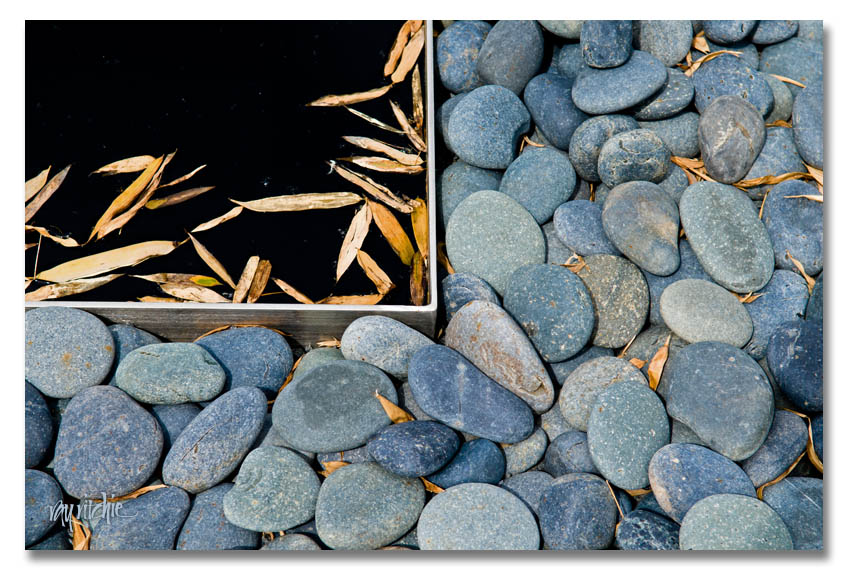
After some private feedback from a fellow member of cyberscribes (see my blogroll for a link), I was prompted to play around with the idea of having some text in the water of the “Zen stones” piece. This required a little re-thinking about the layering and filtering of the image and text in Photoshop, but here’s the result of the first experiment:

There would be multiple challenges with this idea. First, there’s the danger of losing the character of the calligraphy if I distort it too much with the Photoshop “Ripple” filter. Then there’s a technical detail issue: the Ripple filter is 8-bits, whereas I try to do all my image processing in 16-bit mode until I’m ready to publish or post. For reduced-size web images like I’m doing here, it will probably never matter, but in a 12×18 or larger print, there may be some small impact on quality. And most importantly, there’s the design issue of dominance. My feeling in combining text with photos is usually that “less is more;” in other words, I probably don’t want text too many places in the photo, so if I decide to incorporate, say, a quotation in the water, I’d probably want to limit myself to only a few words among the stones. Photos and text always compete with each other for dominance of the viewer’s attention, so I need to decide what amount of text (and what placement) is right for the overall feel of the piece. More food for thought.

Hopefully, I’ll eventually post a completed product for the Zen Stones piece. For now, I’ll probably just respond to comments, if any, and go on to another topic in the next post.

Image seeking word

Sometimes I capture a photographic image that just seems to cry out for some words, but I don’t always know what words the image is seeking. Here’s an image I made at the reflecting pool in the courtyard of the North Carolina Museum of Art during a visit last April:

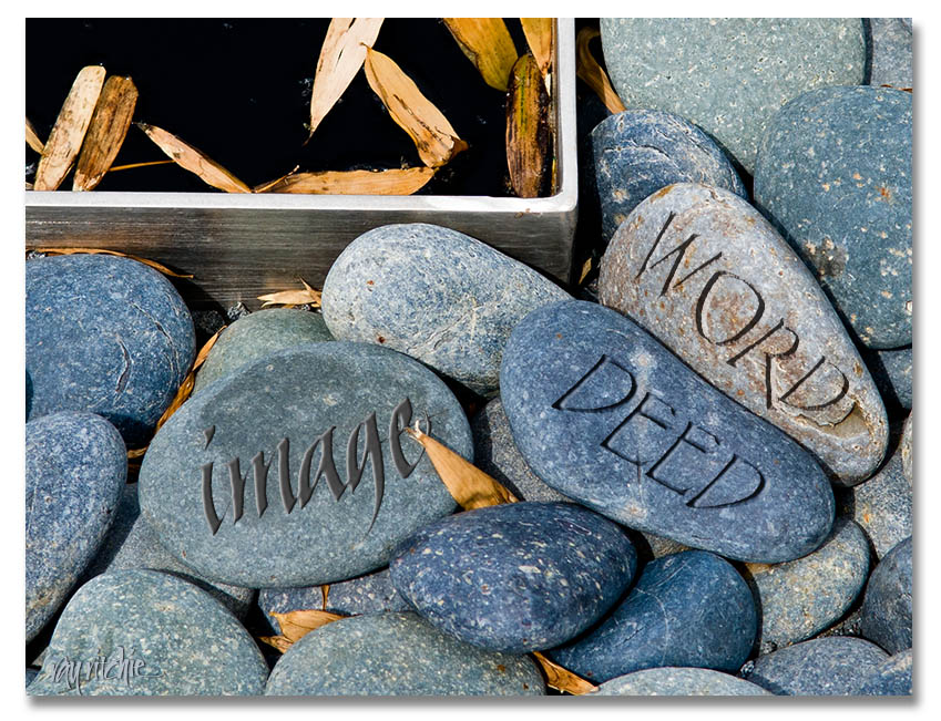
I loved the “Zen” feel of this photo, and have been thinking for several months now about how I could best use it with some text. One thought is to use some Photoshop trickery to paint or incise some words on the individual stones. With a little work with the Bevel and Emboss tools, it’s possible to make a pretty convincing fake. Here’s an example, just to give you an idea of what I’m talking about:

Maybe some of you might have ideas about a nice short quote or a set of words that would go well with this image. Please give me your comments!

By the way, if you’d like to make a quick virtual visit to the NCMoA, a set of my photos from my April visit is on my flickr stream here:

http://www.flickr.com/photos/21031876@N04/sets/72157624547570665/

Word and image

Classical calligraphy is frequently combined with some form of image or illustration. While I do some illustration, drawing, and painting, my most frequent form of imagery is digital photography, and I love to find ways to combine my words and photographic images into unified designs. Here’s an example:

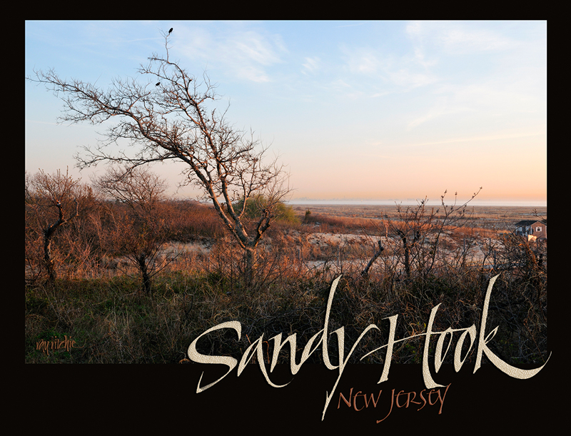
This is a T-shirt design, based on a photograph I made at the Gateway National Recreational Area on Sandy Hook, New Jersey (for those in the know, the specific location is Gunnison Beach, the infamous “nude beach” – no nudes present when I made the photo in April, though). The text at the bottom is hand calligraphy, and was originally written in black ink on white paper. I scanned it into my Mac Pro, brought it into Photoshop, and changed the text color to match colors sampled from the photo. Finally, I added some “sand” texture to the words “Sandy Hook,” and layered the whole design up in Photoshop.

This design was published in the Annual Review issue of Letter Arts Review in the spring of 2010.