It seems that every time we enter a new election cycle, the public appetite for simple solutions to complicated problems increases. We hear calls for the “simple, unvarnished truth,” as though there really is someone somewhere who is sufficiently wise to discern what that might be, given all the unknowns and complications we face.
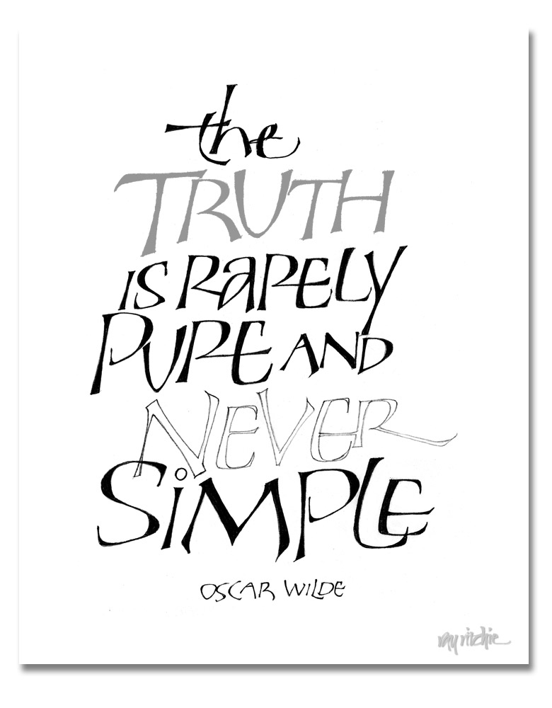
I got some queries about the lettering on the Beer Geek poster in the previous post, and I thought I should do some further posts about that style of lettering. As I was thinking about that, and as I was reading the latest reports of the political posturing going on across the country, I was reminded of this quote:
 I started doing letters like this a number of years ago; I usually think of them as “Perkins Caps,” because I originally started doing them after seeing some work by Tom Perkins. I really haven’t studied Tom’s work for years now, though, and my forms have continued to evolve, so I need to think of a new name for them, and stop blaming Tom for something for which he should bear no responsibility. Maybe I should call them “Geek.”
The letters above are a heavier-weight form related to the letters of the previous post. They are a drawn and filled form. They start out for me as pencil outlines – you can see an example above in the word “Never.” I usually outline with a fairly hard pencil, such as a 3H or 4H, and then fill them in with something like a B or softer. Doing this kind of lettering is a slow, deliberate process, much like doing any other kind of pencil drawing, but it allows great control over the forms, and lots of flexibility, since you’re constrained only by your imagination. I’ll show a number of variations in the next post.
